| Author | Thread |
|
|
06/22/2006 04:15:23 AM |
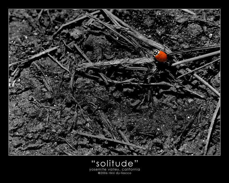
Ohh...poor creature, she needs a bit of green!
Nice works on the desat! Perfect composition! Very nice! :) |
|
 Photographer found comment helpful. Photographer found comment helpful. |
|
|
06/21/2006 11:57:30 PM |
|
I know a lot of people don't like selective desats but this is spot on. Rule of thirds framing is excellent and just draws you in to the little bug. Fantastic stuff! |
|
| Photographer found comment helpful. |
|
|
06/21/2006 02:10:58 AM |
|
Oh that is cute...a little ladybird in a big wide scary world. |
|
| Photographer found comment helpful. |
|
|
06/21/2006 01:18:10 AM |
|
Has all the the wrong ingredients for a good picture ... a messy nusy background, harsh lighting, big empty areas on the canvas. But it seems to work. |
|
| Photographer found comment helpful. |
|
|
06/20/2006 06:07:56 PM |
|
Very nice. Everything works here |
|
| Photographer found comment helpful. |
|
|
06/20/2006 05:33:53 PM |
|
good eye for this shot. I prolly would have stepped on it :) |
|
| Photographer found comment helpful. |
|
|
06/20/2006 12:10:21 PM |
|
I agree with Jutilda below. I don't like single saturation, but in this picture it worked out great. Very powerful, and I could see it easily on a wall :) |
|
| Photographer found comment helpful. |
|
|
06/20/2006 11:50:11 AM |
|
Excellent. Not always a fan of single sat, but this is killer. |
|
| Photographer found comment helpful. |
|
|
06/20/2006 11:48:40 AM |
|
Way to make the most of what's available in the shot. The selective desat is great - definitely the way to go, as the background would just be too busy and distracting otherwise. Well seen and presented. |
|
| Photographer found comment helpful. |
|
|
06/20/2006 10:13:17 AM |
|
Desat is well done, composition is good, but background for me is quite busy, though it could be argued that it completely supports the image. I personally am not fond of titled frames on digitals - they only look good to me on prints. |
|
| Photographer found comment helpful. |
|
|
06/20/2006 06:46:41 AM |
|
Very cute. and the title really helps make it. |
|
| Photographer found comment helpful. |
|
|
06/20/2006 03:18:12 AM |
|
I really like this - it has a huge emotional impact. The only thing I might recommend is a tighter crop on the left and bottom - I am slightly overwhelmed by the background, and it would have the added benefit of removing the out of focus part on the top left. But yeah, I know the point is to emphasize the solitude, and what you have does a really great job with that! |
|
| Photographer found comment helpful. |
|
|
06/20/2006 03:09:26 AM |
I really like this one!! Composition is great..The title says it all. Great photo, adding it to my favourites!
Message edited by author 2006-06-20 03:13:33. |
|
| Photographer found comment helpful. |
Home -
Challenges -
Community -
League -
Photos -
Cameras -
Lenses -
Learn -
Help -
Terms of Use -
Privacy -
Top ^
DPChallenge, and website content and design, Copyright © 2001-2026 Challenging Technologies, LLC.
All digital photo copyrights belong to the photographers and may not be used without permission.
Current Server Time: 07/02/2026 09:46:34 AM EDT.