| Image |
Comment |
| 07/06/2006 03:07:36 PM |
Gothic Glow Trishieby annasenseComment: I like it however, the teeth stand out too much, IMO. Maybe make the eyes a bit sharper to compensate? |
 Photographer found comment helpful. Photographer found comment helpful. |
| 07/06/2006 02:10:56 AM |
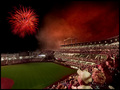
And the Rockets Red Glare...by CutterComment: Sweet. Would have liked to see the light trail leading up to the fireworks but that's about the only negative I have for this shot. I love how everyone is all looking and nobody is getting up for some beer. :P |
| Photographer found comment helpful. |
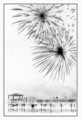
| 07/06/2006 02:08:17 AM |
|
| Photographer found comment helpful. |
| 07/05/2006 06:46:19 AM |
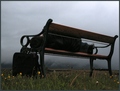
Some Flowers Bloom no moreby GunnsiComment: I like this one. I wish I could see his face but otherwise the elements here are good. Maybe too desolate and depressing for this challenge? |
| Photographer found comment helpful. |
| 07/05/2006 06:41:55 AM |
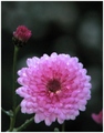
Ioby GunnsiComment: I like the composition and the bokeh is good. Not sure about the noise and the white pixels seem a little strange to me. Would have done better if the flower was sharper and the image cleaner. I agree with Rebecca about the color but I'm ok with the amount of light you have here. |
| Photographer found comment helpful. |
| 07/05/2006 06:37:52 AM |
Blue Riverby GunnsiComment: This is a cool image. Good color, detail and unique framing. For some reason the thin inner frames and the fairly thin outer frame feels a little awkward, IMO. Maybe make the outer frame thicker so it can be the dominate frame. Other than that I like it. |
| Photographer found comment helpful. |
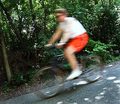
| 07/05/2006 06:32:41 AM |
The Bicyclistby DigiFotoBuddyComment: I agree with Rebecca 100%. The subject simply doesn't stand out against that highly detailed background. Oh and what's with the I just want to meet my average comment? You gotta reach higher than that! Come to think of it you're probably just trying to get your average down so you can take most improved photographer again in season 2. :P |
| Photographer found comment helpful. |
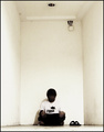
| 07/05/2006 05:55:55 AM |
Psychogenic Incorporealityby blackenedwhiteComment: Ha. I like your style. When I read your shirt I thought it said "Runa". Ah well, tuna it is. To be honest this reminds me of one of those hostage photos. That room sure can pass for a prison cell. |
| Photographer found comment helpful. |
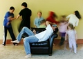
| 07/05/2006 05:31:18 AM |
Mom's Day Offby margiemuComment: Congrats on the top ten! You pulled this idea off well. Not your typical "blurred" background. :P Speaking of which, I like the motion blur of all the kids however the one in the red hood and the girl directly to the right has a sharp edge on their heads which looks a little strange. I probably would have blurred that just a bit but I can see why you wouldn't want to do that for the challenge besides it's not distracting just more of a curiousity. I also like the foreground subject, which is sharp, colorful and well lit so great job making him and the sofa stand out and stand out well. All in all a really cool image. Message edited by author 2006-07-05 06:15:33. |
| Photographer found comment helpful. |
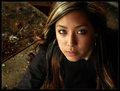
| 07/05/2006 04:37:00 AM |
Vuby Joey LawrenceComment: Not Vu, Wow! I always like your grunge but in this shot I don't think I like that bird poop in the background assuming that's what it is. Yeah I know, how in the world did I get past her eyes to see that. :P |
| Photographer found comment helpful. |
Home -
Challenges -
Community -
League -
Photos -
Cameras -
Lenses -
Learn -
Help -
Terms of Use -
Privacy -
Top ^
DPChallenge, and website content and design, Copyright © 2001-2026 Challenging Technologies, LLC.
All digital photo copyrights belong to the photographers and may not be used without permission.
Current Server Time: 06/23/2026 12:05:20 AM EDT.