| Image |
Comment |
| 11/16/2005 05:06:36 PM |
Waiting for a Trainby ElaineComment: An interesting idea. I think I would have pulled that weed? that is over the cup. It isn't obvious what it is so distracts people from the subject. As weird as this sounds, you could have picked better trash. White styrafoam is hard to make look good (maybe a non-white paper cup) as is a baggie (a chip bag instead?).
I would have removed the other weed that is entering from the left. Controlling the whole canvas is always important. If it isn't adding something, get rid of it.
Your conversion to B&W isn't too bad. A little harsh on the RR track highlight. |
 Photographer found comment helpful. Photographer found comment helpful. |
| 11/16/2005 05:03:05 PM |
Re-bar Rollercoasterby tmhallingComment: I sorta like this one. I'm not sure about the blue tint though. Rebar makes me think of rusty red. Either going with the natural tint or trying B&W since this is a picture mainly concerned with shapes and patterns (color isn't an issue with those so why use it?).
The white splotch is too bad and you probably could have done something about it. A bit overexposed on the middle highlight. The composition is nice though. |
| Photographer found comment helpful. |
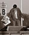
| 11/16/2005 03:19:33 PM |
Disposalby janskuComment: The coversion to B&W is excellent. Very well done. The composition could maybe be a bit stronger with a little less centeredness. Perhaps shift to the left toward the sign. The sign is better than the big pole in the background.
Ultimately the subject probably got you. It's too "snapshot" or mundane. We see fat guys throw away trash every day. Why are we looking at a picture of it? That being said, you did as well as you could. I'd have given a 6 just for the crisp B&W. |
| Photographer found comment helpful. |
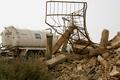
| 11/16/2005 03:16:26 PM |
Only in IRAQ!by shaverComment: Since the colors don't do much for this picture, I would think B&W to go for the texture. You have nice textures in the rubble and the rebar makes a nice pattern against the sky. The bush also hurts your image because it's a muddy green/black chunk of no detail. Dark green like evergreens is really hard to photograph well. I would have recomposed to remove the bush. I'm guessing you took this on the fly because of the truck so you probably didn't have time to think about this stuff.
Focus and DOF is nice. So much sky in the picture is never really good blown out. Either expose for the sky (and see if you can get away with it on the ground objects), or recompose so the sky isn't as dominant. |
| Photographer found comment helpful. |
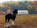
| 11/16/2005 03:12:59 PM |
Hazy Shade of Autumnby TuckersmomComment: The worst thing on this picture is that I spelled "faux pas" wrong in my comment. :)
The biggest issue is probably the control of the background. We don't really want that big corrugated barn in the back. That doesn't feel warm and fuzzy. Take that away and you have a 5.5 at least. The horse adds a nice foreground subject and is not centered. That's good. It's probably not the most flattering view of a horse though. ;)
It was a tough shot for basic editing. You had to expose to keep the horse from being a black mess, but also had to keep the trees and sky from being too light. In the end, it probably wasn't gonna happen. I think you did well for what you could work with.
|
| Photographer found comment helpful. |
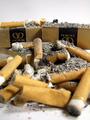
| 11/16/2005 03:08:33 PM |
Trash, My Wayby mfairbanksComment: It just looks too nice for garbage. The lighting is wonderful. I need to make my own lightbox someday too. But it all looks too staged and antiseptic. I think that's your biggest problem. The composition isn't bad, but is too symmetrical and centered. We have 4 elements all mirroring each other. That adds to the unrealistic nature. I think we wanted our garbage to look like garbage...(see ribbon winners). |
| Photographer found comment helpful. |
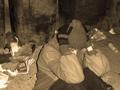
| 11/16/2005 03:05:35 PM |
Waiting for dinnerby GiorgioComment: I like the composition, although I think we want to see a little more of her? face. It's sorta nice she's shutting us out a bit, but we want to see the emotion. I have a hunch this is staged as her clothes look pretty clean and new. :)
I think the sepia isn't doing you any favors. B&W would have been better. I always ask what purpose I'm trying to accomplish when I add an effect. If it's just to "look cool", I usually wind up going with simpler. It almost always works better.
The lighting is a bit harsh too. Looks like a utility light which casts harsh dark shadows. I think dark shadows would be good in this pic, but they aren't utilized at all. Side lighting might be more dramatic here. |
| Photographer found comment helpful. |
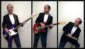
| 11/16/2005 03:01:54 PM |
Watching My Score on a DP Challengeby fotomann_foreverComment: I think it is more unconventional and harder to pull off when the foreground is out of the DOF and the background is within the DOF. The foreground commands so much more of the space and people are disconcerted when it is OOF.
The lighting and other technicals seem great. I don't think there is a cast and there appears to be ample contrast. The composition is nice, although perhaps a little too symmetrical.
You got a few 1-votes from the pro-smoking crowd no doubt. |
| Photographer found comment helpful. |
| 11/16/2005 01:10:16 PM |
Errant Headstocksby NordlysComment: Another creative one. I like the idea a lot. The lighting is just a tad cast (red), but your composition makes up for it. 10 otherwise...9 for now. |
| Photographer found comment helpful. |
| 11/16/2005 01:06:56 PM |
ME?!? Framed! Nahh...by mesmerajComment: Very cute. I'd like to see a version where the body stands out just a bit from the background. Might be better, might not. 8 |
| Photographer found comment helpful. |
Home -
Challenges -
Community -
League -
Photos -
Cameras -
Lenses -
Learn -
Help -
Terms of Use -
Privacy -
Top ^
DPChallenge, and website content and design, Copyright © 2001-2026 Challenging Technologies, LLC.
All digital photo copyrights belong to the photographers and may not be used without permission.
Current Server Time: 06/12/2026 02:56:37 AM EDT.