| Image |
Comment |
| 11/30/2005 02:29:46 PM |
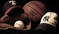
Odd Ballby hollisterGqComment: I think the composition of the photo is good. Technically it isn't bad. The white of the yankee hat is quite blown and that immediately distracts. I bet that cost you some.
I have found many of these mediocre scoring photos lack contrast. You were limited by your exposure, but the rest of the picture looks much better with an upping of +20 on your contrast. Doing such blows the hat even more and also the baseball, so to get such you would need to reshoot the picture with a lower exposure. (or have wished for advanced editing)
Finally, I bet the DNMC crowd bit you a bit. (you can see it in the 1-3 votes) While I get what you are going for, it seems slightly shoehorned into the challenge. I didn't vote odd and I'm quite liberal in my threshold for meeting a challenge, but there are others that are very strict. Whether you deserved it or not, I bet this lowered you by .1-.2. The basketball just isn't "odd" enough. Yes, it isn't baseball, but it is a sportsball, and in that respect they all go together. |
| 11/30/2005 11:23:12 AM |
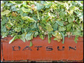
Leftover Odds n' Sodsby tembaComment: Actually I don't think you have a green cast. In photoshop it looks like it's slightly blue, but it isn't off by much. I think it lacks contrast and I goofed with it in PS and think it looks better by upping the contrast. I also darkened the midtones in levels a bit.
Overall, the image may be a little to centered with the crop exactly on the edges of the tailgate. I'm not quite sure what else to do, but I don't think I like it that way. We don't get enough context for the picture. It may have been neat to have just enough background so we can see just how much cabbage (or whatever) is in the back. |
 Photographer found comment helpful. Photographer found comment helpful. |
| 11/30/2005 11:10:12 AM |
|
| Photographer found comment helpful. |
| 11/30/2005 01:02:14 AM |
|
| Photographer found comment helpful. |
| 11/30/2005 12:48:37 AM |
Even with two - they lostby shaverComment: There have been a few threads which state that photojournalism is not as valued on this site as it used to be. I think that's true. So we'll chalk a little bit of your score up to this (but not much).
I think the photo looks a little too "snapshot". By this I mean the lighting is not dramatic at all; nor the background. It looks like you shot almost exactly at noon which is a bad time for photos. This gives a very flat light and low contrast.
The title is also a bit confusing. It actually took me a minute to realize what it was referring to ("they lost" as in the war and not "they lost" as in the two people who were sitting in this piece of equipment).
Perhaps you could have tried some other perspectives for something more dramatic. From below? Along the barrels? It's hard to know what would work, but this shot is too static and ordinary. |
| Photographer found comment helpful. |
| 11/28/2005 05:05:47 PM |
|
| Photographer found comment helpful. |
| 11/28/2005 05:04:49 PM |
Suits Meby BrenbComment: How about "It's a dog eat dog world"? The setup and exposure are excellent here. Should ribbon in this small challenge. I only rated one other pic as highly. |
| Photographer found comment helpful. |
| 11/28/2005 05:03:34 PM |
Motherhood : a fine tuned balancing actby mesmerajComment: Could have been a ribbon winner in my mind if the focus and lighting were superior. It seems like the focus is slightly off (see phone) and the color of the laundry dispenser is garish. Still I gave it a 7 and that's pretty good in this challenge. |
| Photographer found comment helpful. |
| 11/23/2005 01:03:22 AM |
|
| Photographer found comment helpful. |
| 11/23/2005 12:20:54 AM |
|
| Photographer found comment helpful. |
Home -
Challenges -
Community -
League -
Photos -
Cameras -
Lenses -
Learn -
Help -
Terms of Use -
Privacy -
Top ^
DPChallenge, and website content and design, Copyright © 2001-2026 Challenging Technologies, LLC.
All digital photo copyrights belong to the photographers and may not be used without permission.
Current Server Time: 06/12/2026 07:19:40 AM EDT.