|
|
|
Showing 3001 - 3010 of ~4080 |
| Image |
Comment |
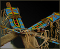
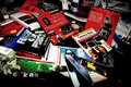
| 12/12/2005 03:44:05 PM | Knife and Mirrorsby rjksteschComment: "I don't know if the voters will be liberal enough to figure the knife and scabbard fit under the knife category. I'll just have to see. "
I guess we saw. I have to admit I gave this a 5. Why? Perhaps it was that the scabbard was more prominent than the knife, but I am usually fairly liberal with my DNMC deductions. There's a chance the pretty colors were denied a bit of "wow" as you used a similar pattern of colors so recently in triptych. (I thought of that shot immediately when I voted on this one. Looks like I was on to something as you did them both.)
Visually, I think the blurred foreground knife is a bit of a drawback. Not only does it command a fair sized portion of the frame, it is not colorful like the others. Of course it would be impossible to do the shot without, but it might be a "doomed concept" in this regard. |  Photographer found comment helpful. Photographer found comment helpful. |
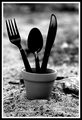
| 12/12/2005 03:36:20 PM | Home Grownby L1Comment: I liked this one Laurie. I gave it a 6 and that was fairly good for this challenge. I'm sure you are astute enough to know the technicals are good. Nice DOF, nice sharp focus, nice conversion to B&W. Here's my take on why it did poorly. Just a guess though...
1) Too much of a non sequitur. While it's a cute and creative idea, it doesn't seem to have any sort of reference to base it in. It isn't a play on words (as far as I can decipher) like "Fork in the Road" and we don't "home grow" silverware even in any other sense of the phrase. People may have just scratched their head a bit and moved on. This is really the only thing I can come up with.
2) Was this black plastic silverware? I'm not sure about the blackness. I go back and forth. At one time I wish it was a more traditional reflection of metal, but at other times I like it the way it is. I'd have to see it with silver and judge from that.
Hope that helps a bit. I'm scratching a bit on the 5.1 myself... | | Photographer found comment helpful. |
| 12/12/2005 11:52:39 AM | | | Photographer found comment helpful. |
| 12/12/2005 12:55:08 AM | | | Photographer found comment helpful. |
| 12/12/2005 12:09:34 AM | | | Photographer found comment helpful. |
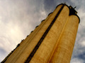
| 12/09/2005 04:41:55 PM | Grain Industryby arsenalComment: I think this had real potential. I like the composition and colors. It looks like it got killed in post-processing. Did you use Neat Image? Looks a bit "plastic". I assume that's what's causing the halo effect around the grainary since this was a basic editing challenge. That's the only big minus in this picture. Like I said, I like the vertiginous composition and the contrast between the reds and blues...
I didn't look at the other comments yet, but I bet you already knew all this... ;) | | Photographer found comment helpful. |
| 12/09/2005 04:26:45 PM | Book Collectionby shaverComment: Hmmm, technically I think this is well done. The lighting is nice and the focus is sharp. Colors are bright and vibrant. I think perhaps there is not a lot of intent in the picture. It looks like a jumble of books (which it should), but there isn't any sort of pattern or design for the eye to catch. I'm not saying they need to be aligned or anything, but maybe taking some of the colors on the book and arranging them so we get some contrasts, etc. (Maybe the green book would have looked good between the two red ones.)
You have a very even distribution in votes and that makes me think that nobody really found much wrong with it, but they didn't see anything to fall in love with either. | | Photographer found comment helpful. |
| 12/09/2005 04:20:46 PM | 1.21 Gigawattsby MQuinnComment: I think this isn't bad. Let me see. First, I like the color of the dusk sky. That blue, to me, is quite appealing. I also like the star effect on the few lights. The composition is very centered, but I don't know if uncentererd would be better or not. I'd have to see it. Could you have walked to the next set of power poles and shot so the hill to the left wasn't there? The black of the hill pulls the shot down. Maybe here you could crop a little off the bottom so you have less black there.
The focus looks just a bit soft, especially on the power poles. I added some USM and it looks better to my eyes. (100%/0.7/0)
All-in-all, I don't think it's bad. 5.25 isn't a bad score. You almost hit 50th percentile, which is nothing to sneeze at in a challenge of people who like photography enough to enter.
| | Photographer found comment helpful. |
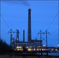
| 12/09/2005 01:07:54 PM | Old Zn factoryby skyoneComment: I get lots of pictures like this when people ask me to comment on their 4.8-5.2. Immediately I think this would be better in B&W. The colors here are washed and drab. Get rid of them. Color is there to help a picture, but when it doesn't, we forget that we can take it away. When you go to B&W, the picture becomes more about shapes, patterns, and textures.
If you use photoshop, open the picture and hit ctrl-1 to show the red channel. This is a good approximation of a nice B&W coversion for this picture. I also adjusted the levels a bit (20/1.3/255) to bring out the midtones more and give things more definition. Finally I added some unsharp mask which brings out the detail. I bet those 3 things would have added .2-.4 to your score.
Your composition is nice with the uncentered image. If you could use advanced editing I would have cloned out the power line towers as they detract. As it is in basic, you can't, but perhaps it was possible to shoot from a different vantage to keep them out? The powerlines, to me, give the picture a bit of a "snapshot" feel. (I'm not blaming you for them, just saying what they do to the picture.) | | Photographer found comment helpful. |
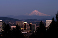
| 12/08/2005 06:06:14 PM | These City Wallsby ace flymanComment: Oh yeah, I remember this one since I live in Vancouver, WA. I gave it a 7, but you might have gotten a homer bonus. The biggest problem is actually the pine trees. Evergreens are impossible to photograph well (I find). They turn to black, muddled messes really fast, and here they take up a good 25% of the picture. I'm sure you were limited by your vantage points and the cost of renting a helicopter, but I think it's a detractor from the overall picture.
The colors are both nice, but also a bit drab. I like the blue (although I have seen better, deeper twilight blue) and the lights, but the rest of the picture would probably be better in B&W. I tried to covert to B&W and it didn't do it for me, but I also tried a selective desat of everything but yellow (with only a 50% desat on yellow). That was a bit more interesting, but I'm not sure it would have done much better. So I'm not quite sure which direction to go there. Did you use a polarizer? That can really make a nice color of the sky, even at twilight.
So overall a great idea limited by the trees. | | Photographer found comment helpful. |
|
Showing 3001 - 3010 of ~4080 |
Home -
Challenges -
Community -
League -
Photos -
Cameras -
Lenses -
Learn -
Help -
Terms of Use -
Privacy -
Top ^
DPChallenge, and website content and design, Copyright © 2001-2026 Challenging Technologies, LLC.
All digital photo copyrights belong to the photographers and may not be used without permission.
Current Server Time: 06/12/2026 04:49:54 PM EDT.
|