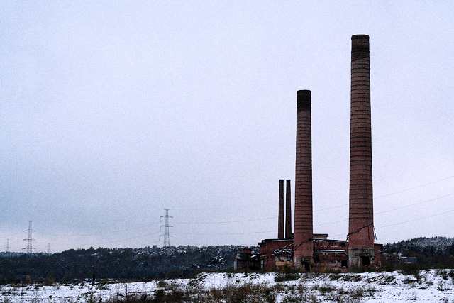
I get lots of pictures like this when people ask me to comment on their 4.8-5.2. Immediately I think this would be better in B&W. The colors here are washed and drab. Get rid of them. Color is there to help a picture, but when it doesn't, we forget that we can take it away. When you go to B&W, the picture becomes more about shapes, patterns, and textures.
If you use photoshop, open the picture and hit ctrl-1 to show the red channel. This is a good approximation of a nice B&W coversion for this picture. I also adjusted the levels a bit (20/1.3/255) to bring out the midtones more and give things more definition. Finally I added some unsharp mask which brings out the detail. I bet those 3 things would have added .2-.4 to your score.
Your composition is nice with the uncentered image. If you could use advanced editing I would have cloned out the power line towers as they detract. As it is in basic, you can't, but perhaps it was possible to shoot from a different vantage to keep them out? The powerlines, to me, give the picture a bit of a "snapshot" feel. (I'm not blaming you for them, just saying what they do to the picture.) |