| Image |
Comment |
| 03/02/2006 02:52:06 PM |
Rock Run Millby LN13Comment: In voting I gave this a 6 which I see as my vote for a solid picture, but not an exceptional one. Often it is merely the subject that keeps from the 8-10 scores. I do like your subject here and the leading lines it provides. The duotone is well done and appropriate for the picture giving it a nostalgic feel. The focus could be a bit sharper; this is likely your using the 50mm at f/1.8. I love that lens, but it does soften quite a bit at 1.8. I usually see if I can get away with at least f/2.5 on that one. If you could use a tripod, I would have gone with f8 on this as there isn't really any part of the picture that would be enhanced by a shallow DOF. If you couldn't use one, I would have upped to ISO 200 or 400 and then upped the aperture. I see you were already at 1/50th.
I wouldn't be too disappointed with the score. 5.2 seems mediocre, but it isn't really. I think perhaps the subject, while I liked it, ultimately didn't "do it" for enough people. There isn't "wow" to it, which DPC seems to love. Keep it up! I think this picture shows you can easily do solid work. |
 Photographer found comment helpful. Photographer found comment helpful. |
| 03/01/2006 10:20:45 PM |
|
| Photographer found comment helpful. |
| 03/01/2006 10:19:57 PM |
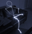
Lightmare by AlbireoComment: My ribbon pick. The only question, will it finish above or below mine? :) Both an excellent light drawing, but has a secondary element which makes the picture more. My only 10 for the challenge. |
| Photographer found comment helpful. |
| 03/01/2006 10:19:14 PM |
Lightmanby ksymeonComment: Should make Top 10. Creative and excellently orchestrated with the light. The rest of the picture is fairly plain, but the effect is likely enough. 9 |
| Photographer found comment helpful. |
| 03/01/2006 07:22:40 PM |
|
| Photographer found comment helpful. |
| 03/01/2006 07:21:48 PM |
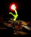
Soulby glodaComment: What's up with the pricetag on the pot? Doesn't give me a lot of confidence there was a lot of time spent on this shot. The pattern, however, is nice so that saves it. 5. I may bump it later. EDIT: It took me 5 more pictures, but I think I finally "got" this picture. The plant was ignored by its owner and thus has died...subtle. Bumping to a 7. |
| Photographer found comment helpful. |
| 03/01/2006 07:20:28 PM |
|
| Photographer found comment helpful. |
| 03/01/2006 07:16:03 PM |
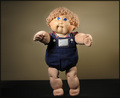
The 80's Crazeby ChinabunComment: There were way to many shots that just relied on the nostalgia of a piece of 80's paraphenalia. I'm afraid this is one of them. The doll is perfectly centered and mostly just put on display rather than doing anything. The background is fairly blase. The lighting of the doll, however, isn't bad at all. To improve this picture, you need to add dynamics through a more interesting pose, crop and background. I gave it a 5 in voting. |
| Photographer found comment helpful. |
| 03/01/2006 07:12:16 PM |
untitledby bluenovaComment: I gave this a 6. A different time of day may have helped as the sky is fairly blown (not totally). The little castle is an interesting subject, but the rest of the picture is nondescript. The sky, as mentioned, adds little and the reflection is fairly ordinary. I would have kept the crop if the water were very smooth (because that is more unusual), but with this quality, I would have cropped more into the castle, possibly with a landscape crop rather than a portrait one. Finally, after having taken care of they sky, I would have boosted contrast (but you can't do it in this picture because the sky would totally blow). |
| Photographer found comment helpful. |
| 03/01/2006 07:08:25 PM |
Harry The Egg Manby hotpastaComment: Is it just me or is there distortion to the picture? Were you shooting at 10mm? The worst seems to be in the upper right which is also where our subject's face is. It makes the picture fairly soft as well. The lighting on the subject is well done and the contrast is probably the best you could do with the large black patch and the large bright patch in the background. If they weren't there, I would have tried to bump the contrast even more for the foreground and subject. Photojournalism doesn't always fly on this site, so I wouldn't be too disapointed. |
| Photographer found comment helpful. |
Home -
Challenges -
Community -
League -
Photos -
Cameras -
Lenses -
Learn -
Help -
Terms of Use -
Privacy -
Top ^
DPChallenge, and website content and design, Copyright © 2001-2026 Challenging Technologies, LLC.
All digital photo copyrights belong to the photographers and may not be used without permission.
Current Server Time: 06/19/2026 10:32:12 AM EDT.