| Author | Thread |
|
|
03/01/2006 07:12:16 PM |
|
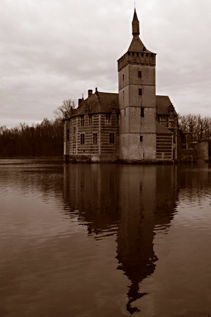
I gave this a 6. A different time of day may have helped as the sky is fairly blown (not totally). The little castle is an interesting subject, but the rest of the picture is nondescript. The sky, as mentioned, adds little and the reflection is fairly ordinary. I would have kept the crop if the water were very smooth (because that is more unusual), but with this quality, I would have cropped more into the castle, possibly with a landscape crop rather than a portrait one. Finally, after having taken care of they sky, I would have boosted contrast (but you can't do it in this picture because the sky would totally blow). |
|
 Photographer found comment helpful. Photographer found comment helpful. |
|
|
03/01/2006 03:34:06 PM |
I hope you see my comment as constructive and helpful in your pursuit to improve your photos ;)
My first impression of this image is that it definitely has the age old feel of medieval castles that you see in old photos. The reflections are a great touch and definitely gets the most bang for your money with this shot. What hurts this image IMHO is the fact that you broke one of the major rules of photography. You situated your horizon line smack in the middle of the composition. There are time when this "breaking the rule" technique works but it doesn't for this image. I believe the crop is too tight on top. If the building was situated more on the right to give ample space on the left for trees I think this would look well balanced.
Keep on practicing but most improtantly have fun! This is a great image!
Cheers,
Rikki |
|
| Photographer found comment helpful. |
|
|
03/01/2006 12:15:05 PM |
Thank you for your detailed critique on my firefighter photo. It's good to hear what this community is really looking for and to get the photo "picked apart" if you will in a respectful way. It really helps me to zoom in on what others see & or look for in the photographs. Many times I get negative feedback without any helpful tips or suggestions. I'm certainly not new to photography, but new to digital, and Photo Shop, so I am interested in helpful critiques and suggestions. That particular photo was taken during an actual Fire I Academy Class, and I didn't have a whole lot of control over the lighting & just tried to capture the action as it unfolded. I thought even with the strong backlighting there was enough light on the subject but your comment made me look at it with a more critical eye. Anyway, sorry for rambling on, I just wanted to thank you for your time & effort.
I like your photo, I thought it could have had a bit more contrast, but the photo itself is nicely composed and presented. I'm new to the duotone settings in PS, some of the photos in the challenge amazed me though so I am now playing around a bit more with some old photos. Perhaps next time I'll do better. :) Thanks again for your input. Dottie |
|
| Photographer found comment helpful. |
|
|
03/01/2006 10:50:39 AM |
|
Thanks for the comments. I took the picture using the Sepia function on the camera as I was worried about meeting the challenge in post-processing. I realised later that the contrast setting on black and white was set very low which I think hurt the image a lot. It's a real shame, cause I liked it a lot. |
|
|
|
03/01/2006 09:28:57 AM |
|
I liked this one too. All I can think of is that it's a bit dark... Might have worked better in a full color challenge. Or a challenge with less than 600 entries :) |
|
| Photographer found comment helpful. |
|
|
03/01/2006 08:57:20 AM |
|
This got a 5.3??? what's up with voters lately? This image clearly deserved a better score - its a lovely image. |
|
| Photographer found comment helpful. |
Comments Made During the Challenge  |
|
|
02/28/2006 10:53:09 PM |
|
What is it that shows in the water reflection that doesn't show at the top of the tower? Sepia tones work well for this shot. good composition. |
|
| Photographer found comment helpful. |
|
|
02/25/2006 09:44:39 PM |
|
Simple and beautiful. Actually, kind of haunting really. |
|
| Photographer found comment helpful. |
|
|
02/24/2006 09:08:04 AM |
|
Great composition with nice use of reflection. |
|
| Photographer found comment helpful. |
|
|
02/23/2006 08:36:37 AM |
|
building looks too dark against the sky... the bright sky overpowers the shot, IMHO |
|
| Photographer found comment helpful. |
|
|
02/23/2006 05:56:01 AM |
|
yes, this works for me... |
|
| Photographer found comment helpful. |
|
|
02/22/2006 10:19:23 PM |
|
nice shot, good composition, sepia works... I dont have any suggestion... good job |
|
| Photographer found comment helpful. |
|
|
02/22/2006 10:31:22 AM |
|
Good reflection. I think I want a little more contrast - bring out the clouds a bit more. |
|
| Photographer found comment helpful. |
Home -
Challenges -
Community -
League -
Photos -
Cameras -
Lenses -
Learn -
Help -
Terms of Use -
Privacy -
Top ^
DPChallenge, and website content and design, Copyright © 2001-2026 Challenging Technologies, LLC.
All digital photo copyrights belong to the photographers and may not be used without permission.
Current Server Time: 06/27/2026 11:46:32 PM EDT.