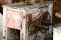
DPChallenge: A Digital Photography Contest You are not logged in. (log in or register
 
Browse Settings
Currently viewing:
Registered UserDrAchoo

Show comments:

Per page:

Order:

Comments:


Comments Made by DrAchoo
Pages:   ... [247] [248] [249] [250] [251] [252] [253] ... [408]
Showing 2491 - 2500 of ~4080
Image Comment
The Blue Line
04/27/2006 04:17:19 PM
The Blue Line
by Rae-Ann

Comment:
I've been through 180 shots and there is no way this isn't Top 5 of what I've seen. It's too bad 80% of the shots are blue because it diminishes the stripe a bit. But still an awesome shot. I want this in the Top 10!
Photographer found comment helpful.
British Museum
04/27/2006 04:12:33 PM
British Museum
by luloma

Comment:
would have been a great shot if it were sharper.
Garden Dweller
04/27/2006 04:10:53 PM
Garden Dweller
by willagher

Comment:
This looks like sherpet's shot.
ye olde geary thingy
04/26/2006 07:48:01 PM
ye olde geary thingy
by Jaded_Housewife

Comment:
Last minute entries can be dangerous, eh?

Actually I think there is some promise to the picture overall. But, yes, it does need some work.

1) It's soft. I didn't see which lens you were using, but we needed to either a) put it on a tripod if you were handholding at 1/60 or b) increase DOF (which would probably mean you needed a tripod anyway). You can see the gear in the front is sharper than the gear in back. Either way, they are both soft.
2) The interesting parts, the gears, are dark while the more boring part (the front) is light. Could we have moved or manipulated the object or the lighting to reverse this?
3) I would have cropped even tighter to remove the object on the right. Although some might complain, I may even cut off a small part of the big gear. That may lead to a my dynamic picture.
4) Many times in pictures that lack strong colors, changing to B&W is helpful. The picture then becomes one of texture, shape and pattern. You probably need to increase contrast too, although as is the front will blow out even more so you'd have to fix the lighting first.
Photographer found comment helpful.
Old Light
04/26/2006 07:40:18 PM
Old Light
by iamkmaniam

Comment:
The good:
1) The composition uses the rule of thirds nicely.
2) The lighting does create texture and interesting shadow

To be worked on:
1) The subject doesn't capture us at all. We look at it a second and then move on. You don't even have to add a new subject, but just more interest. An example would be the same shot, but you were lucky and had a creeping ivy vine crawling up the wall. It would give us more to digest.
2) While the lighting does create texture, it's a bit dark as well. More light and then more contrast would be beneficial.
Just Can't Make It
04/26/2006 05:58:19 PM
Just Can't Make It
by livitup

Comment:
A few things, although I like the picture and idea overall.
1) The composition is so centered. Boring. You know better than that.
2) The building is awesome, but is just a bit dark. We lose the great detail of all the wood planks.
3) I think you did a good job on the sky, but to be honest, the tone in the middle is my least favorite color of sky. It looks like faded slides to me. That's just a nitpick though. I think you did well with the sky.

It's mainly the centered composition which got you here, I think.
Photographer found comment helpful.
Waiting Forever
04/26/2006 05:52:55 PM
Waiting Forever
by Neuferland

Comment:
Hmm, I think you got a bit underrated here. Your technicals are well done. I especially like the well demarcated shadow against the mausoleum. Perhaps people didn't know this was a graveyard (I thought it was a museum at first look). Not that that should matter. One thing I don't quite like is the quadtone. It looks purple to me and I'm not sure what purple adds to the picture.

It also lacks just a bit of that "wow" factor. That's can be judged by the # of 8-10 votes. Still, I would have easily given this a 6 if not a 7. 5.3 is low in my opinion.
Photographer found comment helpful.
The Glow
04/26/2006 05:17:33 PM
The Glow
by Wayne1492

Comment:
Wow, monitor calibration is probably hammering you. I can only see the image at a sideways look on the monitor.
Other Plains
04/26/2006 05:06:53 PM
Other Plains
by Kivet

Comment:
Boy this one is tough, I can't even tell what it is. It looks like a cloudy forest, but if it is, I don't think it's a negative.
Photographer found comment helpful.
Windmill of the Souls
04/26/2006 05:04:04 PM
Windmill of the Souls
by Beetle

Comment:
How come I'm not in this picture?
Photographer found comment helpful.
Pages:   ... [247] [248] [249] [250] [251] [252] [253] ... [408]
Showing 2491 - 2500 of ~4080


Home - Challenges - Community - League - Photos - Cameras - Lenses - Learn - Help - Terms of Use - Privacy - Top ^
DPChallenge, and website content and design, Copyright © 2001-2025 Challenging Technologies, LLC.
All digital photo copyrights belong to the photographers and may not be used without permission.
Current Server Time: 09/11/2025 06:53:56 PM EDT.