| Image |
Comment |
| 10/11/2006 12:22:12 PM |
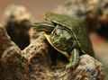
Climbing to the Topby theSajComment: I gave this shot a 6 which indicates a solid shot.
The technicals: Focus and DOF are great. The sharpest focus is on his eyes, which is perfect. Composition is excellent. The lighting has a few issues with some reflections (not too big a deal though). The worst is on the rock in the lower right. You might have burned that down.
The feel: I do like the texture and detail of the turtle. We may lack a little "wow" here, but I think it's a nice intimate shot of an interesting animal.
The game: Your technicals were rewarded by only having 20 4- scores. The lack of 8-10 scores probably signified the "wow" factor... |
 Photographer found comment helpful. Photographer found comment helpful. |
| 10/11/2006 12:17:11 PM |
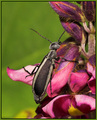
The Climbby ShaneBlakeComment: Technicals: great composition, sharp focus, good lighting. It may be a tad oversharp. I'd have to goof with it myself. The velvety look of the flowers and bug may be a product of that.
The feel: An interesting looking bug, however, a very "snapshot" sort of pose. The truly good bug macros will have a story to tell more than "bug climbing flower".
The game: 6+ shots are great. I think you did well with this one. I didn't get to it in voting but would have likely given it a 7. Did anybody bust on you about the green border? |
| Photographer found comment helpful. |
| 10/11/2006 12:10:54 PM |
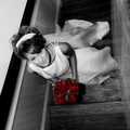
Roses are Red.....by jrtoddComment: I gave this a 7 which indicates more than a solid shot. 7-10 pictures, to me, are very good pictures. With that in mind, I'm not going to have too much to say because I like it.
The technicals: well done all around. Scores of 6+ don't have flaws with technicals very often.
The feel: The square crop works and I like the interesting perspective. Perhaps people reacted to that a bit in a negative way just because it's a little disorienting? I personally like selective desat. Not everybody does. I think you did well. If there is a problem with the technique, people usually keep the colors super saturated when they really want to desat them a bit.
The game: I'm not sure what to recommend to get this higher than the score you got. A border? I think a small, conservative border can actually help most shots. |
| Photographer found comment helpful. |
| 10/11/2006 12:17:27 AM |
|
| Photographer found comment helpful. |
| 10/11/2006 12:12:33 AM |
|
| Photographer found comment helpful. |
| 10/11/2006 12:11:59 AM |
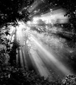
Morning Lightby ArtifactsComment: Great one steve! Not quite the 7.0 you were hoping for, but Top 5 and an awesome shot. I love voluminous light. |
| Photographer found comment helpful. |
| 10/10/2006 01:29:16 PM |
Your son!by JudiComment: Awww, isn't this too sweet for a Judi? I gave it a 6, which is my score for a solid shot.
Technicals: Excellent focus, great lighting (are the PJ's maybe a bit on the bright side? not a biggie though). Composition is intimate. The conversion to B&W is reasonable. Perhaps a bit on the low-contrast side, but that might be what is called for considering the subject.
The feel: Captures a nice moment, although it would obviously mean more to those who know the subjects. In this regard it is perhaps a bit of a cliche shot for those with no emotional involvement.
The game: You know what you are doing Judi. It's a solid shot and one I bet daddy will treasure, but for DPC lacks "wow" and all that jazz... |
| Photographer found comment helpful. |
| 10/10/2006 11:32:15 AM |
Mutsby MajankaComment: Technicals: good focus and composition. The shot is, in general, overexposed. You may have been able to rescue it with a lowering of midtones in PS.
The feel: I like the square crop and the closed in composition. The primarily diagonal lines also add to a feel of dynamics. This is the strength of the shot. The selective desat isn't bad and I tend to like the technique, but you always need to ask what the purpose is. I think the blue of your eyes works to draw us to them, but the green of the hat? I'm neutral about it.
The game: I think you got a bit hosed on votes. This is a better shot than the score. The overexposure, to me, is the most obvious weakness. |
| Photographer found comment helpful. |
| 10/09/2006 07:46:28 PM |
The Re-Emergence of a Giantby tryals15Comment: I gave this a 6 which indicates a solid picture.
The technicals: Perhaps a bit soft and/or a bit dark on the building. I might have tried to bump midtones. Perhaps it's a victim of the B&W conversion. The picture doesn't have too much pop from this point of view. Composition is the strong point.
The feel: A nice contrast between the sun and the building, but lacks punch after this.
The game: I did recognize this as the superdome, but someone who wouldn't might wonder what the shot was all about. You worried about it being too "american". I agree in the sense that those outside America, and many within, wouldn't know what you are shooting and understand the context. |
| Photographer found comment helpful. |
| 10/09/2006 07:42:12 PM |
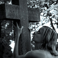
Stayby hannekeComment: Technicals: Your focus and DOF are appropriate. A dark picture, but that's what we're going for. The bokeh, I fear, is really weird with the donut look. There's probably not much you can do about that.
The feel: Gutsy. I like it. Instantly conveys the emotion you want. I do wonder about the bare shoulder. Why? It gives us the impression the model is nude and that just seems incongruous with the emotional pain she is experiencing.
The game: Pure DPC Underground. 5.4 is a good score for that right? |
| Photographer found comment helpful. |
Home -
Challenges -
Community -
League -
Photos -
Cameras -
Lenses -
Learn -
Help -
Terms of Use -
Privacy -
Top ^
DPChallenge, and website content and design, Copyright © 2001-2026 Challenging Technologies, LLC.
All digital photo copyrights belong to the photographers and may not be used without permission.
Current Server Time: 06/18/2026 10:40:19 PM EDT.