| Image |
Comment |
| 02/13/2007 01:56:19 AM |
|
 Photographer found comment helpful. Photographer found comment helpful. |
| 02/12/2007 02:59:18 PM |
The DPChallenge Votes Start Rolling Inby GreetmirComment: The technicals: The processing is well done. I do think you did a good job with the image grain. Lighting is nice as the high contrast helps the grainy feel. (it's probably a product of the processing as much as the original lighting).
The feel: Creative expression, but much to "stylized" for me. It's obvious it's a posed look. Without the title, what would we have? A charicature. That probably hurt you with a number of voters, but helped greatly with a few.
The game: Image grain is a tough sell here (although personally I love it). This shot was meant to speak to a few, not the mass audience. |
| Photographer found comment helpful. |
| 02/12/2007 02:55:19 PM |
On the fenceby alexjackComment: The technicals: Focus is sharp for the subject. DOF is clearly there. The lighting is quite flat and the composition, while nicely off-set, is not too dynamic. This is a shot I would quickly think about B&W because the colors do not add much to the picture. Personally, I like color which provides "pop" or adds meaning, or B&W. Drab, in-between colors generally let a picture down.
The feel: What is the purpose of the picture? What feeling are you trying to capture? I'm not sure I'm picking up much. If you wanted a sorta nostalgia feel, you could have considered sepia to help you out. Could you have removed that thing hanging from the one antler? It ruins the mood a bit too.
The game: Fits Shallow DOF well, but the picture does not stand on its own. The voters supported your clear shallow DOF and the framing, but did not reward you for content or "wow". |
| Photographer found comment helpful. |
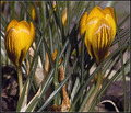
| 02/12/2007 02:50:57 PM |
Shy Melissa in her Sunday Hatby KelliComment: The technicals: I've entered shots at 60% quality before and they didn't look like this at all. Did you use Neat Image? This has that over-NI'd look to me. The lighting isn't bad, but also not dramatic. You do see some highlighting on the top leaf of cabbage. Composition is centered and static.
The feel: It took me a while to see the face in this shot. The shot does "feel" shy somewhat.
The game: Personification. It was a minefield. People were all over with their interpretations. I can tell you I gave you a 2, but that was purely because I didn't see the face until this time around. Had I revoted, however, it would have been a 4-5. Mainly the NI look kills the shot. You didn't mention the processing, but if you used Neat Image, that's your culprit. |
| Photographer found comment helpful. |
| 02/08/2007 06:42:03 PM |
Smaller Than Grassby Bruce_the_RobertComment: Technicals: Not bad focus. 70-300 lenses are typically pretty soft. The lighting is poor and borders on harsh, which probably limited the amount of contrast you could add in processing.
The feel: When I do a shot like this, I like to control everything. You have all the time in the world. Look at the canvas. I would have removed the detrius in the middle (with tweezers if needed). I may have also raised the lens to put the flowers a little lower on the canvas. (that depends on what was then introduced into the scene). Balance between two pictures is nice, but here, I think it is actually too balanced. Working with other angles or crops would have been interesting.
The game: I think the lighting hurt you the most on this picture. |
| Photographer found comment helpful. |
| 02/08/2007 06:36:37 PM |
What do you mean that snow was yellow?by scotthadlComment: The technicals: Lighting is harsh, which is usual for a brightly lit snow day. Composition isn't too bad.
The feel: although you capture a decent DOF, I'm not sure what the background people are adding to the shot. In fact, they serve as a distraction to pull our eye away from the subject. The usual purpose of a shallow DOF is to make the subject stand out. The people work counter to this.
The game: I think the picture is a victim of the lighting and the "snapshot" feel. The background is to blame for this. |
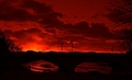
| 02/08/2007 06:33:11 PM |
10th Street Bridge at Sunsetby CitadelComment: The technicals: the focus is soft. That's my first impression. I do like the sillouette. I much prefer strong sillouette to a little detail. The red works as a hyper-reality shot.
The feel: composition is a bit off. I'm not sure about the bushes on the left. The tree on the right isn't bad, but I may have cropped that as well. The car doesn't serve much purpose and contributes to a "snapshot" feel.
The game: DPC loves sharp. This feels soft. |
| Photographer found comment helpful. |
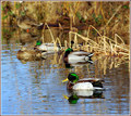
| 02/08/2007 03:43:18 PM |
Mallardsby optionComment: The technicals: I think well done. Focus is sharp on the subject, lighting is active and dynamic. Colors are nice. DOF is probably on the deep end for what we were trying to get here. I do like the "flow" of the ducks up to the corner although the orange leg annoys me a bit. I probably would have desated it a bit.
The feel: Duck shots. What are you going to do? The successful duck shots I've seen have been on the minimalistic line. One problem is that the shot is so familiar. Not that that is always bad, sometimes capturing a daily scene is excellent, but here I'm not sure what is being said or accomplished in the picture. I get no direction or feel to it other than a picture of a duck.
The score: the difference between this being a 5.3 and a 6.3 lies in "wow" and probably in the DOF. I agree, it isn't quite shallow enough. |
| Photographer found comment helpful. |
| 02/08/2007 03:37:56 PM |
Down By The Riverby SaraRComment: The technicals: I like the composition of the two geese. The balance each other well while maintaining interest with asymmetry. The lighting is flat which doesn't lead to a very dynamic feel.
The feel: the DOF is a good idea, but not necessarily with the clutter of the background. This picture would have been much stronger without the black railing or the boats(?).
The score: I think you did fairly well for the shot. The limiting factor is the flat light and the background. You did the best you could for the situation, but there may not have been a 6+ picture available to take. |
| Photographer found comment helpful. |
| 02/08/2007 02:04:40 PM |
Grayby pamelasueComment: The technicals: Hmm, we could go a few ways here. The gutsy way is to lowers the contrast on the picture on purpose to juxtapose with the name "Gray". If you did that, I would have almost overdone it to make the intent obvious. Otherwise, I would have added more contrast to the picture. You are in the middle. My guess is that it involves your conversion technique to B&W. Have you learned how to do it with the channel mixer? This is probably one of the best methods and is far superior to "convert to grayscale".
The feel: this is a nicely composed shot. I like the quiet feel of the picture. The only possible improvement would be to shoot at a different time to try to get some detail from the sky. It's either completely blown or was a completely overcast day.
The game: I bet a bit more processing on the shot would have taken this from the 5.3 range to the 5.7-5.8 range. |
| Photographer found comment helpful. |
Home -
Challenges -
Community -
League -
Photos -
Cameras -
Lenses -
Learn -
Help -
Terms of Use -
Privacy -
Top ^
DPChallenge, and website content and design, Copyright © 2001-2026 Challenging Technologies, LLC.
All digital photo copyrights belong to the photographers and may not be used without permission.
Current Server Time: 06/11/2026 07:02:50 PM EDT.