| Image |
Comment |
| 09/01/2006 03:00:24 PM |
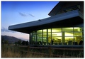
Glowby justin_hewlettComment: Some thoughts:
- I like the lighting here!! The title is very fitting.
- Pretty sky
- In my opinion, the composition would be stronger if you were to frame it without the weeds on the bottom and get the top of the building in the shot.
- Nice border
- Score: 5 |
 Photographer found comment helpful. Photographer found comment helpful. |
| 09/01/2006 02:58:38 PM |
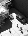
Curious...by taterbugComment: Thoughts:
- I like the black and white
- Great work on the contrast
- Nice composition, for the most part! I would however crop off whatever is in the bottom right corner.
- The subject matter is somewhat dull.
-Score: 5 |
| Photographer found comment helpful. |
| 09/01/2006 02:57:11 PM |
My Two Sons ---- As the Sun Setsby Dirt_DiverComment: Some thoughts:
-Very cute, I like the pose.
-Colors are very pretty, I love the pink.
-Could use a tad bit more contrast on the silhouettes.
-Straighten the horizon, as it is very tilted.
-Clone out the people in the background.
- Score: 5 |
| Photographer found comment helpful. |
| 09/01/2006 01:10:53 AM |
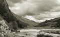
glen nevisby alpharichComment: neat clouds and i like the composition, however, nothing in the shot reallly grabs my attention. 6 |
| Photographer found comment helpful. |
| 09/01/2006 01:10:18 AM |
Abandonedby esaintpiComment: simplicity at it's very best. simply perfect that is :) 10 |
| 09/01/2006 01:09:49 AM |
Twilight Joyby rameviComment: cool!! i like te splash of the water!! greats sunset too... im jelous, the clouds and fog have been rolling in just before sunset at the beach every night lately... so theres not much of a sunset to be seen. this is gret though! nice colors. 7 |
| Photographer found comment helpful. |
| 09/01/2006 01:08:27 AM |
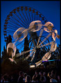
The Amusement Parkby rjksteschComment: super duper cool!! i love the nightime blue in the sky. and the long exposure on the ride is uber cool. great work 8 |
| Photographer found comment helpful. |
| 09/01/2006 01:07:38 AM |
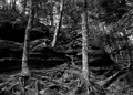
Whispering Woodsby ShutterPugComment: wow, those roots are cool!! nice choice of black and white and I like the contrast. all in all though, there is nothing really in this image that captures my attention. 5 |
| Photographer found comment helpful. |
| 09/01/2006 01:06:50 AM |
The Guardianby rasdubComment: cool black and white. the depth and field and the sharpness are quite stunning. nice border and title too :) :) 7 |
| Photographer found comment helpful. |
| 09/01/2006 01:04:58 AM |
moodswingby ErinMComment: Hey Erin! I am really really taken by this image. I think that it is absolutely beautiful. I tried out some different post processing techniques on it, I hope you don't mind. Please let me know if you would like me to unpost them.
  Message edited by author 2006-09-01 01:05:24. Message edited by author 2006-09-01 01:05:24. |
| Photographer found comment helpful. |
Home -
Challenges -
Community -
League -
Photos -
Cameras -
Lenses -
Learn -
Help -
Terms of Use -
Privacy -
Top ^
DPChallenge, and website content and design, Copyright © 2001-2026 Challenging Technologies, LLC.
All digital photo copyrights belong to the photographers and may not be used without permission.
Current Server Time: 06/25/2026 02:13:35 PM EDT.