|
|
|
Showing 4221 - 4230 of ~4957 |
| Image |
Comment |
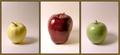
| 11/14/2005 05:26:20 PM | Picks of the Seasonby GentleSoulComment: 4 - Nice and 'soft', coloring and 'focus'. Criticism; whilst I think the frame color suits the background colors I am not sure it suits the subjects. Overall, while nice and 'clean', this lacks 'something' in my opinion, maybe just a richer coloring or uniform crop, may have made it better, not sure. |  Photographer found comment helpful. Photographer found comment helpful. |
| 11/14/2005 05:19:07 PM | |
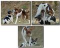
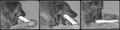
| 11/14/2005 05:12:33 PM | Dog 1, Pup 0by mksnowhiteComment: 7 - Very good. Another good use of the triptych to show a 'range'. Criticism; undecided on the framing/placement choice, it works but, if possible, depending what you had to work with, the bottom one full width, may have balanced this out better, or rather reduced the 'dead space' there. I do like the bottom shot though, good capture - as is on all. Good colors and contrast control. Just a touch more contrast in the bottom one as is with the top two, would also have made this better in my opinion. |
| 11/14/2005 04:58:52 PM | Pineconesby ElaineComment: 6 - Nice. Criticism; seems a little 'hazy', but could be something lost in the resize, not sure, so a little more vivid in color, if possible, contrast dependent, may have made this better in my opinion. Nice and 'simple'. Also may have worked well at 640x640, if possible. | | Photographer found comment helpful. |
| 11/14/2005 04:52:03 PM | Physalisby mrmorrisComment: 4 - Like the potential but, criticism; would have packed more punch in color I think, especially at this size, but I understand the concept you were going for. | | Photographer found comment helpful. |
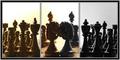
| 11/14/2005 04:50:44 PM | Mine.....All.....Mineby notbiscuitComment: 3 - Good concept. Criticism; the perspective/angle does not reach the potential I see in these shots. Perhaps getting closer (might mean slowly), or in front, could have captured more 'feel' for this 'story'. The toning doesn't work very well here, especially at this size and the focus doesn't seem sharp enough, but perhaps you lost some in the resize. | | Photographer found comment helpful. |
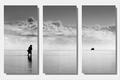
| 11/14/2005 04:39:38 PM | Another day in Paradiseby JeanComment: 7 - Very nice, and simple, works well. Criticism; not sure, just seems it needs a little 'lift' somewhere, not sure how or where, be it colors/toning, outer frame, don't know. Of course, it may just be the small size/restrictions, which I have taken into consideration. | | Photographer found comment helpful. |
| 11/14/2005 04:37:26 PM | The Weddingby NekoNitaComment: 6 - Good concept, well done if this is original. All nice shots. Criticism; like to see more detail in at least one frame, obviously preferably the center one, but perhaps you lost a lot in the resize. 1 & 3 do not seem to be cropped uniformly, which may be intentional, but in my opinion, would have looked better if they were, and it were 'balanced' better. | | Photographer found comment helpful. |
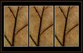
| 11/14/2005 04:34:12 PM | Natureby aussieComment: 4 - Colors and framing are nice. Criticism; needs some variation, in some way, in my opinion, although I realize you may have been going for this 'effect/look'. |
| 11/14/2005 04:29:24 PM | The Artistby annahComment: 5 - Good concept, nice bold colors. Criticism; maybe a little too saturated, or it could be that the black frame enhances the colors more so perhaps a different color choice of framing, not sure. Not sure on the thinner middle frame, maybe more 'fore space' in all and more vertical, who knows. | | Photographer found comment helpful. |
|
Showing 4221 - 4230 of ~4957 |
Home -
Challenges -
Community -
League -
Photos -
Cameras -
Lenses -
Learn -
Help -
Terms of Use -
Privacy -
Top ^
DPChallenge, and website content and design, Copyright © 2001-2026 Challenging Technologies, LLC.
All digital photo copyrights belong to the photographers and may not be used without permission.
Current Server Time: 07/21/2026 05:16:15 PM EDT.
|