| Author | Thread |
Comments Made During the Challenge  |
|
|
11/18/2005 01:09:42 PM |
|
 Photographer found comment helpful. Photographer found comment helpful. |
|
|
11/18/2005 04:15:30 AM |
|
Technically excellent I find the overall impression to have too little contrast for my taste. |
|
| Photographer found comment helpful. |
|
|
11/17/2005 10:29:10 AM |
|
| Photographer found comment helpful. |
|
|
11/15/2005 07:20:40 PM |
|
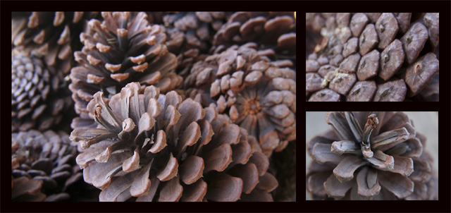
I like the layout you've chosen but I think I'd prefer the top righthand photo to be more different from the larger photo than it is. Those two photos also seem to be a bit out of focus. |
|
| Photographer found comment helpful. |
|
|
11/14/2005 04:58:52 PM |
|
6 - Nice. Criticism; seems a little 'hazy', but could be something lost in the resize, not sure, so a little more vivid in color, if possible, contrast dependent, may have made this better in my opinion. Nice and 'simple'. Also may have worked well at 640x640, if possible. |
|
| Photographer found comment helpful. |
|
|
11/14/2005 04:31:53 PM |
|
Colors seem a little flat, but otherwise good job. |
|
| Photographer found comment helpful. |
|
|
11/14/2005 03:10:53 PM |
|
Nice sharp photos, but not the most interesting subject. |
|
| Photographer found comment helpful. |
|
|
11/14/2005 07:49:31 AM |
|
I love the nice winter feel to this. |
|
| Photographer found comment helpful. |
|
|
11/14/2005 12:50:13 AM |
|
To me there is a little bit too much of the same in this triptych. The upper right image is too similar to the left side image. Maybe choosing a different color tones for each image would have helped to differentiate them? I like your choice of subject. |
|
| Photographer found comment helpful. |
Home -
Challenges -
Community -
League -
Photos -
Cameras -
Lenses -
Learn -
Help -
Terms of Use -
Privacy -
Top ^
DPChallenge, and website content and design, Copyright © 2001-2026 Challenging Technologies, LLC.
All digital photo copyrights belong to the photographers and may not be used without permission.
Current Server Time: 06/29/2026 08:01:37 AM EDT.