|
|
|
Showing 4211 - 4220 of ~4957 |
| Image |
Comment |
| 11/14/2005 07:58:34 PM | Passage of timeby burtctComment: 5 - Nice. Good coloring. Criticism; difficult at this size, but to see more detail in all would be good, but I realize it is not easy. Would perhaps like to see the center shot with a similar 'bokeh' background, giving more 'flow' and balance, but perhaps you were going for the difference with the center shot, not sure. |  Photographer found comment helpful. Photographer found comment helpful. |
| 11/14/2005 07:22:32 PM | Once Upon A Birdby YoungerComment: 6 - Nice. Good title. Criticism; not sure on the outer 'padding', does give a 3d type of effect but not sure it complements the 'light and delicate' nature of the 'set'. Middle shot not sure on, especially cropping, size and loss of color and detail - again though, likely looks quite different 'wall size'. Colors overall are nice, but would like to see all a little 'richer'. Similar detail in #3 as in #1 would also make this a better triptych in my opinion. | | Photographer found comment helpful. |
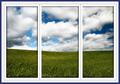
| 11/14/2005 06:52:46 PM | Through the windowby Travis99Comment: 7 - Nice, simple, good 3d effect, good colors and good 'window illusion'. Criticism; not much, seems to be a minor 'flaw' top right on the semi-transparent blue inner frame. Perhaps the '3d effect' (inner shadow) applied more uniformly may have given even more impact, not sure, but does seem you applied it to the first panel 'entirely' but not 2 & 3. Good detail in the grass and sky, even at this size. Nice balance and good 'flow'. | | Photographer found comment helpful. |
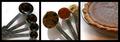
| 11/14/2005 06:49:00 PM | Making of a Pumpkin Pieby DeniseBernadetteComment: 6 - Good idea and execution. Criticism; definitely at least 640 width, enabling 'larger squares' would have made this even better. Coloring is good, good detail (even at this size) in the spices and the pie. Maybe not so tightly cropped on the right in the center frame, #2. Framing works. Nice and 'neat'. | | Photographer found comment helpful. |
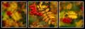
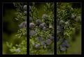
| 11/14/2005 06:46:00 PM | The Tree of Scarlet Berriesby strangeghostComment: 7 - Very nice. Criticism; not much, unsure on the inner white frame, but it does work. Like the effect with the two 'side panels' being blurred/softened/out of focus. Good coloring. Difficult at this size, but perhaps more definition, especially on the berries, in the center shot, may have made this better in my opinion. Good overall balance. | | Photographer found comment helpful. |
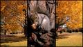
| 11/14/2005 06:20:01 PM | Autumnby canyoncatComment: 6 - Good, and unusual. Criticism; difficult, as much as I like that middle shot (and a great capture and focus), it needs 'something', not sure, maybe (and I know the size restrictions etc) the middle one 'wider' and the two side ones narrower, or cropped differently or different perspective, not sure. Like it, just, seems too disproportionate, or 'unbalanced', somehow. |
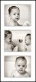
| 11/14/2005 06:08:27 PM | Rub a Dub Dubby jenesisComment: 4 - Good 'personal' triptych. Criticism; not much as, as I said, it is a personal one, I am sure would look very good on one of the walls in your home. Good capturing of the children, toning, cropping and choice of frames. | | Photographer found comment helpful. |
| 11/14/2005 06:06:30 PM | windy city riverby parrotheadComment: 5 - Good. Make a good postcard. Criticism; difficult, as so much detail is lost this small, bet it looks great 'wall size'. Perhaps a slight straightening of the sign in 2, not sure, might just be the angle. It is in a sense a 'personal' type shot or as I said, postcard/commercial like. | | Photographer found comment helpful. |
| 11/14/2005 05:59:28 PM | U3by ArtanComment: 4 - Good potential. Good contrast control. Criticism; perhaps either a 'zooming' in 'series' may have worked better (if this is the same 'ewe'), or else just different 'poses' - balancing it out, or creating more of a 'flow' effect, may have made this better in my opinion. | | Photographer found comment helpful. |
| 11/14/2005 05:40:02 PM | Window to Blueby SandyPComment: 6 - Very nice, focus and coloring are very good. Criticism; whilst no 'expert' in triptychs, to me, this would be better if the cuts/crops flowed 'smoothly' from panel to panel, either by a realignment or by a 'deletion' of that space - if that makes sense. In my opinion, this is one of the 'single split photos' that the separation/panelling/framing via triptych, has worked well and enhances the shot. | | Photographer found comment helpful. |
|
Showing 4211 - 4220 of ~4957 |
Home -
Challenges -
Community -
League -
Photos -
Cameras -
Lenses -
Learn -
Help -
Terms of Use -
Privacy -
Top ^
DPChallenge, and website content and design, Copyright © 2001-2026 Challenging Technologies, LLC.
All digital photo copyrights belong to the photographers and may not be used without permission.
Current Server Time: 07/22/2026 06:25:25 AM EDT.
|