| Author | Thread |
|
|
11/26/2005 04:45:25 PM |
Hello from the Critique Club!
I have studied your image and have the following to offer:
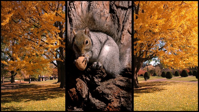
Composition/perspective – the perspective in the two outside panels is very nice. It appears as though you split one image down the middle. If not, good job in lining them up as the branches on both sides appear at the same heights. But I like the split image concept better as the perspective from front to back is identical in both shots. The center panel, while an excellent shot, just seems a little close/large for the distant perspective shown in the outside panels. This takes away from the feeling that the squirrel is part of the same tree. Perhaps if it was cropped so the squirrel wasn’t so much in the center it would help. The focus and clarity of the three panels is very good. The balance of negative space to subject space is well done.
Color – very nice balance between the gold’s and yellows of the two outside panels and the browns and grays of the center panel. Sets up a very nice contrast and division between the panels and allows for a smooth flow between them. Especially the darker left to lighter right concept.
Lighting – all areas of this image make excellent use of natural light. Good camera exposure control has allowed the light to work to advantage in this scene. The center panel, area just to the left of the nut, seems a little too dark and some detail is lost. However, the lighter side of the nut helps to keep this from becoming a real distraction.
Challenge requirements – a true triptych image. This meets the requirements nicely. I can even get a story of sorts from it as the onset of autumn signals the squirrel to fatten up. I wonder where he got the walnut though…
Overall/my opinion –an excellent composition overall. I would like to see the squirrel placed higher in the panel, but in the triptych being centered works, especially since it is the center panel. It almost becomes busy on the right with all the shrubs, the strength of the tree draws you away from that though. Well done!
|
|
Comments Made During the Challenge  |
|
|
11/18/2005 05:25:14 PM |
|
|
|
11/17/2005 05:46:22 PM |
|
Great squirrel shot. The color of the tree is great too. Good luck. |
|
|
|
11/17/2005 10:10:16 AM |
|
|
|
11/17/2005 03:46:20 AM |
|
That's a really good picture of the squirrell, but the tones in the squirrell picture don't really go with the tones in two side pcitures. You have three good pictures, but IMHO they don't really complement each other. |
|
|
|
11/16/2005 08:43:43 PM |
|
|
|
11/15/2005 11:56:30 PM |
|
Nice pic. I love the squirrel in the middle, how he's holding the nut. I can't help but think of the new Charlie and the Chocolate Factory movie :-) |
|
|
|
11/15/2005 11:04:42 PM |
|
Nice how the left and right images mimic each other. Nice clear image of the squirrel too!!! 8 |
|
|
|
11/15/2005 09:43:25 PM |
|
hmmm, it's a nice idea, and I love the fall foilage part, but the squirrel, while a nice picture on its own, seems too incongruous to make a nice flow between all panels. 6 |
|
|
|
11/15/2005 09:02:40 PM |
|
i like it...the autumn leaf colors grab your eyes, and the extending branches draw your eyes back to the subject |
|
|
|
11/15/2005 01:14:49 PM |
|
Nice pictures on their own. Not sure the the close up in the center works. A transition picture may have helped with the overall flow. |
|
|
|
11/15/2005 12:18:44 PM |
|
very cool capture. i like how the tree is surrounding the squirell. it's almost like it envelopes the little guy. |
|
|
|
11/15/2005 12:15:59 PM |
|
I might have substituted the first image for another but I really like the other two & the theme is perfect. 7 |
|
|
|
11/15/2005 10:06:25 AM |
|
Wow...not sure what else to say...wow seems to do it. |
|
|
|
11/15/2005 09:07:53 AM |
|
I like the way you positioned the panels. Makes you feel like you are zooming into the center of the tree to see the squirrel. Good Luck! 10 |
|
|
|
11/14/2005 06:31:00 PM |
|
Very nice idea, as though you have zoomed into the tree to see the squirrel |
|
|
|
11/14/2005 06:20:01 PM |
|
6 - Good, and unusual. Criticism; difficult, as much as I like that middle shot (and a great capture and focus), it needs 'something', not sure, maybe (and I know the size restrictions etc) the middle one 'wider' and the two side ones narrower, or cropped differently or different perspective, not sure. Like it, just, seems too disproportionate, or 'unbalanced', somehow. |
|
|
|
11/14/2005 03:07:56 PM |
|
This is a good example of how the three pictures compliment each other wonderfully. Good good idea...and well execued |
|
|
|
11/14/2005 10:35:45 AM |
|
nice composition, looks a bit too sharpened tho. |
|
|
|
11/14/2005 04:42:21 AM |
|
Excellent work, really "pops". |
|
Home -
Challenges -
Community -
League -
Photos -
Cameras -
Lenses -
Learn -
Help -
Terms of Use -
Privacy -
Top ^
DPChallenge, and website content and design, Copyright © 2001-2026 Challenging Technologies, LLC.
All digital photo copyrights belong to the photographers and may not be used without permission.
Current Server Time: 06/27/2026 02:09:36 AM EDT.