|
|
|
Showing 4191 - 4200 of ~4957 |
| Image |
Comment |
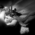
| 11/19/2005 09:37:17 PM | perfecting her craftby hopperComment: 8 - Like this, especially for this Challenge, a good capture and concept. Criticism; difficult as this will always be 'a sewing shot', but perhaps slightly sharper on the foot/needle etc, and fabric possibly too. The toning I like but wonder if a variation may have boosted this, not sure. Maybe a slightly different crop, especially with this toning, mainly at the top may have also made this better in my opinion, but not sure as I do like the 'easing out' of the focus around the edges. |  Photographer found comment helpful. Photographer found comment helpful. |
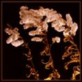
| 11/19/2005 09:33:57 PM | Autumn Puffsby paul58Comment: 8 - Like the choice of subject and composition, good use of lighting. Criticism; having said that, I think that perhaps some more space to the left and a slightly more 'dramatic' (stronger?) lighting bottom right, may have made this better in my opinion, but not sure. Some more discernable 'texture', or detail, in the seed heads(?) also may have made this better, but difficult I imagine with the one light source, unless it was stronger lighting, but then llikely blow out issues in the stems so, who knows. | | Photographer found comment helpful. |
| 11/19/2005 09:30:38 PM | 'loyal'by suemackComment: 5 - Apologies in advance if I am wrong, but this looks a lot like a fellow(?) I have in my Favorites named Bailey - 'windows of the soul', suemack (not a photographer guessing game but the style is so alike), and that makes me want to mark this higher, mainly for the 'affiliation' of Bailey and his(?) character who/which is so photogenic, in my opinion. However, for this Challenge, "Use a single, artificial light source to dramatically light the subject of your choice.", I just don't think you have done this to its (his/yours) full potential. Perhaps I am comparing this shot to the other too much, but trying not to. Just would like to have seen some more 'darkness' around the edges perhaps, mostly in an attempt to 'create a more dramatic effect'. Also, I find the little 'light' in his(?) eye detracts from this shot, although only slightly. Some more detail (although I think perhaps you were going for this 'soft' look) in some of his fur, or the eye, may have made this better too, in my opinion. Hope all this makes sense and I haven't offended/disappointed you. Like the title - obviously apt. edit:typo & ha & apologies to Bailey, who I now know is a 'she' Message edited by author 2005-11-23 01:12:46. | | Photographer found comment helpful. |
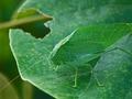
| 11/17/2005 09:25:15 PM | katydid katydid itby echo54Comment: 8 - Excellent meet of the Challenge. Good colors. Criticism; difficult, as the detail is very good and would get 'lost' with a different crop likely, but would like to have seen the inclusion of the antennae (the one that has been cropped and the one that is out of focus), but a very difficult shot to get I imagine. Also the 'rear' too included would have probably made this even better in my opinion. Good capture in a seemingly natural environment. | | Photographer found comment helpful. |
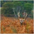
| 11/17/2005 09:22:58 PM | Trees for Antlersby AlexSaberiComment: 8 - Excellent colors and capture. Criticism; maybe just a fraction less of the fore 'blur', even though it does add to the shot, not sure. Perhaps more crop off the top too, making the stag(?) 'feature' more, don't know. Good with the limbs/trunks/branches in the background behind it's antlers, very good meet of the Challenge. | | Photographer found comment helpful. |
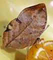
| 11/17/2005 09:18:47 PM | Beleaf it or notby BeetleComment: 8 - I belief it. I also belief you may have set this up (obviously with the orange), so well done. Excellent meet of the Challenge, even without a background to blend into/illustrate the camouflage. Criticism; not much, like to see it even 'crisper', but imagine that is very difficult. Colors are nice, maybe a different colored plate(?) may have enhanced this even more, not sure. | | Photographer found comment helpful. |
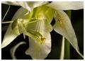
| 11/17/2005 09:16:55 PM | I See You...by davidus428Comment: 8 - Very good, and two for one meet of the Challenge. Criticism; very difficult given the composition and inclusion of the two 'characters', but maybe a slightly different cropping. Would like to say different angle, but I am sure this was an opportune capture as is. Definition is good on both but would like to have seen perhaps a touch more as well as more vivid (especially in the green) colors, again though, difficult with the resulting contrast issues I imagine, as well as retaining definition in both 'characters' at once, in a macro. | | Photographer found comment helpful. |
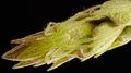
| 11/17/2005 09:13:19 PM | Leaf me alone by BrennanOBComment: 8 - Good meet of Challenge. Very nice colors. Criticism; different composition if possible, either sharper angle (face more at the fore), or the inclusion of the entire body, depending what you had to work with, may have made this even better in my opinion. Difficult with such a small snake though. | | Photographer found comment helpful. |
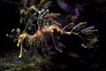
| 11/17/2005 09:11:59 PM | Natures Disguise by DefyTimeComment: 8 - Very nice capture. Nice colors. Criticism; like to see the colors even bolder if possible, but difficult with aquarium shots. Even more definition too on the seahorse, but again, difficult. Even though you haven't captured the seahorse close to a rock etc, to really emphasize the camouflage, this still works with the background, but I think had it been 'closer' to a rock/coral etc, would have made this even better, especially for the Challenge. | | Photographer found comment helpful. |
| 11/17/2005 09:09:34 PM | Waiting by wsteynComment: 8 - Very good meet of the Challenge. Good colors/contrast control, while retaining definition in the hairs, etc. Criticism; despite that contrast comment, seems a little 'blown' (or whatever the correct term is, ie bottom right of 'leaves' and 'in between' the spider's eyes) in some areas but difficult to control this I imagine, however this looks like a studio set up (apologies if wrong) so maybe the use of 'cards/boxes' whatever, may have helped, not sure, don't have enough knowledge to suggest anything there. | | Photographer found comment helpful. |
|
Showing 4191 - 4200 of ~4957 |
Home -
Challenges -
Community -
League -
Photos -
Cameras -
Lenses -
Learn -
Help -
Terms of Use -
Privacy -
Top ^
DPChallenge, and website content and design, Copyright © 2001-2026 Challenging Technologies, LLC.
All digital photo copyrights belong to the photographers and may not be used without permission.
Current Server Time: 07/22/2026 01:18:50 PM EDT.
|