|
|
|
Showing 4171 - 4180 of ~4957 |
| Image |
Comment |
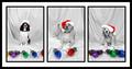
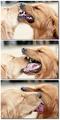
| 11/20/2005 06:34:34 AM | Happy Howlidaysby nsoroma79Comment: 4 - The one in the middle's tail and tongue are causing problems. Good selective desaturation(s). Even though the 'restrictions', still think that if the dogs were 'closer'/larger and also the frame (white) slightly narrower, make this even better in my opinion, even with the crazy tongue and tail in the middle. |
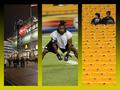
| 11/20/2005 06:27:43 AM | Pre-Gameby alanfreedComment: 7 - Good use of triptych to show a 'story' and 'feel'. Criticism; the green/yellow tint to the frame detracts in my opinion, perhaps a little darker would have looked better/enhanced the shots, especially the 3rd, more. Cropping half the flag in the first is 'not good', the perspectives and crops for 2/3 I think work well. Good coloring(s) in all, and all complement each other and there is good 'flow', not just with the color from frame to frame. Up to 7 from 6, I really like the concept and - well done if the idea is original. I just wish... that flag were not 'chopped'. |  Photographer found comment helpful. Photographer found comment helpful. |
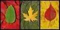
| 11/20/2005 06:22:57 AM | Autumnby ShaneBlakeComment: 6 - Nice. Good coloring. Criticism; not much, not sure on the 'base' choice of leaf for the middle shot/#2, doesn't seem to 'fit in' with the others, color yes but the shape/type no, in my opinion. More definition in the 'top' leaves especially, would also have made this better in my opinion. Up to 6 from 5. | | Photographer found comment helpful. |
| 11/20/2005 06:20:41 AM | Crossing The Lawby JudiComment: 6 - Good idea and potential. Criticism; not much, just more attention to minor details such as; straightening of the hat in 1, imbalance via over brightness of shirt in 3, perhaps the cuffs with a different and sharper angle (such as you have with the hat) in 3, may have made this a better 'series' in my opinion. If the 'officer' is holding open a cell door, to be able to better identify that, somehow, would also make this better in my opinion, although I do like the 'silhouette' type of effect in that shot. Up to 6 from 5.edit:typo Message edited by author 2005-11-21 00:46:07. | | Photographer found comment helpful. |
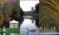
| 11/20/2005 06:17:30 AM | Fountains Abbey - A World Heritage Siteby p2jvrComment: 7 - Very nice. Criticism; the title is slightly forced and unnecessarily wordy. All nice shots, especially 2/3. 2 would like to have seen more definition 'somewhere', preferably in the swan. Colors and balance in 1/3 are nice, 2 choice/arrangement works, but not sure it 'flows' with 1/3 as well as it could. To really nit-pick, get every single pixel you can, especially for this style. Up to 7 from 6. | | Photographer found comment helpful. |
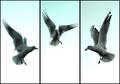
| 11/20/2005 06:11:51 AM | Aerial Balletby RiponladyComment: 7 - Good. Nice colors and tones, good 'balance'. Criticism; not much, and difficult with the size restrictions, perhaps a little more space 'below' each (depending what you had of course), may have given this a different edge, not sure. Good captures and seemingly good contrast control. Up to 7 from 6. | | Photographer found comment helpful. |
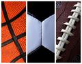
| 11/20/2005 06:08:03 AM | Let's Play Some Ballby Marc923Comment: 6 - Very good concept. Criticism; the 'artificial surfaces' are so well defined that they are the first thing I noticed in the texture detail, especially in #3. Texture is good, but doesn't have as much character/'feel' as different quality (leather) balls would have had. Color choice and arrangement is good. #2 is not perfectly centered, which would have been better in my opinion, but perhaps you were going for 'off center'. Like the diagonals on 1 & 3. The white frame works, but I wonder if perhaps even thin inner frames as well may have given more depth here. | | Photographer found comment helpful. |
| 11/20/2005 06:04:50 AM | Devotionby sajinComment: 8 - Oh. Great. Criticism; not much, maybe slightly richer colors but difficult adjusting contrast I imagine on the cats. To really nit-pick, perhaps trying to get each shot more 'uniform' composition / colors, making a perfect 'set', if that makes sense, the green in the background, the rock the cub has it's head on (which you have just about identical in the last two frames). Perhaps (depending what you had to work with), the inclusion of the cub's paw to the left too, may also have made this an even better triptych. Be very good 'wall size'. Very nice and good balance, flow and 'story'. Too easy with a shot(s) like this/these. | | Photographer found comment helpful. |
| 11/20/2005 12:27:17 AM | Friends Not Foesby lynnesiteComment: 8 - Oh very good. Very good shots each. Criticism; colors on the white lab/retriever seem just slightly 'out', but difficult I am sure with these combinations. Very good use of triptych to display the three 'catches', and the 'story' for which your title is very good. Of course bigger - but you know that. I wonder if horizontally may have 'helped', but not sure. Also not sure on the 'shadow framing', or even on the choice of white as the background color, works, but I wonder if another color may have helped this be even better. Up to 8 from 7. | | Photographer found comment helpful. |
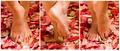
| 11/19/2005 10:26:59 PM | Piedi Nudiby rscorpComment: 6 - Like the concept, nice colors. Criticism; to really nit-pick, the marks (veins/creases) in the feet detract, especially from the seemingly 'soft' feel. Perhaps a little more space around, especially at the fore, of the feet, may also have made this better in my opinion. | | Photographer found comment helpful. |
|
Showing 4171 - 4180 of ~4957 |
Home -
Challenges -
Community -
League -
Photos -
Cameras -
Lenses -
Learn -
Help -
Terms of Use -
Privacy -
Top ^
DPChallenge, and website content and design, Copyright © 2001-2026 Challenging Technologies, LLC.
All digital photo copyrights belong to the photographers and may not be used without permission.
Current Server Time: 07/22/2026 06:24:48 AM EDT.
|