| Author | Thread |
|
|
11/24/2005 07:52:11 AM |
|
 Photographer found comment helpful. Photographer found comment helpful. |
Comments Made During the Challenge  |
|
|
11/20/2005 10:18:59 PM |
|
I wasn't allowed to vote, but if I could, you'd get a 10!! AND a blue ribbon for sure!! |
|
| Photographer found comment helpful. |
|
|
11/20/2005 06:08:03 AM |
|
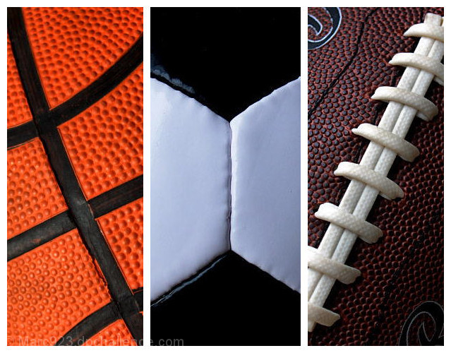
6 - Very good concept. Criticism; the 'artificial surfaces' are so well defined that they are the first thing I noticed in the texture detail, especially in #3. Texture is good, but doesn't have as much character/'feel' as different quality (leather) balls would have had. Color choice and arrangement is good. #2 is not perfectly centered, which would have been better in my opinion, but perhaps you were going for 'off center'. Like the diagonals on 1 & 3. The white frame works, but I wonder if perhaps even thin inner frames as well may have given more depth here. |
|
| Photographer found comment helpful. |
|
|
11/18/2005 01:01:14 PM |
|
great different interpretation and shots |
|
| Photographer found comment helpful. |
|
|
11/18/2005 10:18:07 AM |
|
Great detail, nice even lighting. I like the consistency it has between the 3 images, tying them together, and the way you made the angles symmetrical for the main lines in the balls. |
|
| Photographer found comment helpful. |
|
|
11/18/2005 05:33:30 AM |
|
| Photographer found comment helpful. |
|
|
11/17/2005 11:36:54 PM |
|
Those balls are too clean - they need some use. LOL Good use of close up while clearly portraying the theme. |
|
| Photographer found comment helpful. |
|
|
11/17/2005 12:34:16 PM |
|
Neat idea, I like how you used the soccer ball for sepeartion. Good luck. |
|
| Photographer found comment helpful. |
|
|
11/16/2005 11:33:02 PM |
|
| Photographer found comment helpful. |
|
|
11/16/2005 11:15:12 PM |
|
Nice lighting on a classic poster. 8 |
|
| Photographer found comment helpful. |
|
|
11/16/2005 07:37:46 PM |
|
| Photographer found comment helpful. |
|
|
11/16/2005 02:03:33 PM |
|
| Photographer found comment helpful. |
|
|
11/15/2005 10:35:18 PM |
|
great color and cropping. the details and textures really pop. |
|
| Photographer found comment helpful. |
|
|
11/15/2005 09:44:06 PM |
|
Love this! Great shots, great color, great layout. Excellent. |
|
| Photographer found comment helpful. |
|
|
11/15/2005 08:13:49 PM |
|
i love it, good idea and well done. 7 |
|
| Photographer found comment helpful. |
|
|
11/15/2005 06:18:49 PM |
|
Perfect. Nothing more to say. 10 |
|
| Photographer found comment helpful. |
|
|
11/15/2005 12:08:33 PM |
|
perfect for the challenge & excellent lighting too |
|
| Photographer found comment helpful. |
|
|
11/15/2005 05:00:08 AM |
|
Wonderful sharpness and clarity. |
|
| Photographer found comment helpful. |
|
|
11/15/2005 02:58:11 AM |
|
Nice photos and well composed. |
|
| Photographer found comment helpful. |
|
|
11/14/2005 10:34:42 PM |
|
Great focus and colors. Nice job. |
|
| Photographer found comment helpful. |
|
|
11/14/2005 10:02:55 PM |
|
| Photographer found comment helpful. |
|
|
11/14/2005 06:29:58 PM |
|
For some reason, not sure why, the basket ball does not seem as nice of a shot as the other two, maybe because it has more light shining off of it. But a very nice shot. |
|
| Photographer found comment helpful. |
|
|
11/14/2005 12:57:12 PM |
|
This photo is very appealing. It gets a 9 from me and is my 3rd place finisher :) The only thing that took away from this image for me, is the basketball's lighting is much more flat than the soccer ball or the football. The lighting may be the same on the basketball and the soccer ball, but the black hexagons on the soccer ball give it more shape. The top of third of the basketball seems like it might be a bit soft. BUT........I am nitpicking here. I really do love the image. |
|
| Photographer found comment helpful. |
|
|
11/14/2005 10:41:33 AM |
I see 'V' for victory in this composition. Though it goes against the grain of a traditional triptych I feel that it works quite well.
What might improve it though is to make the black on the basketball the same as the black on the soccer ball and the white laces on the football the same as the white on the soccer ball. This, to me, would increase the transition from one image to the next. |
|
| Photographer found comment helpful. |
|
|
11/14/2005 10:07:19 AM |
|
Maybe not the most interesting shot in the challenge but technically it's really well done. The exposure and focus are perfect, and the lighting is good, especially on the football. |
|
| Photographer found comment helpful. |
|
|
11/14/2005 06:08:37 AM |
|
This works.. at least for me. Nice color and balance in the three images. 8. |
|
| Photographer found comment helpful. |
|
|
11/14/2005 02:36:08 AM |
|
Excellent! So sharp, and the colors are so vivid. Looks like a poster. :) |
|
| Photographer found comment helpful. |
|
|
11/14/2005 12:58:01 AM |
|
Great vivid close ups. Clever and imaginative take on the challenge. |
|
| Photographer found comment helpful. |
Home -
Challenges -
Community -
League -
Photos -
Cameras -
Lenses -
Learn -
Help -
Terms of Use -
Privacy -
Top ^
DPChallenge, and website content and design, Copyright © 2001-2026 Challenging Technologies, LLC.
All digital photo copyrights belong to the photographers and may not be used without permission.
Current Server Time: 06/29/2026 04:53:14 PM EDT.