|
|
|
Showing 4161 - 4170 of ~4957 |
| Image |
Comment |
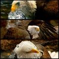
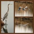
| 11/20/2005 10:17:41 PM | Bird of Prey by CutterComment: 8 - All very good shots, nice simple colors. Criticism; the obvious is losing so much detail with the size restrictions, but cannot be helped and I think you have still managed to show good detail with each in this size. The first shot I am not sure is a good choice (your call obviously) as the 'starter', mainly for the eyelid closed, looks a little 'odd', great shot, but that's the first thing I saw was the 'clouded eye'. So even at 'wall-size' I think this triptych, which would look impressive big, loses some impact with that first shot, in my opinion. Dependent how many other shots you got; a. perhaps a different choice for 1st, or just a different arrangement and b. hope you got another one, especially with the water, saved for the Free Study. The detail in the water in 1 & 3 is very good. Up to 7 from 6, these are great shots in a seemingly natural environment, but that eyelid still 'irks' me slightly in the first one. Up to 8, really like this & the eye is adding an 'unusual' element to this making it more unique. |  Photographer found comment helpful. Photographer found comment helpful. |
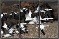
| 11/20/2005 10:14:32 PM | Morning Flyoutby jemisonComment: 5 - Good shot and nice colors. Criticism; 2 & 3 work better with this style than the framing on 1, in my opinion. Not sure on the placement/crop, perhaps with more space on the left in 1, may have balanced this more and been more complementary to a triptych. The frame colors/style works well. Up to 5 from 4, just wish '1' had as much clarity and detail as 2 & 3. | | Photographer found comment helpful. |
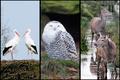
| 11/20/2005 05:06:21 PM | Animals of the Northby puzzledComment: 7 - Like this. All very good shots. Criticism; the only real 'criticism' I have had on this triptych (and I've looked at it a few times now) is there seems to be a lack of 'balance', or flow between the three, or their arrangement. Whether it is the colorings, or the 'compositions', I can't decide, but I keep thinking the 'level' (angle?) on 1 & 2 is fairly uniform, the 3rd doesn't 'suit', maybe if it were in the middle, not sure. There are similar colorings in each shot, but obviously blues/whites dominate in 1/2, but then 3 is different and not just because 3 is not 'birds'. Sorry, hard to put into words, but I tried. | | Photographer found comment helpful. |
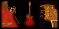
| 11/20/2005 04:56:27 PM | Standing Ovation™by FotoMunkiComment: 7 - Good, nice and 'clean'. Criticism; not much, mainly the red inner thin frame, not sure if perhaps a darker red, or different color may have made this better in my opinion. Maybe just a little more contrast/color. More definition in the detail in 1 & 3 too, but almost impossible I realize at this 'size'. Good 'showcase' via triptych. Up to 7 from 6. | | Photographer found comment helpful. |
| 11/20/2005 04:49:44 PM | heron at homeby coolharComment: 7 - Very good, and good use of 'triptych'. Criticism; not much, really only the frame detracts in my opinion, especially the 'gold' thin frame. Very good shots all, nice coloring and good captures, especially 2 & 3. Up to 7 from 6. | | Photographer found comment helpful. |
| 11/20/2005 04:48:53 PM | For Any Moodby karmatComment: 6 - Good use of triptych to 'showcase'. Criticism; not much, difficult with the size restrictions anyway, but perhaps 'sharper' on all, more 'fore focus' in the lower left shot and slight contrast/lighting(?) adjustment in 3/right shot, may have made this better in my opinion. Good 'commercial' aspect. | | Photographer found comment helpful. |
| 11/20/2005 04:45:23 PM | Courage, Honor, Integrityby dahkotaComment: 6 - Like the concept. Criticism; not sure on the toning/desaturation, especially at this size. I think color would have been better in my opinion, but that's your call. Again, difficult with the size restrictions, but perhaps a little more 'space' to the right in 1 and left in 3, and maybe centering of the Honor Roll, may have made this better in my opinion. | | Photographer found comment helpful. |
| 11/20/2005 04:34:35 PM | The Breakby JohnTFComment: 6 - Like the concept, and while I recall seeing similar shots 'elsewhere' in the past, not sure so if this is original, well done. Criticism; seems to be some gamma/contrast/reduction issues in the reds/oranges. Perhaps a sharper angle, creating a more 'dramatic effect' may have made this better in my opinion. Also, I think more 'movement' in the balls in 1/3 could also have enhanced the effect you have already achieved, but difficult to get this right I imagine. Possibly a different composition, especially in 1 & 3, allowing more balance and visual 'effect', may have also made this better. The light reflection on the balls is detracting/distracting, but could also have been used for added effect, with some 'diffusing', not sure how though. Like the potential here. Frame(s) work well. | | Photographer found comment helpful. |
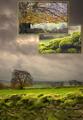
| 11/20/2005 04:29:27 PM | Peak District Triptych by FalcComment: 7 - Very nice. Criticism; very difficult, mostly because of the size limitations, but I imagine this looks quite different 'wall size'. The 'inserts' are a good idea, but I am unsure on the 'gold' framing, especially since it has not been applied to the main 'frame', but unsure, as it does still work. The shot/scene itself is excellent and I like the perspective and composition and use of the wall. Slightly curious if the horizon is slanted, but not overly. Like to see even more detail (again difficult at this size) in the moss on the wall, but then - you have done so with the 'insert', as you have also done with the tree. Unless I am mistaken, both these 'inserts' are cropped out of this one picture, and to retain such good detail, clarity and color in them is very good. Perhaps a slightly different crop of the main frame, losing some of the sky/clouds, may have made this even better, but I realize your 'inserts' placing would change completely then. Maybe 'vertically framed' inserts would have 'balanced' better, not sure. Good, seemingly original, application of the triptych technique. review:unsure on 'classic triptych', but I like this nevertheless. | | Photographer found comment helpful. |
| 11/20/2005 06:35:37 AM | Caught in the Middleby DrAchooComment: 5 - Good, but a 'personal' type shot. Criticism; not much, you did well and I am sure this on your wall will be forever a classic. Again, it is a 'personal' shot though. Fun shots, reminds me of a shampoo/soap/family 'something' ad. Perhaps also in this case, slightly thicker framing may have also given this a little 'extra', not sure. Up to 5 from 4. | | Photographer found comment helpful. |
|
Showing 4161 - 4170 of ~4957 |
Home -
Challenges -
Community -
League -
Photos -
Cameras -
Lenses -
Learn -
Help -
Terms of Use -
Privacy -
Top ^
DPChallenge, and website content and design, Copyright © 2001-2026 Challenging Technologies, LLC.
All digital photo copyrights belong to the photographers and may not be used without permission.
Current Server Time: 07/22/2026 08:05:12 AM EDT.
|