|
|
|
Showing 3791 - 3800 of ~4957 |
| Image |
Comment |
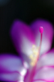
| 12/21/2005 07:49:22 PM | Hallelujah!by The EskimoComment: 3 - Mainly for the potential. Like the concept, good colors. Criticism; if that pistil/stigma were nice and sharp, even if nothing else were in focus, would have made this much better in my opinion. Perhaps a variation in the composition too, with a little more space on the left and a tighter crop on the right, may have also made this better, not sure. |  Photographer found comment helpful. Photographer found comment helpful. |
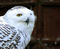
| 12/21/2005 07:46:19 PM | White Owlby pacpintoComment: 5 - Nice capture. Seems good clarity on the eye. Criticism; difficult given this is opportune likely but, a variation here, likely in composition, may have given this something 'extra', not sure what nor how. Seems a wooden fence/door/barn at the rear, perhaps incorporating more of that to allow for more context/contrast (which would also allow more of the DOF to be seen, and, seemingly 'pick up on' the brown coloring in the owl) may have made this even better in my opinion. Seems some slight 'blown' issues on the whites in the feathers, but could be due to lack of sharpness/focus there, plus trying to tweak the contrast/brightness here would be very difficult I imagine. | | Photographer found comment helpful. |
| 12/21/2005 07:42:21 PM | Lilly curvesby beafliesComment: 5 - Unusual. Criticism; your call on the toning obviously, but a lot of detail has been lost in the texture, shape and patterns in my opinion. Also, especially at this size, a little dark. The 'blown' area is slightly detracting but minor and could well have been 'used more', had there been more of an overall balance in the lighting/light areas. I like the concept, just don't think the potential has been reached. |
| 12/21/2005 07:33:56 PM | Wanna Ride?by ShaneBlakeComment: 4 - Good potential. Criticism; either a sharper perspective (more 'level') and/or else inclusion of more of the cars on the side that are out of focus, would likely have made this better in my opinion. Perhaps 'sharpest' on the center car too. Different cropping, especially at the fore, to create more 'impact' may have also helped this. edit:typo Message edited by author 2005-12-28 20:51:10. | | Photographer found comment helpful. |
| 12/21/2005 07:26:46 PM | Arri 12000watt Tunsten Lighting Fixture Scrim Bagby radioninComment: 3 - Looks like good potential, but difficult to discern at this size. Criticism; needs to be 640, in this case height. The textures and colors are what appeal most in this to me, otherwise the subject itself likely doesn't hold much interest, especially compared to others in this Challenge, in my opinion. Again, from what I can discern, looks like fairly good DOF. | | Photographer found comment helpful. |
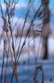
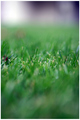
| 12/21/2005 07:22:42 PM | Winter Grassby linda12201Comment: 2 - Good potential. Criticism; 640, in this case height. Perhaps not as tight a crop on the top, dependent of course 'what' is there, would have made this better in my opinion. Nice colors and composition and DOF, as far as I can discern. More detail in the seedheads/textures too, but that may be there at a bigger size so who knows. | | Photographer found comment helpful. |
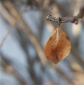
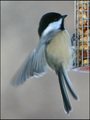
| 12/21/2005 07:20:48 PM | hangin' in thereby fordmanf1Comment: 5 - Nice capture. Criticism; wish it were 640. Looks like fairly good focus, but a slight 'tweaking' to get it sharper would likely make/have made this even better in my opinion. Like the composition, colors, perspective/angle and background. Good DOF. Up to 5 from 4. | | Photographer found comment helpful. |
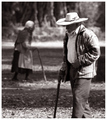
| 12/21/2005 07:19:21 PM | As life goes byby patrinusComment: 4 - Good concept. Criticism; wish it were sharper on the gentleman in the fore, even softer (no idea 'how') on the trees/etc in the very rear. A different crop, or else sharper angle/perspective and inclusion of 'legs/feet', and a slight tweaking of the toning too perhaps, would all have likely made this better in my opinion. | | Photographer found comment helpful. |
| 12/21/2005 07:17:12 PM | I'm hungryby docurrieComment: 5 - Good capture. Criticism; difficult, but sharper, less grainy (quality/camera/lens dependent of course) make this better in my opinion. Opportune though. Perhaps 'zoomed out' more, especially if you were not able to get the quality may have made this better 'as is', and also allowed more of the 'DOF' to come into play/be seen. |
| 12/21/2005 07:14:48 PM | An Ant's Viewby TroyMosleyComment: 5 - Like it. Criticism; wish it were 640, in this case height. Colors are nice, dependending what is there, more inclusion of context (especially of whatever that maroon colored object is) and possibly even more width, may have made this even better in my opinion. Difficult, but also a little sharper on the in focus blades of grass would also have been good. |
|
Showing 3791 - 3800 of ~4957 |
Home -
Challenges -
Community -
League -
Photos -
Cameras -
Lenses -
Learn -
Help -
Terms of Use -
Privacy -
Top ^
DPChallenge, and website content and design, Copyright © 2001-2026 Challenging Technologies, LLC.
All digital photo copyrights belong to the photographers and may not be used without permission.
Current Server Time: 07/26/2026 08:25:14 PM EDT.
|