| Image |
Comment |
| 12/28/2005 11:18:31 PM |
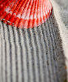
Shell and Sandby aeli2468Comment: 7 - Good idea, nice colors, good pattern. Criticism; perhaps a crop variation or more 'width' may have given this a little extra in my opinion, not sure. |
 Photographer found comment helpful. Photographer found comment helpful. |
| 12/28/2005 11:15:54 PM |
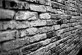
Brickby AzrifelComment: 7 - Nice. Toning is good. Criticism; crop variation, to 'cut' that bottom right 'dark' area would have made this better in my opinion. |
| Photographer found comment helpful. |
| 12/28/2005 11:06:45 PM |
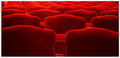
Red Seaby EvanHComment: 4 - Good concept and looks like very good potential. Criticism; needs to be 640 width. Hard to discern at this size, and could be due to resizing issues, but seems some gamma issues, but could be jpeg loss/etc, who knows. Not sure on the frame, again, difficult to 'tell' at this size how it would work larger. A little more attention to symmetry (ie; looks like it needs a nudge rotation up on the right, top/back left seats/chairs, etc), would also have likely made this even better in my opinion. Up to 4 from 3, mainly for the potential and seemingly good and unusual 'pattern capture'. |
| 12/28/2005 10:59:38 PM |
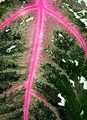
pink channels on leafby striveComment: 7 - Nice colors and 'capture'. Criticism; difficult, but perhaps a slight variation in 'composition'/ cropping and possibly even framing, may have enhanced the pattern more and made this even better in my opinion, not sure. Your 'call' anyway, obviously. Good subject choice. |
| Photographer found comment helpful. |
| 12/28/2005 10:50:45 PM |
|
| Photographer found comment helpful. |
| 12/28/2005 10:49:39 PM |
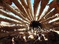
Desert Remainsby synchrorae1Comment: 6 - Interesting. Looks like an unusual perspective, whatever it is. Back PC to see what this is. Criticism; 640 width would have given this a little extra. Depending on opportunity, a slight focus adjustment to try to exclude that branch/whatever in the 'background' on the left, may have enhanced the pattern effect in this shot and given it more impact in my opinion. |
| Photographer found comment helpful. |
| 12/28/2005 10:44:43 PM |
just a weed....by suemackComment: 7 - Very nice. Always like this unusual perspective, especially for flowers. Criticism; very difficult, but would like to see it sharper and, bigger (height, making this more square), but the choice of horizontal is your call, obviously. The frame does not 'enhance' the simplicity nor colors of this shot in my opinion. Like the colors, especially the dappled blue sky with the clouds overhead of the 'bunch'. |
| Photographer found comment helpful. |
| 12/28/2005 10:36:11 PM |
Abstract shadowsby aartiprasadComment: 3 - Looks like good potential. Criticism; frame is too thick in my opinion, especially for here/this size. Size also, if this were 640 width would have helped it. If the focus were a little sharper, even just on one strand/stick/'whatever' and the lighting adjusted (this looks too artificial and has a slight 'tint' to it), would have made this better in my opinion. |
| Photographer found comment helpful. |
| 12/28/2005 10:33:49 PM |
at the frontdoorby visaksenComment: 6 - Good perspective and use of DOF, especially to fit the Challenge well. Criticism; difficult, needs 'something' to 'raise' it in my opinion, no idea what nor how, perhaps adjusting the tone/color, not sure. Maybe more height for added 'pattern effect', but not sure on that either. |
| Photographer found comment helpful. |
| 12/28/2005 10:31:00 PM |
polka dotsby ursulaComment: 8 - Very nice. Criticism; not much, perhaps a crop variation or 'bigger width' may have made this even better, not sure. Toning works well. Good fit for the Challenge. |
| Photographer found comment helpful. |
Home -
Challenges -
Community -
League -
Photos -
Cameras -
Lenses -
Learn -
Help -
Terms of Use -
Privacy -
Top ^
DPChallenge, and website content and design, Copyright © 2001-2026 Challenging Technologies, LLC.
All digital photo copyrights belong to the photographers and may not be used without permission.
Current Server Time: 07/26/2026 07:36:39 AM EDT.