| Image |
Comment |
| 04/26/2006 08:40:09 PM |
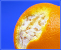
Orangeby ClayaComment: 4 - Meets Challenge, just the blue... seems, too much. Hard to explain. Just my opinion anyway. |
 Photographer found comment helpful. Photographer found comment helpful. |
| 04/26/2006 08:25:41 PM |
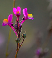
Hueby tmhallingComment: 6 - Nice. A more refined crop and, while difficult, a fraction sharper/more definition, make this better in my opinion. |
| Photographer found comment helpful. |
| 04/26/2006 08:24:45 PM |
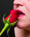
Kiss from a Roseby RobbyComment: 1 - Rose by itself quite nice but overall, this is not holding my attention, nor 'appealing'. |
| Photographer found comment helpful. |
| 04/26/2006 08:23:43 PM |
Bladesby caro_08Comment: 3 - Composition is quite good. A more refined crop, focus a litlte more forward/to the right, make this better in myopinion. Not sure on the frame. |
| Photographer found comment helpful. |
| 04/26/2006 08:22:36 PM |
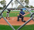
Red Dirt, Green Grass - The Colors of Spring!by EarlBakerComment: 2 - Bit of a stretch. Would like to have seen the color schemes dominate in this shot, rather than the ball play. Looks more orange to me - which would go well with the blue in the distance - but your call. |
| Photographer found comment helpful. |
| 04/26/2006 08:21:20 PM |
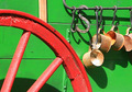
1880s Chuckwagonby BalkoComment: 5 - Quite good and simple. Nice composition. More detail in the textures, 'somewhere', and sharper, make this better in my opinion. |
| 04/26/2006 08:20:38 PM |
Irisby smccComment: 4 - Do like this, however the hue adjustment has turned the yellow/orange to red, as best I can see. The blues/purples have remained blue/teal - so a finer adjustment there would have made this better for this Challenge in my opinion. Like the view/composition, like the teal, not sure on the red. Overall a little soft, but could be intentional. |
| Photographer found comment helpful. |
| 04/26/2006 08:18:56 PM |
1000 mg= wowby yourbuddyjhawkComment: 2 - I'm seeing pink, green and yellow primarily in this shot. Perhaps a 'birds eye' view/angle and adjusting the hue pp to purple more, may have given this extra. No idea on your title, but your call. |
| 04/26/2006 08:16:57 PM |
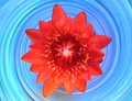
Fire & Iceby shirokkoComment: 4 - Like the concept and angle. Coming across more red than orange, but is bordering, so who knows. More definition 'somewhere' in the flower/sharper, and better control of the reds/oranges, make this better in my opinion. |
| Photographer found comment helpful. |
| 04/26/2006 08:15:39 PM |
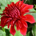
Dahliaby trainComment: 6 - Nice. Would like to have seen green incorporated a little more 'somehow', perhaps a slight variation in the lighting for added depth too, not sure. Also seems a little unbalanced compositionally. |
| Photographer found comment helpful. |
Home -
Challenges -
Community -
League -
Photos -
Cameras -
Lenses -
Learn -
Help -
Terms of Use -
Privacy -
Top ^
DPChallenge, and website content and design, Copyright © 2001-2026 Challenging Technologies, LLC.
All digital photo copyrights belong to the photographers and may not be used without permission.
Current Server Time: 05/15/2026 08:33:03 PM EDT.