| Image |
Comment |
| 04/26/2006 11:00:19 PM |
|
 Photographer found comment helpful. Photographer found comment helpful. |
| 04/26/2006 10:59:30 PM |
Derby Feverby rkligmanComment: 3 - Don't mind the concept, but took a while to work it out. Less green, make this better in my opinion. 'Using' the other purple/yellow spectators more and less black.. not sure. Perhaps just a sharper angle/perspective. |
| Photographer found comment helpful. |
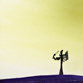
| 04/26/2006 10:57:28 PM |
The Sorcerer's Might.by Dan_CottleComment: 6 - Like this. Obviously a bit of hue adjusting pp, but it works in my opinion. Like to have seen the yellow sky more vivid if possible. No idea what the subject is. Perhaps a variation in composition, especially this size, may have given this a little extra in my opinion. |
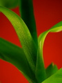
| 04/26/2006 10:54:54 PM |
Lucky Bambooby ilovecars131Comment: 6 - Like this. Nice and simple. Good use of colors. Sharper/more definition in the 'bamboo' and a variation in composition and possibly also framing, may have given this a little extra in my opinion. |
| Photographer found comment helpful. |
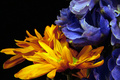
| 04/26/2006 10:53:30 PM |
Spring Lilyby jrtoddComment: 7 - Nice. Like to have seen perhaps a slightly sharper angle, with the focus on at least one of the orange petals - for this Challenge, inmy opinion. Color of the flower looks a little 'odd', but could be pp/hue adjusting. A more finely tuned crop, especially at the bottom as well. Given the coloring this lily, perhaps a more subtle blue background may have complemented and 'enhanced' it more, but your call, obviously. |
| Photographer found comment helpful. |
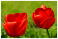
| 04/26/2006 10:50:28 PM |
Tulipsby p2jvrComment: 6 - Nice. A little more fore focus and a more finely tuned crop, make this better in my opinion. |
| Photographer found comment helpful. |
| 04/26/2006 10:50:00 PM |
Pedalsby beermanComment: 3 - Bordering on a bit of red but fairly minor. Like the abstract and the perspective and detail in the peTal. A more finely tuned crop, centering the focal point better somewhere within your composition make this better in my opinion. Frame detracts, again - in my opinion. |
| 04/26/2006 10:48:02 PM |
Reflectingby moniepennyComment: 2 - More 'play' with the colors and a nudge rotate up on the right, make this better in my opinion. Looks like it has some grain/gamma issues as well. Like to see this shot have been all about at least one set of complementary colors primarily. |
| Photographer found comment helpful. |
| 04/26/2006 10:43:43 PM |
Glowing Margaritaby youngnovaComment: 2 - Not holding my attention enough, difficult to comment as this looks totally intentional. Less blue at the bottom, more balanced compositionally, and better use of the color scheme, likely have helped this - but just my opinion. Nudge rotate and cropping the bottom out entirely, make a different shot, but again - this (including colors/style/etc) looks intentional, so your call, obviously. |
| 04/26/2006 10:39:27 PM |
Healthy or Notby ThaiComment: 1 - Meets the Challenge mostly color-wise, but the concept, subjects and focus/quality, not holding my attention. |
| Photographer found comment helpful. |
Home -
Challenges -
Community -
League -
Photos -
Cameras -
Lenses -
Learn -
Help -
Terms of Use -
Privacy -
Top ^
DPChallenge, and website content and design, Copyright © 2001-2026 Challenging Technologies, LLC.
All digital photo copyrights belong to the photographers and may not be used without permission.
Current Server Time: 05/15/2026 11:41:24 PM EDT.