| Image |
Comment |
| 04/27/2006 09:44:38 PM |
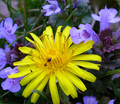
The Lawn Intrudersby dphillipsComment: 7 - Made a comment, but seems it didn't 'stick'. Like this and whilst like to see less green, does get lost because of the dominant yellow in my opinion. A more refined crop make this even better, again, my opinion. Like that the ant has a slight purple 'tint' to it. |
 Photographer found comment helpful. Photographer found comment helpful. |
| 04/27/2006 09:39:51 PM |
*uNTiTLeD*by TheStickComment: 3 - Colors look quite nice, but perhaps a tweaking, especially of the yellow - 'brighter' make this better in my opinion. Overall, not sure on the crop, looks like the top half is missing. Some grain/noise issues on the outer areas of frame. Unless this is a long exposure/something, not quite sure how you achieved this effect. |
| Photographer found comment helpful. |
| 04/27/2006 09:38:11 PM |
Where are the stars?by jiribierieComment: 3 - Colors on the building are quite nice, otherwise not holding my attention. Perhaps a tighter crop, not sure. |
| 04/27/2006 09:37:24 PM |
Victory !by ReM_FrComment: 3 - Don't mind the concept, but think more clarity/better focus make this better in my opinion. Colors are good. Bigger also, quality dependent, may have also helped. |
| Photographer found comment helpful. |
| 04/27/2006 09:34:46 PM |
A large dash of Lemonby front_elementComment: 4 - Like the yellow, but the skin looks a bit 'odd', but could just be distorted under the water. Colors go quite well together. Otherwise, just not holding my attention enough. Perhaps a variation in angle, not sure. Also, looks like some gamma issues in the dark areas up the top, or could be some type of reflection, who knows. |
| Photographer found comment helpful. |
| 04/27/2006 09:32:52 PM |
Balanceby trnqltyComment: 4 - Detail in the fabrics and the color choice is nice. Otherwise just not holding my attention enough. |
| Photographer found comment helpful. |
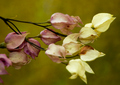
| 04/27/2006 09:32:27 PM |
Spent Beautyby NodeComment: 5 - Like this. Like to have seen the colors tweaked - almost two 'schemes' here in my opinion. Like to have seen one or the other 'stronger'. |
| Photographer found comment helpful. |
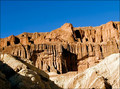
| 04/27/2006 09:31:38 PM |
Canyon Wallby 2mccsComment: 4 - Like to have seen the orange stronger for the Challenge, so perhaps tweaking in pp and a tighter crop may have made this better, in my opinion. Also looks a little 'tilted', but could just be the perspective. |
| Photographer found comment helpful. |
| 04/27/2006 09:30:44 PM |
Complementary coffee breakby imagine74Comment: 4 - Don't mind the close crop, a little more depth/sharper perspective and perhaps a nudge rotate up on the right, make this better in my opinion. I'm seeing more orange than red here as well. |
| Photographer found comment helpful. |
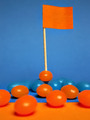
| 04/27/2006 09:29:55 PM |
In the red corner....by Tap10Comment: 4 - A more refined crop and variation in angle/perspective, may have made this better in my opinion. Like to have seen the colors tweaked. Whilst fairly creative, not holding my attention strongly enough. But depends which 'audience' you're catering to/aiming for, obviously. |
| Photographer found comment helpful. |
Home -
Challenges -
Community -
League -
Photos -
Cameras -
Lenses -
Learn -
Help -
Terms of Use -
Privacy -
Top ^
DPChallenge, and website content and design, Copyright © 2001-2026 Challenging Technologies, LLC.
All digital photo copyrights belong to the photographers and may not be used without permission.
Current Server Time: 05/16/2026 09:04:22 AM EDT.