| Author | Thread |
Comments Made During the Challenge  |
|
|
04/30/2006 10:42:11 PM |
|
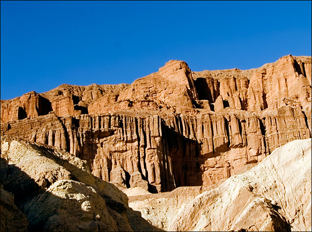
Pretty pic. But on my monitor, the cliffs just don't look yellow. |
|
 Photographer found comment helpful. Photographer found comment helpful. |
|
|
04/30/2006 09:32:44 AM |
|
fits the challenge but overall uninteresting and the title doesnt help make it more itnereting. |
|
| Photographer found comment helpful. |
|
|
04/30/2006 05:51:09 AM |
|
Sorry the orange is just not orange enough for this challenge. |
|
| Photographer found comment helpful. |
|
|
04/29/2006 10:46:16 PM |
|
Shadows are a bit harsh, not much you can do about that though. Still, the large dark area at bottom right is a bit distracting. Perhaps a different crop? |
|
| Photographer found comment helpful. |
|
|
04/29/2006 09:13:50 PM |
|
Not really complimentary colors although I see you were going for orange and blue, the wall dosen't seem orange |
|
| Photographer found comment helpful. |
|
|
04/29/2006 06:01:29 PM |
|
Looks a lot like Red Rock Canyon in CA??? Good blue sky! |
|
| Photographer found comment helpful. |
|
|
04/29/2006 02:40:15 PM |
|
almost orange but i'll give it to you anyway. great shot and i cant argue with the setting you chose ;) good luck! |
|
| Photographer found comment helpful. |
|
|
04/29/2006 10:59:57 AM |
|
| Photographer found comment helpful. |
|
|
04/27/2006 09:31:38 PM |
|
4 - Like to have seen the orange stronger for the Challenge, so perhaps tweaking in pp and a tighter crop may have made this better, in my opinion. Also looks a little 'tilted', but could just be the perspective. |
|
| Photographer found comment helpful. |
|
|
04/26/2006 11:10:47 PM |
|
| Photographer found comment helpful. |
|
|
04/26/2006 07:33:46 PM |
|
Since it's a color study and not a landscape, what if you rotated it so the horizon was on more of a diagonal? i wonder how many people would hate that. . . |
|
| Photographer found comment helpful. |
|
|
04/26/2006 05:45:06 AM |
|
while the place looks inspiring, the photo is not...sorry...your location had the potential to get a great shot, and with a little tweaking, you could have had a winner...but this looks like a holiday snap to me with no real depth or thought...sorry to be tough, but you want the truth right? |
|
| Photographer found comment helpful. |
Home -
Challenges -
Community -
League -
Photos -
Cameras -
Lenses -
Learn -
Help -
Terms of Use -
Privacy -
Top ^
DPChallenge, and website content and design, Copyright © 2001-2026 Challenging Technologies, LLC.
All digital photo copyrights belong to the photographers and may not be used without permission.
Current Server Time: 06/28/2026 06:11:09 PM EDT.