| Image |
Comment |
| 08/19/2006 06:02:32 AM |
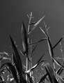
Better Stalk Up, Winter's Comin' Soon...by bs-photosComment: I gave this a 4. Whilst the focus seems good, as well as a good ground up perspective, there wasn't enough overall depth (as in 'feel'), in my opinion. Perhaps a variation in toning may have given this a little extra, not sure. edit:removed 'TN'Message edited by author 2006-08-21 15:23:31. |
 Photographer found comment helpful. Photographer found comment helpful. |
| 08/14/2006 08:30:32 PM |
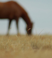
I will Surviveby tuffyComment: 9 - Very nice. The only thing I think may make this even better, is if the grass/seed head were entirely in front of the horse's head - as in totally 'framed' - but.. minor. Perhaps a little sharper too on that said grass, but again minor and - likely there just unable to be appreciated at this size. Lastly, to really 'nit-pick', your title all capitalized too would make this even more professional - in my opinion. |
| Photographer found comment helpful. |
| 08/14/2006 08:20:20 PM |
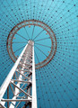
The Pavilionby ChilibeanComment: 7 - Really like this. Your call (obviously), but in this case, I think this may have worked even better 'toned'. |
| Photographer found comment helpful. |
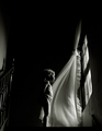
| 08/14/2006 08:18:30 PM |
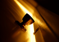
Doorwayby speeding_slowlyComment: 8 - Really like this. Excellent sharp angle/perspective. Toning works very well. Undecided if more detail discernable (sharper focus, as seems to be on the door fixture) in the metal(?) texture on the doorknob/handle may have given this a little extra - but may have changed the 'abstractness', so who knows. |
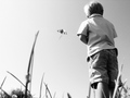
| 08/14/2006 08:16:17 PM |
let's go fly a kiteby mimsydotesComment: 8 - Like the focal point. Nice simple clothing which works well with the tones. Difficult, but just a litle more 'pop'/detail on the kite and possibly (depending what you had to work with of course), a fraction more room at the top of the frame, especially so the top of the child's hair wasn't cropped - but fairly minor. |
| Photographer found comment helpful. |
| 08/14/2006 08:14:46 PM |
Jacob's Ladderby SJCarterComment: 8 - Symmetry seems spot on. Toning works well. Your call (obviously), but wonder whether rotated left may have packed more punch, not sure. |
| Photographer found comment helpful. |
| 08/14/2006 08:12:38 PM |
The Window by bucketComment: 9 - Excellent image. Not much to 'suggest', maybe the staircase railing cropped out, but unlikely - looks near perfect to me. I want to say a whisker of a nudge rotate up on the left - but I think it is just a visual thing. The b&w works so well. Up to 9 from 8. |
| Photographer found comment helpful. |
| 08/14/2006 08:07:47 PM |
|
| Photographer found comment helpful. |
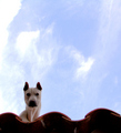
| 08/14/2006 08:07:02 PM |
All dogs go to heaven?by mayonesaComment: 8 - Good angle/perspective. Fairly minor, but in my opinion, this would be even better with a nudge rotate up on the left to get the shingles/tiles 'straight'. The darker areas around the snout and eyes with a little more light, but difficult - and again, fairly minor. |
| Photographer found comment helpful. |
| 08/14/2006 08:03:38 PM |
|
| Photographer found comment helpful. |
Home -
Challenges -
Community -
League -
Photos -
Cameras -
Lenses -
Learn -
Help -
Terms of Use -
Privacy -
Top ^
DPChallenge, and website content and design, Copyright © 2001-2026 Challenging Technologies, LLC.
All digital photo copyrights belong to the photographers and may not be used without permission.
Current Server Time: 06/11/2026 05:40:56 PM EDT.