| Image |
Comment |
| 10/07/2006 06:09:09 AM |
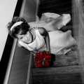
Together aloneby dippydazComment: 6 - Like the concept, including title. Just wish the bottom/fore areas had more color and/or less gamma/grain/something. Sure this size doesn't do this justice, but perhaps for this size, a fraction less width may have given more impact for this medium, who knows. |
 Photographer found comment helpful. Photographer found comment helpful. |
| 10/07/2006 06:04:54 AM |
Longhornby SJCarterComment: 6 - Nice straight on perspective. Looks like good potential. Just the darker areas on the 'longhorn's' right side (image left) resulting in lack of detail and grain, plus the right areas of surface it is on, whilst an interesting element/texture, competing for attention in my opinion. If the quality was there, even with a modified composition, wish this had been 720. Like the use of the shallow dof and the detail discernible is good. Colors are nice. Like the centered composition. Up to 6 from 5. |
| Photographer found comment helpful. |
| 10/07/2006 05:58:37 AM |
Gullby jmritzComment: 8 - Good profile/study of the 'gull'. Nice and clear and simple. To clone or not to clone out the 'fiber' on the beak - but minor, and yes, 'natural'. Frame color choice works well in my opinion, although I do wonder whether a fine line of the 'gold' may have lifted this even more. |
| Photographer found comment helpful. |
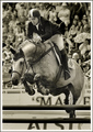
| 10/07/2006 05:47:06 AM |
Spruce Meadows Masterby IvoComment: 8 - Good capture. Like the crowd capture as well. Toning works very well. Just wish there was a bit more definition/contrast 'lifting' and defining the horse/equine and rider more, making them 'jump out the image' - but difficult. |
| Photographer found comment helpful. |
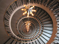
| 10/07/2006 05:28:06 AM |
Round and Roundby levyj413Comment: 7 - Nice. Just wish the chandelier(?) (lights) was 'straight', but perhaps difficult to rotate if this is what you had to work with. Like the depth, including dof. Colors are nice - the coppers tweaked a fraction may have given this a little extra as well, in my opinion. Perhaps also, a little less space on the left, but minor. |
| Photographer found comment helpful. |
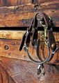
| 10/07/2006 05:19:36 AM |
Spursby PoobaComment: 7 - Nice colors, clarity, details and textures. Just wish the very fore of the spurs, buckles, etc was nice and 'sharp' too. |
| Photographer found comment helpful. |
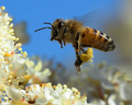
| 10/05/2006 06:26:34 PM |
Busyby owenComment: 6 - Oh - like the detail. Like the composition, colors and close crop. Difficult, but 'even sharper' (including more stop motion) and either the fore flowers and all bee in focus or else 'somehow' just the bee with the flowers a little 'softer' (including contrast), if that makes sense. Maybe a fraction more height compositionally at the top, not sure. |
| Photographer found comment helpful. |
| 10/05/2006 06:18:08 PM |
Roses are Red.....by jrtoddComment: 5 - Like the concept. Lighting is nice. The perspective though, in my opinion, is distracting. Perhaps a rotate 90 degrees right, not sure - which might 'lift' the facial expression a little too. The curtain(?) on the right takes a little to decipher as there is not enough of it yet it is visible, so perhaps including more, not sure, but again, could just be this angle/perspective. The desaturation/toning works well, however the roses more subtle in color and processing, make this even better in my opinion. |
| Photographer found comment helpful. |
| 10/05/2006 06:07:07 PM |
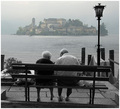
Mirageby LevTComment: 8 - Good photograph. Some nice character elements, a few distracting ones, like the selective desat, but do wonder (if the clothing color suited) whether leaving the couple in color as well, may have made this even better, but your call - obviously. Judging by your title, perhaps you wanted the island to dominate/visually offset. |
| 10/05/2006 04:20:32 PM |
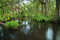
Lazy Loxahatchee Riverby yakatmeComment: 7 - Nice image. Wish it were 720 - sure this size doesn't do this justice. Probably looks very good wall sized. Like the composition. A slight tweaking of the 'ranges' might have given this a little more depth/drama and even more of an edge, but perhaps difficult with likely resulting pp issues. Good detail and dof. |
| Photographer found comment helpful. |
Home -
Challenges -
Community -
League -
Photos -
Cameras -
Lenses -
Learn -
Help -
Terms of Use -
Privacy -
Top ^
DPChallenge, and website content and design, Copyright © 2001-2026 Challenging Technologies, LLC.
All digital photo copyrights belong to the photographers and may not be used without permission.
Current Server Time: 06/11/2026 05:13:42 AM EDT.