|
|
|
Showing 181 - 190 of ~4957 |
| Image |
Comment |
| 03/13/2010 04:00:16 PM | Quantisation by paynekjComment: 7 - I like the quirkiness, but overall seems a little 'dull', color/tonewise. The perspective seems slightly tilted too. |  Photographer found comment helpful. Photographer found comment helpful. |
| 03/13/2010 03:59:07 PM | Inglorious Expositionby JimiRoseComment: 7 - Like the texture that is visible and would like to see more of it, especially on both sides of the frame. | | Photographer found comment helpful. |
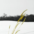
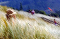
| 03/13/2010 03:57:59 PM | untitledby davidwComment: 7 - Like the simplicity, the lines, curves, seemingly color on b&w aspect - given the image as is, perhaps the grass either sharper or softer for added effect - also does seem slightly unbalanced overall, whether because of the crop at the bottom and/or the amount of sky - not sure. | | Photographer found comment helpful. |
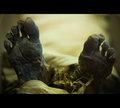
| 03/13/2010 03:56:27 PM | Hand Paintedby tehbenComment: 7 - Like the concept, would like to see more of the 'hand painting' (OOF fore berries/hips on hand) and perhaps a less 'horizontal framing' - just seems unbalanced, especially with the thumb/left side of the image, if you're keeping the fingertips in - but your call. | | Photographer found comment helpful. |
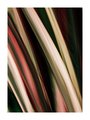
| 03/13/2010 03:54:53 PM | Flowby MelethiaComment: 7 - Nice movement/texture abstract, I like the colors, but wonder about more saturation or hue - but that's just personal preference - not my call. A more refined crop, especially bottom left, to eliminate distractions, make it even better in my opinion. | | Photographer found comment helpful. |
| 03/13/2010 03:53:19 PM | Summerby rinacComment: 7 - Definitely a nice feel to this, which is enforced by your title. A few elements in the scene detract/distract my imagination though, i.e.: the blue pole(?) with yellow at the top, the 'busyness' in some parts, the windsock in front of the sign (fairly minor) and while also fairly minor, the slight tilt I just find distracts. | | Photographer found comment helpful. |
| 03/13/2010 03:49:52 PM | | | Photographer found comment helpful. |
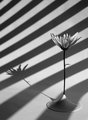
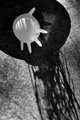
| 03/13/2010 03:49:03 PM | Theater of the Absurdby RKTComment: 7 - The b&w works well to pick up on the shadows and shapes. Your call, of course, but for me - the scene itself is not that 'absurd' - maybe if it was a little bunch of them or something else (and no not that) blown up, might make me think, as the viewer, "oh that's absurd".. Also, because of your title, my mind wants to see some type of theatre scene in the shadows there - puppets, strings, props, something. I like the concept though, just think there's more room to explore/create with the idea. | | Photographer found comment helpful. |
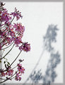
| 03/13/2010 03:45:04 PM | Spring is nearby jnenvirComment: 7 - Nice, but for me the border detracts from the simplicity, colors and shadow element. | | Photographer found comment helpful. |
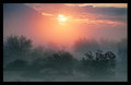
| 03/13/2010 03:42:44 PM | Look directly into the sunby JulietNNComment: 8 - This is a tricky one for me, as I do really like the image, especially the shrubs/bushes/trees at the fore and the distant colors, mist/haze and light creeping in. That part of the image, personally, I can perceive more as 'fine art', but the border detracts and the visible sun and disproportionate mountains (including that their 'shape' doesn't add to the image, isn't 'used'), throws me from the scene and makes this more of a landscape photograph - almost like two images in one. It just seems unbalanced, in more ways than one. Despite the urge after writing this, I still can't take it down to 7 from 8 - I do like it. | | Photographer found comment helpful. |
|
Showing 181 - 190 of ~4957 |
Home -
Challenges -
Community -
League -
Photos -
Cameras -
Lenses -
Learn -
Help -
Terms of Use -
Privacy -
Top ^
DPChallenge, and website content and design, Copyright © 2001-2026 Challenging Technologies, LLC.
All digital photo copyrights belong to the photographers and may not be used without permission.
Current Server Time: 06/25/2026 05:26:46 AM EDT.
|