|
|
|
Showing 971 - 980 of ~1613 |
| Image |
Comment |
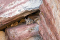
| 07/02/2008 10:50:01 PM | Safety Firstby Frankie_LvComment: Critique Club Review:
Color Saturation & Hue: Colors are well done. Nothing is over or under staturated. Tones appear normal for the subject.
Brightness and Contrast: The white on the rock above the mouse is blown out and featureless. I would imagine that this is a result of trying to keep details in the shadows behind the mouse. All in all it is a good tonal range, but comes out looking a bit pale overall due to the white areas and large naturally pale areas. (Not a process in fault, just the way the composition comes across.)
Focus and depth of field: Focus is nice and sharp but maybe a little long, and depth of field appears a bit shallow. You did a nice job of softening the rock on the right, to force the attention towards the mouse. However, the sharpest area is the debris to the left of the mouse, and that is where the eye goes. Your best bet, besides correcting the focus, would have been to crop the rock on the right out of the picture. As it is, the mouse is dead center which violates the rule of thirds. While it is not an ironclad rule, some techies vote like it is.
Still, all in all a reasonably good picture. I think another reason your image did not do better is seen in some of the comments. They just didn't see a mouse as a virtue. Although you were trying to show caution or attention to safety in your image, as a virtue (which it is), I believe that too many voters just saw a mouse. Which is unfortunate. |  Photographer found comment helpful. Photographer found comment helpful. |
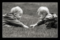
| 06/29/2008 09:05:37 PM | "Let's Be Clear on Who's Important!"by 777STANComment: Critique Club Review:
Color Saturation and Hue: Overall the colors are well done, but the skin tones of the girl appear to be a bit off. A little pale here, almost bluish. The skin tones of the adult look a little more red than they should. (At least on my monitor.) Brightness and contrast, are overall well done. However, the girl's forearm loses detail and is washed out.
Focus and depth of field are very good. Nice job of using depth of field to isolate the subject from the background.
Challenge purists may grade you down a bit because the image looks more like a snapshot than a pose.
The crop may be a little tight on this image, as the girl's disembodied hand comes up out of nowhere to the woman's face.
Overall a very pleasing image. I'm sure that both subjects will treasure it in years to come. | | Photographer found comment helpful. |
| 06/29/2008 08:27:17 PM | Even 3rd has golden rewardsby SarahJ1337Comment: Critique Club Review:
Color Saturation and Hue: Colors are realistic and not over-saturated. Brightness and contrast: Details are held in the shadows, one small area is at burn-out and loses some detail in the coin at the left edge of the box interior. However,the background appears featureless and bright. It winds up competing with the subject by its brightness alone.
The picture does tell a compete story, but the patch competes with the chest, and both attempt to tell the same story.
The image appears to be a bit overprocessed. The edge on the patch is so hard, that it almost appears to have been photoshopped in. |
| 06/29/2008 08:18:41 PM | BFFby scooter88Comment: Critique Club Review:
Color Saturation and Hue: Excellent. Skin tones are prefectly rendered. I really enjoy all the nice bright colors so crisply done. Very nice! Brightness and Contrast: Excellent as well. Details are not lost in shadows, nor are details blown out in highlight areas.
Focus and Depth of Field: Focus is nice and sharp. Depth of Field is a bit shallow, as evidenced by the softness in her hair at the edges. I would have preferred it shaper.
Although you have broken the rule of thirds, by centering the subject, some rules are made to be broken. This image really works because of the subjects. Their smiles light up this picture. I like just about everything about this picture, the lighting, the pose, the colors... I am suprised that it did not score higher than it did. | | Photographer found comment helpful. |
| 06/29/2008 08:09:20 PM | A Sibling's Bondby jeroweComment: Critique Club Review:
Color Saturation & Hue: Very well done, skin tones look very natural. Brightness and contrast: Very good as well. Focus and Depth of Field: Focus is excellent, plenty of nice sharp detail. Depth of Field appears shallow. Although the subjects are well isolated from the background, the subjects themselves go soft in the bottom half of the frame.
I think I might have cropped this one tighter. You pict an unsual vantage for the image, and the softness makes it even more apparant. Had you cropped out his right arm, it also would have removed her partial arm, making the image stronger.
Overall a very nice image. Congratulations on making the top third of the class. | | Photographer found comment helpful. |
| 06/29/2008 08:02:01 PM | A day in the park with the twins...by iceMan71Comment: Critique Club Review:
Color Saturation and Hue: N/A Brightness and Contrast: Well done. Details are visible in the shadows, and although a couple of areas are on the edge, nothing is burned out and featureless. Focus is good, however depth of field appears just a tiny bit shallow. I see smoe softeness at the edge of the hair, and the clothing on their backs. Otherwise a very nice job of isolating the foreground and background to draw attention to the subject.
The border may have been a bit bold for some of the voters, but it is not so bold as to distract from the image.
Overall a timeless image, and a one I am sure their family will treasure in the future.
Congratulations on a well deserved top 5 finish. | | Photographer found comment helpful. |
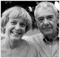
| 06/29/2008 07:54:11 PM | Happily Marriedby tpbremerComment: Critique Club Review:
Color Saturation Hue: N/A Brightness and Contrast: Very well done. Focus and depth of field: Focus is excellent. Depth of field may be just a tiny bit shallow. The upper part of the man's right shoulder, his right ear and the hair go a bit soft. Otherwise very nice job of separating the couple from a busy background. I especially like the crispness of her hair against the contrasting background.
I like the pose, the picture tells a story of a happy couple at a special occasion.
I fear there might be a little over processing here. Even though this is a black and white photo, there is something a bit odd. I can't quite put my finger on it, but the skin tones look a little bit wrong. I would think there would be more contrast between the skin and the clothing. The same goes for the hair. It almost reminds me a little of an infra red picture. It's not huge, but just a bit off.
I try to spend some time with each picture I review. I enjoy this much more than voting as I have the luxury of exploring the images more deeply.
Overall I have really enjoyed your image. Congratualtions on a top 25 finish. | | Photographer found comment helpful. |
| 06/29/2008 07:41:22 PM | Lazy Boneby ding_213Comment: Critique Club Review:
Color Saturation Hue: N/A Brightness and contrast: Overall brightness and contrast are fair. Nothing is too bright. The highlights are well under control. However, the man's face looses detail and starts to dissapear into the shadow. On the other hand, a very nice job of lighting the girl's face.
Focus and depth of field are very well done.
The cords and objects to the left of the girl are somewhat distracting. Were they removed, it would be a cleaner composition. I think the image would also be stronger if it were cropped shorter. The empty space at the top of the frame winds up being wasted, and the dust or scratch marks at the upper left of the frame, mar the blankness of the space.
|
| 06/29/2008 07:32:01 PM | New Level of Successby F-StopBluesComment: Critique Club Review:
Color Saturation and Hue are well done. Brightness and contrast are good as well. Focus and depth of field are very good.
It took me a minute to figure out what this was. At first I was thinking necktie. Interesting commentary, and nice idea. I think that as others noted, keeping the edges together would have worked better. Also the background competes with the money, making it look almost drab by comparison.
Had the center been filled in, or had this been uses as a ribbon on some object, I think the photo would been more powerful for me.
Overall and interesting image with potential for further development. | | Photographer found comment helpful. |
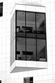
| 06/28/2008 03:12:01 PM | Promotion to a Corner Officeby bobnospumComment: Critique Club Review:
Color Saturation and Hue: N/A Brightness and Contrast: A high contrast image, with the white of the building at burn-out levels.
The featurless white against the grid lines of the tiles makes for a interesting image. Unfortunately it also draws immediate attention to the fact that the camera was not level when the image was taken. This can be corrected in post processing by rotation and cropping.
The other problem is that the partial windows jutting in from the edge of the frame, compete for the attention of the viewer. A tighter crop would have corrected this issue.
As is, this image has nice strong bones. I'd like to see it with a tighter crop, and a correction to the horizon and perspective. Fix the problems and I think this could have made the top 10 or certainly top 20. This would be an excellent image for a high contrast challenge, and could score even higher there. | | Photographer found comment helpful. |
|
Showing 971 - 980 of ~1613 |
Home -
Challenges -
Community -
League -
Photos -
Cameras -
Lenses -
Learn -
Help -
Terms of Use -
Privacy -
Top ^
DPChallenge, and website content and design, Copyright © 2001-2026 Challenging Technologies, LLC.
All digital photo copyrights belong to the photographers and may not be used without permission.
Current Server Time: 07/19/2026 03:38:04 PM EDT.
|