|
|
|
Showing 1231 - 1240 of ~1613 |
| Image |
Comment |
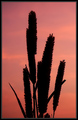
| 09/11/2006 04:19:00 PM | Picture Perfectby ShauryaComment: Critique Club Review:
Meets Challenge well.
As others have already noted, focus is a bit soft on the left side. I believe this may have come from the wide aperature cutting down on your depth of field. If you had a tripod handy, a longer exposure at a smaller aperature, would have solved this issue. For a silhouette sharpness of the silhoutte is very important.
Borders are chancy here at dpchallenge. Some voters will take a picture down a notch or two, just because they are there. In this picture the border adds to the compositon, and does not compete with it.
The picture is cropped tight to the subject, but I feel the vertical format and tight cropping works well. But it did call attention to the softness of the plant.
I really enjoy the colors of the sky, and the overall presentation. With a deeper depth of field, for a sharper image, I would like this hanging on my wall. |  Photographer found comment helpful. Photographer found comment helpful. |
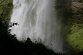
| 09/11/2006 04:10:33 PM | Waterfall Seljalandsfoss Southern Icelandby photo_isComment: Critique Club Review:
Definetly meets the challenge.
Focus and depth of field are done quite well.
As I sit and look at this picture, my opinion has wavered a bit back and forth. And I think what it is, is that the whole pciture seems a bit dark. Saturation and hue are fine, but the picture comes across as a bit under exposed. I would have liked it brighter to bring more contrast against the silhouette area. I don't feel that the other photographer adds to the composition, and I think I might have liked it better had you waited until they moved on.
You did a very good job of capturing the majesty of the waterfall.
Even with cropping some of the height, it still conveys the power and the motion of the water. Much nicer than those who are tempted to go for a long exposure so the water turns into a featureless white fog. |
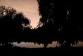
| 09/11/2006 04:00:05 PM | of nights and willowsby lostspyderComment: Critique Club Review:
Meets Challenge.
With the small size of the leaves, and the long exposure time, the picture comes across as if the focus were a bit off.
There is really too much silhouette here. Also the trees seem crowded together and compete for attention. The eye is pulled all over the frame by the different shapes and sizes in a haphazard manner. The end result is that nothing comes across as the point of interest. Perhaps if you had limited it to a single tree, it could have made for a more effective picture with the sky and lake for balance.
Don't be intimidated by the others here. Some have been at their craft for a very long time, some have more resources (read $$$$). Learn from them, and find your own style and do what pleases you. And besides, you beat 42 other people first crack out of the box. Not bad for a first try.
| | Photographer found comment helpful. |
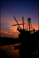
| 09/11/2006 03:44:33 PM | Chapter IVby timfythetooComment: Critique Club Review:
Fits challenge well.
Lighting, color, contrast, saturation and hue, are all done extremely well. Even with the lights across the river, this could be from any time or any place. The border is unobtrusive and does not compete with or take asway from the picture. I am completely at a loss as to why this picture received any 1-2-3-4 scores. Even if a person were tired of sunsets and boat pictures, on technical merits alone I do not see a justification for a 1-2-3.
About the only thing I see that detracts in any way, is that the boat appears to be listing a bit. And with the list is gives the viewer the illusion that the camera was not level during the taking of the picture.
This is a job, very well done! | | Photographer found comment helpful. |
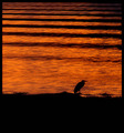
| 09/11/2006 03:34:56 PM | Calm at the End of the Dayby NeilComment: Critique Club Review:
Definetly fits the challenge well.
Lighting, exposure, color, saturation, and hue are all done quite well. Focus and depth of field are excellent.
I really like this picture, and am somewhat surprised that it didn't do better. I love the color of the water.
There are only two small items that could have hurt your score. You've added a frame to your picture, and for whatever reason some people here don't seem to favor them in their voting. The other is that negative space at the bottom of the picture seems a little large. It tends to take attention away from the bird, and it runs into the frame.
These two points are small, as I really enjoy this shot. Congratulations on a well done entry. | | Photographer found comment helpful. |
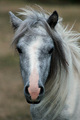
| 09/11/2006 03:25:46 PM | 'Merrylegs' from "Black Beauty"by JacquiDComment: Critique Club Review:
Definetly meets challenge.
Not having seen Black Beauty, I can't say how close you came to creating a scene that would call the movie to mind. (Which may have affected your score, if many others have not seen it also.) I don't see a valid reason for the large numbers of 1s and 2s you received.
Color, saturation, and hue are all done well. The subdued lighting does make the picture seem a little bit "cold". Using depth of field to pull the pony out of the background was a good touch. However the focus starts to soften just past the ears, and by the shoulders it was pretty soft. Which is what I think got you all the focus comments, as the focus at the eyes is good, with the muzzle just starting to soften also.
Since this isn't your animal, and not your property, you were limited with what you could accomplish. Personally, I wanted to see more. Movies are about action, and movement. Which is hard to convey through a single frame exposure. Be that as it may, that is what would get my 10 vote. It's a fine picture of a pony standing still. And given the circumstances of the setting, you did a good job with what you had to work with. |
| 09/11/2006 01:59:29 AM | W O M Bby hannekeComment: Critique Club Review:
An interesting twist to the challenge. I'm surprised this didn't do better in the voting. Too bad this wasn't an advanced editing challenge, you could have cloned out the writing that I and other commenters found a little distracting. Since you couldn't get rid of the writing, perhaps more writing added to the bag might have helped. (Who knows, "Contents 1 human" or something like that.
As it is this is a very creative take on the challenge, and a far cry from a simple back-lit exposure. I like the lighting, the pose, the bag really makes the whole thing work well. The noise in the picture adds to the scifi-horror-mystery atmosphere of the piece. I like the way everything else is eliminated from the piece.
I think the frame may have cost you votes. There is really nothing wrong with this one, but there are voters who hate frames. (They originally were not allowed.) And, while the frame does not detract, it does not add a lot to my eye. Hence it may be the source of some of your 1's and 2's. I can't think of any other reason why anyone would vote low on this picture.
Congratulations on a very creative, and nicely done entry. | | Photographer found comment helpful. |
| 09/10/2006 07:36:24 PM | Too Many Subjectsby jimnessComment: Critique Club Review:
Pictures which can be taken as political statements, are risky in challenges. I wonder if this picture did not score as high as it could or should have, because some didn't know that this was a WWII cemetary.
The B&W really adds to this piece, as I see it as bringing in some of the coldness of death.
Exposure, lighting, contrast, are all done well here.
The sky is the big question for me. I'm torn between liking it for its lack of detail and adding a little coldness to the picture, and wishing it had more detail for visual interest. Perhaps a darker sky to more ephasize the crosses.... Tough to say, which is a good thing, as it means that you have not made an obvious error.
B&W pictures tend to have a hard time scoring near the top in challenges where color is allowed. This picture is a good example of why this bias should not happen. Good job on a tough challenge! | | Photographer found comment helpful. |
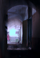
| 09/10/2006 07:27:29 PM | - subject escapes -by GuGiComment: Critique Club Review:
Technical: Fits the challenge well. The girl, as some of the comments state, might be taken as the subject. However, there is so little of her, and with the motion blur, I would say that the challenge is still well met. Focus and depth of field are good. Overall exposure is good. Lighting and contrast are well done. If anything, the color patch on the wall in the backgound is a little bit bright for my taste, and distracts a bit from the rest of the picture.
Artistic: A very good job, and about the only thing that I see that could be off, is the picture looks a tiny bit off level, as it seems to lean to the right just a bit.
Your timed exposure works very well here, as the areas around the arches and above and to the left of the girl are a bit smeared which lends a neat "ghostly" or dream like effect to this picture. Had you used a tripod, this effect might not have occured, and I think the picture would have not been quite as good. Nice job! | | Photographer found comment helpful. |
| 09/10/2006 07:16:17 PM | Brights and colorsby SunshyneComment: Critique Club Review:
Focus, depth of field, lighting, contrast, color and hue are all done well. Nothing is over-saturated or dull and bland. However, the jumble of colors, patterns and shapes, leads to a confusing array for the eye. Think of it as a person wearing a polka dot shirt with plaid pants. Everything here competes for attention, not allowing the eye to rest on any one spot, nor does is guide the eye in a comfortable manner.
I do like all the colors, and the photographic technique. It's the chaos of all the competing patterns. One thing that might help here, would be to rotate the image, say 45 degrees. That would have added some visual interest from diagonal stripes, and distracted the eye from all the different patterns on the cloth.
You weren't far from the top half of the class. A good start for a first attempt. | | Photographer found comment helpful. |
|
Showing 1231 - 1240 of ~1613 |
Home -
Challenges -
Community -
League -
Photos -
Cameras -
Lenses -
Learn -
Help -
Terms of Use -
Privacy -
Top ^
DPChallenge, and website content and design, Copyright © 2001-2026 Challenging Technologies, LLC.
All digital photo copyrights belong to the photographers and may not be used without permission.
Current Server Time: 07/17/2026 10:54:43 PM EDT.
|