Critique Club Review:
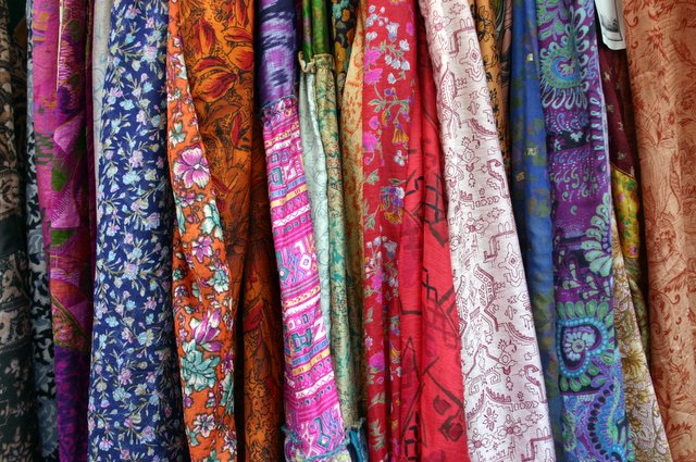
Focus, depth of field, lighting, contrast, color and hue are all done well. Nothing is over-saturated or dull and bland. However, the jumble of colors, patterns and shapes, leads to a confusing array for the eye. Think of it as a person wearing a polka dot shirt with plaid pants. Everything here competes for attention, not allowing the eye to rest on any one spot, nor does is guide the eye in a comfortable manner.
I do like all the colors, and the photographic technique. It's the chaos of all the competing patterns. One thing that might help here, would be to rotate the image, say 45 degrees. That would have added some visual interest from diagonal stripes, and distracted the eye from all the different patterns on the cloth.
You weren't far from the top half of the class. A good start for a first attempt. |