|
|
|
Showing 1161 - 1170 of ~1613 |
| Image |
Comment |
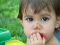
| 09/19/2006 02:24:35 AM | Picnic with Claraby tiagovazComment: Critique Club Review:
Color, saturation and hue are good. Focus is good, depth of field is just a little bit shallow. Her face is nice and sharp, but the fingers of her hand start to go soft at the base.
I would recommend getting rid of the clutter on the left side of the frame.
Your crop is a little awkward for my tastes. You've cut off her ear and the top of her head. If you wanted to show her face, it would be better to include the whole head. If you wanted to show the detail in her eyes, then coming in a bit closer and cropping tighter would help do the trick. (Currently the detail is a bit small, unless you know what you are looking at.)
I like this picture, but at the same time I think a tighter shot emphasizing those beautiful eyes, would be killer. |
| 09/19/2006 02:15:14 AM | No worries...by bugsy55Comment: Critique Club Review:
Very nice picture.
Color, saturation, hue, lighting, brightness, contrast, focus, depth of field are all very good.
There is only one thing I see here, and that is that the setting sun unintentionallly becomes a subject.
You've positioned your son following the rules of thirds. However, your son's gaze, and the reflection on the water, take us straight to the sun. Unfortunately the reflection is right up the middle, and the sun close to it. Positioning your son further to the left so that he was in one third, and the sun in the other, might have helped.
As is, I really enjoyed this picture, and it really speaks to the feeling of the moment. |  Photographer found comment helpful. Photographer found comment helpful. |
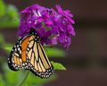
| 09/18/2006 01:59:21 AM | Monarchby banmornComment: Critique Club Review:
Lighting, exposure, color, contrast, saturation and hue are all done extremently well. Focus is excellent, and depth of field has been used quite well to isolate distracting background clutter, yet is deep enough to include as much of the flowers as needed.
About the only drawbacks I see here are that the butterfly looks a bit over sharpened. (Though I must confess that it has been too may years since I saw one this close. So it may be accurate.) And the background looks a little grainy. Not bad, but perceptable. A darker backround would have added to this shot. Unfortunately your options were limited there, because of a this being a basic editing challenge.
Overall this is a very good picture and a well deserved score. Good job. | | Photographer found comment helpful. |
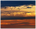
| 09/18/2006 01:52:37 AM | Leavingby KHoltComment: Critique Club Review:
Nice Picture!
You are correct, the blue looks a bit over processed.
I really like the sihouttes of the birds. However, my eye keeps getting drawn to the band of white clouds that run across the center with all the detail there. The brightness there, especially in the right third of the frame, is a bit distracting.
Color saturation and hue, is done very well. Focus is spot on. A little more softness in the clouds would keep the eye on the birds.
Overall this is a very well done photo, and I add my congratulations on your top 20 finish. | | Photographer found comment helpful. |
| 09/18/2006 01:46:00 AM | Deathby inutzaComment: Critique Club Review:
It took me a second to see what this was. I didn't catch the spider web right away.
Contrast, exposure, color, saturation, and hue are all well done.
Focus is good, depth of field was used to good advantage.
The spider web dissapears in some areas, and if the lighting were a bit different, or if some water mist were sprayed to simulate dew, it might show more clearly.
I'm in agreement with those who found the green distracting. Though it is helped some by being soft, the color still overpowers the paleness of the sky, and the size of the bugs.
On the other hand, the softness of the sky is just about right. We have enough detail to tell us we are seeing sky and cloud, but not so sharp as to take the eye away from the subject. Good job.
I suspect the other reason for your score is, unfortunately, some people are turned off by bugs, and other by death. You gave them both. Though personally I like this piece. | | Photographer found comment helpful. |
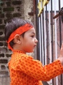
| 09/17/2006 10:05:56 PM | Saying Goodbyeby arati_halbeComment: Critique Club Review:
Rule of thirds, is basically the center of attention should be along one of the imaginary lines, that would run across the photo if you divided it into thirds vertically and horizontally.
The eye here, is drawn to your son's eye, which is in the center of the photo. (not along one of those imaginary lines) As with most rules, sometimes breaking the rules gives a better result. However, the challenge is rule of thirds, and your score probably suffered some because of this.
As far as this photo goes...
Color, saturation, and hue are very good. Skin tones are very good. Brightness and contrast are good as well.
Focus is good. I would liked to have seen a little shallower depth of field. A soft background would really emphasize your son.
As you already mentioned, a complete hand would have helped a lot, and probably included the full latch on the gate, which currently runs out of the frame and distracts a little bit.
| | Photographer found comment helpful. |
| 09/17/2006 05:46:42 PM | Fetchby larry595Comment: Critique Club Review:
Looks like most of the issues have already been covered by the other commenters, but I want to add my voice in a couple of areas.
Size matters, size matters, size matters. (Read book once where it said, say it three times and people will remember it.) Take advantage of the photo size and file size rules. Send every pixel and kilobye allowed. Over compressed jpegs wind up showing artifacts and squiggly things that you didn't put there. Small photos are harder to see, hide lack of focus and imperfections, and voters being the conspiracy theorists that they are; suspect that you are out to hide something and vote accordingly.
From what I can tell, focus is good. I would suggest darkening the backround or adjusting the light to hide the highlight to the left of the dog. It is a little distracting. Color saturation and hue are good. I would suggest also finding a friend with one less foot, or and axe, or probably the easiest having (s)he stand a bit to the right so as to be out of the frame. (Sorry a bit silly today.)
Overall I like the picture. My dog has a tendency to do the same. Unfortunately he bit the postman, so we are waiting to see what the price on that shall be. irakly is right, this would make a good post card, or greeting card. Nice first effort. Just remember size, Size, SIZE! Get that detail to us. |
| 09/17/2006 03:51:16 PM | Softnessby riccardinoComment: Critique Club Review:
I read your comments twice, before the word petals sank into my brain. Up to that point I had no clue what this was. I had several theories, and none of them were close.
You've met the challenge well, and color, saturation, hue, brightness, and contrast are all rendered well.
The darks spots do distract, as you've noted. Macro doesn't leave much room for problems.
Focus and depth of field are very well done.
The curves as the expand out from the center are cut off, and keep guiding the eye out of the frame. I would have liked it better, had there been a way to keep them intact. Also I find myself wishing for a little more drama in the color.
Very nice photo, and one that holds the viewers interest as they try to figure out what this is.
| | Photographer found comment helpful. |
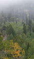
| 09/17/2006 03:42:50 PM | Early Autumn Fogby pmichaudComment: Critique Club Review:
Pretty picture.
Lighting is a little flat, but fog does that; so not much to be done there. Color, saturation, and hue are OK.
Focus & depth of field: I'm having a hard time finding the focal point here. The foreground looks a little soft. With a 1/30 sec exposure, camera shake could be the problem, especially if that lens was zoomed out at all. It almost looks sharper in the middle, but by that time the fog is starting to take over, so it is hard to tell.
What proabably hurt your score more, was that most people probably saw no pastels in this picture. Green has to be really pale before most people see it as pastel. The limited yellows and oranges here, would not strike many voters as pastels either.
I do like the way the top of the hill fades into the fog, but at the same time I like the tree with autumn colors in the foreground. The problem for me is I would really like to see one or the other be the dominant feature in this picture. As it is they compete, and diminish each other a little.
Still, a pretty picture, and if it were a bit more saturated I would like to see it hanging on my wall. | | Photographer found comment helpful. |
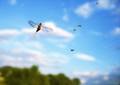
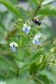
| 09/17/2006 02:55:04 AM | Buzzzzzzzzzzzzzby JewellyComment: Critique Club Review:
Nice shot.
Focus and depth of field are excellent. Excellent detail on the Bee coming in for a landing, and the flower as well.
Lighting, color, saturation, and hue are all done well.
The bare twigs on the right of the frame are a bit distracting.
What probably hurt you most on scores was that the greens in the plant are not seen by most people as pastels. What comes across as pastel is the three flowers, that make up a very small part of the picture. Since the eye naturally gravitates to the Bee, their effect is almost nil. Many voters here tend to place a high value on the challenge subject as they interpret it.
Still a very good photograph. One that I enjoy, and I'm sure would have score much higer in a different challenge. | | Photographer found comment helpful. |
|
Showing 1161 - 1170 of ~1613 |
Home -
Challenges -
Community -
League -
Photos -
Cameras -
Lenses -
Learn -
Help -
Terms of Use -
Privacy -
Top ^
DPChallenge, and website content and design, Copyright © 2001-2026 Challenging Technologies, LLC.
All digital photo copyrights belong to the photographers and may not be used without permission.
Current Server Time: 07/19/2026 01:07:05 PM EDT.
|