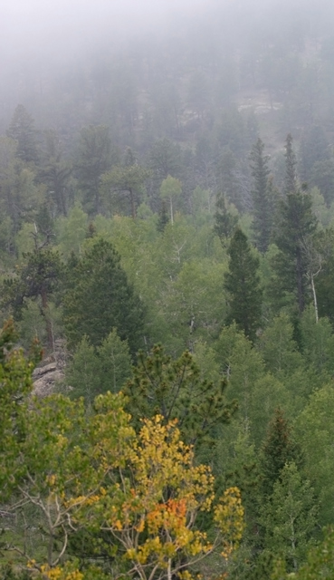
Critique Club Review:
Pretty picture.
Lighting is a little flat, but fog does that; so not much to be done there. Color, saturation, and hue are OK.
Focus & depth of field: I'm having a hard time finding the focal point here. The foreground looks a little soft. With a 1/30 sec exposure, camera shake could be the problem, especially if that lens was zoomed out at all. It almost looks sharper in the middle, but by that time the fog is starting to take over, so it is hard to tell.
What proabably hurt your score more, was that most people probably saw no pastels in this picture. Green has to be really pale before most people see it as pastel. The limited yellows and oranges here, would not strike many voters as pastels either.
I do like the way the top of the hill fades into the fog, but at the same time I like the tree with autumn colors in the foreground. The problem for me is I would really like to see one or the other be the dominant feature in this picture. As it is they compete, and diminish each other a little.
Still, a pretty picture, and if it were a bit more saturated I would like to see it hanging on my wall. |