|
|
|
Showing 1141 - 1150 of ~1613 |
| Image |
Comment |
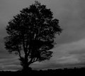
| 09/20/2006 10:29:54 PM | Hayfield treeby snafflesComment: Critique Club Review:
The tree and horizon are so oversharpened that there is a halo along the edges. Was that the intention of this piece. I've seen the effect used before, but unsure if this was on purpose.
I have to agree it is a little dark overall, but I do like the detail in the clouds.
The silhouette works well here. Just a little lighter, ease up on the sharpening, and keep the detail. Then your score should go up.
Overall I like the picture, is a nice mood piece. Especially with Halloween coming. |  Photographer found comment helpful. Photographer found comment helpful. |
| 09/20/2006 08:43:05 PM | Lone Survivorby riversongComment: Critique Club Review:
Color is good. Saturation and hue are well done.
I'm not quite sure what happened in the sky. Could be over compression of your software creating the jpeg. The upper right of teh sky just looks "splotchy".
At the top of the tree, just to the right of center, it looks like smoke or the edge of a cloud and comes across as a little too loose a hand while editing.
I like the texture of the rock face. You can almost reach out and touch them.
However, the tree is overwhelmed in this picture and comes across a bit small and there is just too much featureless sky. The sky is a pretty blue, but there is so much bright empy space there that it hurts the rest of the picture a bit.
| | Photographer found comment helpful. |
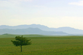
| 09/20/2006 04:43:52 PM | South Parkby pmichaudComment: Critique Club Review:
Very nice lighting and tonal qualities. Makes me almost wish the grass were a shade of blue.
A larger tree, a little furter back would have been nice. the tree follows the rule of thirds, but what keeps popping into my gaze are those great layered blue hills. They work so well against the sky that they tend to become the subject, and the tree and grass more of a distraction.
This is a really nice picture, unfortunately the tree just isn't strong enough to hold center stage. | | Photographer found comment helpful. |
| 09/20/2006 04:37:59 PM | Tenacityby madhatterComment: Critique Club Review:
Really pretty photo. Lighting, color, contrast, brightness, hue and saturation are done very well.
The blues in this piece are fantastic, and I really like the layering of th hills in the background.
For my taste teh tre is a little centered. But what comes even more to mind as I spend time with this picture is that the tree, wich is almost silhouetted, is not strong enough to hold the picture.
I find my gaze keeps going through the tree to the background.
A shallower depth of field might help. What I really keep thinking is I wish the tree were not in the way, so I could see more of the rest of the picture.
Still a very nice picture and a well deserved top 40 finish. | | Photographer found comment helpful. |
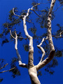
| 09/20/2006 12:59:59 AM | Eucalyptus Reachingby electinaComment: Critique Club Review:
I really like the bark and the sky.
The leaves come off as a bit drab. Did they get affected by the post processing? There also seems to be a bit of a halo along the right most limb at the vrey top of the picture.
Other than that, it looks really good. Though I suppose there might have been a voter or two who noticed the limbs from another tree coming in from the left. That's about the only way I can see you didn't score a little higher. | | Photographer found comment helpful. |
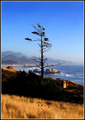
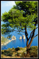
| 09/20/2006 12:54:39 AM | A View Atop Capriby steffyldComment: Critique Club Review:
Color, saturation, brightness, contrast and hue are all very well done.
I like the way the ocean turns to sky, but you can't tell where.
The foreground shrubs/weeds/grass/??? that come in from the left block part of the tree and compete for attention.
The only other comment I have is that while this is a really beautiful shot, and the tree nicely frames the scene. It really functions as more of a frame than as a subject. I find myself looking at the islands in the bay much more than the tree.
Still a really, really pretty photo. | | Photographer found comment helpful. |
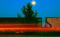
| 09/20/2006 12:49:23 AM | Lighting of the Treeby camphanComment: Critique Club Review:
You've got a couple of competing items here. The red streaks, obviously not from the train, because of their brightness placement command attention.
At the same time the light above the tree make a play for center stage.
If you were going for a Christmas tree effect, an angle where the light was at the top of the tree would be a little more effective.
Also, since this is and advance rules challenge, I would recommend eliminating the bird, or whatever the object is, above the gap between the two rail cars.
I think this photo might have worked best for me without rail cars and without red streaks. |
| 09/20/2006 12:42:12 AM | survivorby gastonComment: Critique Club Review:
Color, saturation, brightness, contrast, and hue are excellent!
The tree does seem a bit soft in comparison to the grass, but that could be a bit of illusion.
I too would have like a bit wider frame. The tree travelling off the edges is a little less satisfying.
I would really like to see you come back and take this photo again at sunrise, sunset, or on a stormy day, to fill in the featureless sky. All that empty sky is a blank canvas waiting for your brush.
Very nicely done, and should have scored a bit higher. |
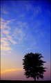
| 09/20/2006 12:37:18 AM | Silhouetteby timfythetooComment: Critique Club Review:
Very nice colors. And very creative in getting a tree on a ridge where there wasn't one.
Exposure, color, saturation and hues are done well. Brightness and contrast are also excellent.
It's that darn sky.... It seems too tall. I've been sitting here with a piece of paper up to the screen to try to figure out a better crop. But I keep going up, up, up. There doesn't seem to be a good place to end it.
The cloud pattern at the top is distracting in its difference from the rest. The pattern looks almost like somebody laid something on the non-existant negative or slide.
I also like very much the transition of the colors from the horizion to the upper sky.
I think you did an extrodinary job with what you had to work with.
| | Photographer found comment helpful. |
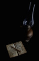
| 09/20/2006 12:27:46 AM | Old memoriesby Rino63Comment: Critique Club Review:
Very Nice Photo.
Focus and depth of field are excellent. Color is done well.
I think you've already heard the major complaint over, and over.
I like the tones of of the lamp, book and pencil. But the rest is just too dark. The rest is so dark that the book and pencil become almost disconnected from the lamp. Together they almost seem to float in space. As a mood or dream piece, this could work. But then I would expect to see a softer focus or warmer background.
For some reason, this almost seems to be a piece about death. Perhaps because of the darkness, or maybe it is just me.
Either way, this is still a very good photo and congratulations on finishing in the top 30. | | Photographer found comment helpful. |
|
Showing 1141 - 1150 of ~1613 |
Home -
Challenges -
Community -
League -
Photos -
Cameras -
Lenses -
Learn -
Help -
Terms of Use -
Privacy -
Top ^
DPChallenge, and website content and design, Copyright © 2001-2026 Challenging Technologies, LLC.
All digital photo copyrights belong to the photographers and may not be used without permission.
Current Server Time: 07/19/2026 02:28:09 AM EDT.
|