|
|
|
Showing 1061 - 1070 of ~1613 |
| Image |
Comment |
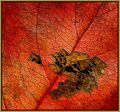
| 10/08/2006 02:41:29 PM | Gold Leafingby lynnmarieComment: Critique Club Review:
I think you have already heard, over and over, about the only real problem with this picture. (The softness of the focus.) At this closeness, and with a wide aperature, (f-2.8) the depth of field will be extremely small and unforgiving.
Had you tried to sharpen the image much more, it would have looked worse because it would have become grainy and had haloes around objects.
Other than that, this is an extrodinarily good image. Color, saturation, hue, brightness and contrast are all excellent. I particularly like the perfect black contrast of the missing areas of the leaf. It really sets off the other colors well.
Nice job. |  Photographer found comment helpful. Photographer found comment helpful. |
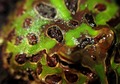
| 10/08/2006 02:35:07 PM | Misted Skinby SebiComment: Critique Club Review:
Focus is good, depth of field is a bit shallow. The 50 ISO gave you a nice grain free image, but the large aperature required gave you the shallow depth of field. In this composition, the viewer's eye is drawn to the frogs eyes. When encountering another person or creature, we humans tend to look at the eyes. Since they were a bit soft, you got a complaint of soft focus. However, the area further back is quite sharp, so it wasn't a focus problem.
Lighting is good; color, saturation and hue are excellent.
Personally I really liked the colors, shapes and especially the textures of the skin in the sharp focus area. I would love to see this picture re-done with just the back of the frog in view.
The water droplets, skin texture, colors and shapes, if all were in focus would make a photograph that I would like to hang on my wall. A smaller aperature as mentioned above, and more direct angle from the camera so that the distance from the lens is more uniform, would help here.
This picture has the bones to make a really great photograph. I hope you take more. | | Photographer found comment helpful. |
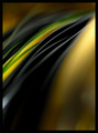
| 10/08/2006 02:18:46 PM | Follow the Leaderby GraydogComment: Critique Club Review:
Color, saturation, hue, brightness and contrast are all excellent.
I might have liked a tiny bit more depth of field. Just enough to keep the yellow/green stripped line sharp to the edge of the frame. Just a personal preference, not a major point.
This picture really meets the challenge. I like the play of the shapes and the colors. The only other suggestion I have, would be for a little more detail in the lower left of the frame. There is really nice texture and shape to the blacks, until the seem to meld into a undefined shape lower left. Again, a minor point and more of a personal preference.
Overall an excellently done photo, and well deserving of the top ten finish it received. | | Photographer found comment helpful. |
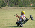
| 10/08/2006 03:42:51 AM | Riding the Windby cryingdragonComment: Critique Club Review:
Focus and depth of field are good. Color, saturation and hue are done well. Brightness is a bit overdone, highlights on the helmet are burned out and shirt is getting close.
I think the two biggest problems here are shutter speed, action is completely stopped; and no kite. A bit of motion blur would have emphasized the action. As is, the picture comes across a bit static, and frozen. Like other commmenters I would have liked to have seen the kite. If you are familiar with the sport, you understand what is going on in this picture. If not, then you are left out of the story. This would be a good picture as a part of an illustrative series, as in a magazine article. However, as a stand alone shot I feel that it doesn't tell enough of the story.
| | Photographer found comment helpful. |
| 10/08/2006 03:34:17 AM | Worshipby Rino63Comment: Critique Club Review:
I think you have already gotten a lot of good advice for this picture. The cropping suggestions by amieehtetoo were excellent. The main portion of the picture seems to be in shadow. The highlights on the priest on the left's robe and the floor behind him, tend to draw the eye away from the the rest of the picture. I might have cloned out the man against the wall, between the first and second priest. He is a bit distracting, and does not add to the photo.
I realize, that in this setting you were really limited by what you could do. However I'm left wondering if you would have been able to catch a front view of the priests as they turned to leave.
People tend to like to see faces. Photos from the back, tend to send a messsage of exclusion.
I would also suggest a bit shallower depth of field. If the railing in the foreground were softer, I think I would like this picture a bit better. | | Photographer found comment helpful. |
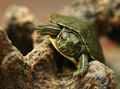
| 10/08/2006 03:24:11 AM | Climbing to the Topby theSajComment: Critique Club Review:
Focus is nice and sharp. Depth of field is well used to isolate the subject from distracting components of the picture. If anything I would have blurred the stripe of sharp focus at the bottom of the 'V' in the rocks to the left of the turtle. It's a little bit distracting for me. Not bad, just a little. Or you could have gone with an even shallower depth of field. To me the key is the face of the turtle. Turtles don't have much to have an expression with, but this picture sure seems to speak of sheer determination.
The ISO 400 speed left you with a little more grain than I like to see. But, at a shutter speed of 1/60 it looks like you didn't have much choice.
Very nice capture.
| | Photographer found comment helpful. |
| 10/08/2006 03:11:48 AM | Ring of Lightby taljComment: Critique Club Review:
Interesting picture...
A couple of the highlight areas are burned out from the long exposure. However, it isn't all that serious and with the time exposure needed to get the effect you wanted, it would be diffiult if not impossibe to do much about it.
One thing I do keep noticing, is the angle of the picture. When you angle the camera up, to take the picture of a tall object, distortion occurs that makes the objects turn into trapezoids. The building on the left should be a rectangle. Instead, it appears to lean into the center of the frame. As this is an advanced editing challenge, I believe it would be within the rules to reverse the distortion. Some software packages have built in tools for this kind of correction. The other alternative is to find a vantage point where the eleveation is equal to the hight of the center of the frame, which would allow the camera line of sight to be level.
I would have to agree with one of the other commenters that there is a little too much empty sky above the subject. Were there stars or a moon visible that night, it would help. Otherwise I'd recommend a little tighter crop.
Focus is quite good, especially for a one minute photo.
I like this picture. Well done! | | Photographer found comment helpful. |
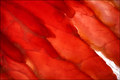
| 10/05/2006 04:06:25 PM | Red cellsby olbolComment: Critique Club Review:
Meets challenge well.
Focus and depth of field are very good. Color, brightness, saturation, and hue are fine.
This makes foa nice pattern, and could be an entry for a no subject challenge as well. Which for me, is about the only negative here. The eye doesn't know where to look. The pattern is interesting, but the eye sort of wanders aimlessly about.
I think this image would be quite interesting canvas mounted at poster size or larger in a gallery. | | Photographer found comment helpful. |
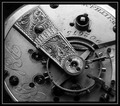
| 10/05/2006 04:00:08 PM | 1873by photoslik1967Comment: Critique Club Review:
I really enjoy the detail of this photo. Focus and depth of field are very good. It does appear that a little bit of softness is starting to creep in at the lower left. It could be an illusion of the lighting.
The angle of the lighting does a great job of showing the texture of the piece. I small fill light on the bottom would help reduce the harshness but keep the texture.
I like the way the watch goes off the frame also. Too many are circular blobs in the middle of the screen.
I would suggest a thinner border. The details and lines of the watch are fine and somewhat delicate. The border, in comparison, comes across to me as a little heavy.
Overall an excellent photo, I could see this hanging in a shop or gallery.
Very nice job.
| | Photographer found comment helpful. |
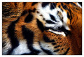
| 10/05/2006 03:50:49 PM | Jungle Patternsby timfythetooComment: Critique Club Review:
Very nice picture!
Focus and depth of field are good. As noted there is a smudge, but evidently cleaning the inside of the glass with the tiger present wasn't an option. Still you did a very good job in making it appear in the least noticeable area. Nice lens for this kind of detail at that range.
Color, saturation, hue, brightness, contrast, and lighting are all very well done.
You may have lost a point or two, to those who didn't see this as a true macro, or abstract. However, I like the play of the stripes and colors. I feel that it is a powerful photo, and one I would not tire of hanging on my wall. | | Photographer found comment helpful. |
|
Showing 1061 - 1070 of ~1613 |
Home -
Challenges -
Community -
League -
Photos -
Cameras -
Lenses -
Learn -
Help -
Terms of Use -
Privacy -
Top ^
DPChallenge, and website content and design, Copyright © 2001-2026 Challenging Technologies, LLC.
All digital photo copyrights belong to the photographers and may not be used without permission.
Current Server Time: 07/19/2026 03:56:42 PM EDT.
|