|
|
|
Showing 1031 - 1040 of ~1613 |
| Image |
Comment |
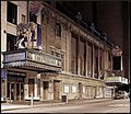
| 10/14/2006 02:27:40 PM | The Decline of Theatre.by RulerZigzagComment: Critique Club Review:
Nice image!
Yes it is a bit overprocessed in one sense. However, perhaps the opposite is true. It is starting to take on a style seen in the images in magazines and books around the early ninteen hundereds.
I've seen similar styles in my grandmothers old books. I'd recommend cloning out the car, and darkening the building in the background. The architecture there doesn't fit with the architecture of the subject.
The image here is taking on the feel of an illustration as opposed to a straight photograph. I do not feel that everything has to be a straight, detailed rendition of what the photographer saw.
This image appears to me, to be more of what you felt about what you saw. I think I like it better. |  Photographer found comment helpful. Photographer found comment helpful. |
| 10/14/2006 02:17:11 PM | Bad breath?by TUBORGComment: Critique Club Review:
Interesting image.
Great detail, and the lighting provides a lot of texture here. At first I would have agreed that a closer crop would be better, but as I study the picture, the clouds start to look more like an extension of the horse's mane.
What I do find distracting is the partial animal next to the subject. I would recommend either cropping the other animal out, or moving it away.
Nice humerous picture. |
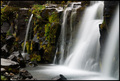
| 10/14/2006 03:32:40 AM | Running wildby garlicComment: Critique Club Review:
This area was filled in during the challenge? Talk about a last chance opportunity...
Overall I like this picture a lot. I think the largest water fall steals the show a bit. And I think it hurts the picture a bit by doing so. There is so much soft bright white area there, that it keeps pulling the eye back. Whereas the smaller fall near the center is beautiful in its detail and complements the detail and texture of the rocks and moss well.
The technical points of this photo, color saturation hue focus and all that are excellent.
It is a shame that this is all gone now. It was a beautiful place. |
| 10/13/2006 07:57:00 PM | Dance Partnersby nomad469Comment: Critique Club Review:
Excellent picture!
Focus is excellent. Color saturation and hue are very good as well. The reds look great, and the skin tones are nice and natural.
Nice job making her hair stand out from the back drop. It could have very easily blended in.
About the only thing I see here, is that I wish the back drop were a little darker. As it is I an see some detail there, folds, and some sort of blemish or object to the right of her right hand.
All in all an excellent picture that I feel should have scored higher. | | Photographer found comment helpful. |
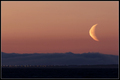
| 10/13/2006 07:38:18 PM | Bad moon risingby GautiComment: Critique Club Review:
Nice picture. Looks almost like something out of a science fiction movie.
Focus is good. Horizon is nice and level. The border is a little distracting, but not bad. The ISO is nice and low (100) but still the sky areas look a tiny bit grainy.
I think I would have to agree with on of the other comments. A tighter crop on the top would even more emphasize the moon.
I'm not sure why the moon is distorted. Looks like heat waves rising from the ground, but I wouldn't think that would be problem this time of year. Especially in the evening. However, had the moon been sharper, it would have helped your score. Though, I do like it this way too, because it could almost pass for a close planet out of some science fiction movie.
Very nice photo. | | Photographer found comment helpful. |
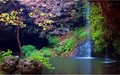
| 10/13/2006 01:51:24 AM | Hiding Placeby SlohandsComment: Critique Club Review:
The long exposure has resulted in some unwanted effects. The leaves on the tree must have been moving, and so look out of focus. I'm guessing this because rocks closer and further away are sharp.
There is a lot going on in this picture, actually a bit too much.
I'd like the picture better if the foreground tree on the left were gone.
Color, saturation, hue, and brightness are OK. Contrast is a bit low.
The cave on the left third of the picture would work better if contrast were uppped a bit, to render the void black. As it, it looks like a photo with some sort of film on it. There is no detail in the cave, just a bluish haze or film.
I would like to see this picture with more contrast and a bit sharper exposure. Could make a nice calendar scene. |
| 10/13/2006 01:44:32 AM | "At 105, still ain't no crabber better'n me"by dolphnz8Comment: Critique Club Review:
Focus is excellent. Depth of field is good, though a bit shallower would have further softened the background. It still is a little distracting for me.
Brightness and contrast are excellent as well.
Lighting looks like it came from the on camera flash. The head on light tends to wash out texture of the features and leaves the lighting a bit flat.
Very good composition. You can tell by the photo that this guy is quite a character. I'm sure this is a picture that his family will treasure in years to come. |
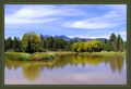
| 10/11/2006 03:55:44 PM | Mountain Homeby elizadebComment: Critique club Review:
Focus and depth of field are excellent.
Color, saturation, and hue are done well.
An earlier, or later in the day, exposure would have been preferrable. By the shadows, it looks like the picture was taken around high noon. Which leaves the lighting a little flat. Hours 10 - 2 are not the best for straight natural lighting. This might have also helped reduce the brown colors in the water. A neutral density filter and a longer exposure could have smoothed the water a bit more too. I'd go for the glassy smooth, as there is no way I know of to get huge waves in a duck pond.
The horizon line is a bit centered, but is nice and level.
You've already heard about the border. Some voters hate them, no matter what they look like. In this case, it is a little heavy. It starts to over power the picture. Had you mad eteh outer line the width of the inner, it would not have been so overly strong.
Overall, a pretty image, and would make a nice postcard. Message edited by author 2006-10-11 15:56:25. | | Photographer found comment helpful. |
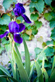
| 10/10/2006 06:07:17 PM | Irisby mosaComment: Critique Club Review:
Focus is very good. Depth of field is too deep here. A really soft background could have made for some nice patterns behing the iris. I would love to see this picture redone with a shallower depth of field.
Color saturation and hue are all done well. Nothing looks artifical, or forced.
Lighting, I would have liked a little more light at the base of the plant, and a little darker wall.
Overall a nice pleasing photo. |
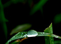
| 10/10/2006 06:02:58 PM | Raindropsby BeckyTComment: Critique Club Review:
Focus and depth of field are very well done. Nice job isolating the leaf from any background clutter.
Color saturation and hue are good. Brighness and contrast are good, though the bright highlight in the large drop is un-naturally bright and is burned out and featureless.
I like the soft hints of grass in the background. Perhaps just a little more there, not much, just a very little.
Overall a very good picture that should have scored a bit higher. | | Photographer found comment helpful. |
|
Showing 1031 - 1040 of ~1613 |
Home -
Challenges -
Community -
League -
Photos -
Cameras -
Lenses -
Learn -
Help -
Terms of Use -
Privacy -
Top ^
DPChallenge, and website content and design, Copyright © 2001-2026 Challenging Technologies, LLC.
All digital photo copyrights belong to the photographers and may not be used without permission.
Current Server Time: 07/20/2026 01:43:44 PM EDT.
|