| Image |
Comment |
| 11/30/2011 12:40:26 AM |
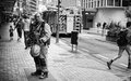
Ballet dancerby keyzComment: haha =) nice going Julien =]
love your profile pic as well. |
 Photographer found comment helpful. Photographer found comment helpful. |
| 11/30/2011 12:38:59 AM |
|
| Photographer found comment helpful. |
| 11/28/2011 09:42:25 PM |
|
| Photographer found comment helpful. |
| 11/28/2011 09:40:59 PM |
|
| Photographer found comment helpful. |
| 11/11/2011 10:59:24 PM |
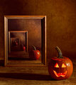
Alone by gyabanComment: The amount of thought and planning - and discovery you put into this stuff is inspiring. I can only hope that others will appreciate it and aspire to such an attitude. So many people seem to get a decent camera and that is pretty much all the effort they put in - you are the antithesis of that.
So awesome.
|
| Photographer found comment helpful. |
| 11/11/2011 02:08:33 PM |
Aloneby skarpi_xxxComment: pretty much perfectly awesome. I'm sure in a basic edit challenge this would be tops. |
| Photographer found comment helpful. |
| 11/09/2011 03:24:40 PM |
|
| Photographer found comment helpful. |
| 11/08/2011 08:10:58 AM |
|
| Photographer found comment helpful. |
| 11/08/2011 08:10:10 AM |
|
| Photographer found comment helpful. |
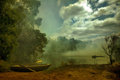
| 11/08/2011 08:09:05 AM |
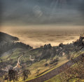
Mist over smoky waterby JudiComment: foreboding hope - I can't decide whether to be excited or fearful of the future. Awesome emotive shot. |
| Photographer found comment helpful. |
Home -
Challenges -
Community -
League -
Photos -
Cameras -
Lenses -
Learn -
Help -
Terms of Use -
Privacy -
Top ^
DPChallenge, and website content and design, Copyright © 2001-2026 Challenging Technologies, LLC.
All digital photo copyrights belong to the photographers and may not be used without permission.
Current Server Time: 07/26/2026 10:49:38 AM EDT.