| Image |
Comment |
| 07/20/2006 04:09:19 AM |
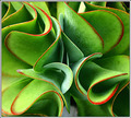
Sherpets Perspectiveby timfythetooComment: Trading Post
I love the depth of this shot as the perspective draws me right into the center of this plant. The complementary colors are winning too, as is the focus and hint of DoF. The title is a clever turn...both in reference to Sherpet's well-known style and the double entendre evident in the use of the word "perspective". There is also a kind of rhythm in the curvature of the leaves and the way they relate to each other. I can't think of any way to improve upon it. Message edited by author 2006-07-20 04:09:58. |
 Photographer found comment helpful. Photographer found comment helpful. |
| 07/19/2006 12:20:17 AM |
|
| 07/16/2006 01:37:24 AM |
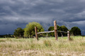
Corner postsby MelethiaComment: Congrats on a top 50 finish. I like the dark clouds behind the posts and the colors in this image. I am not crazy about the composition because the posts appear to be cutting or blocking two significant trees. If it was possible to change position and have the posts line up between the trees or on the outer edge, I think I would have liked it better. I would have voted this a 7 as it is. |
| Photographer found comment helpful. |
| 07/16/2006 01:31:33 AM |
Double Breakby timfythetooComment: I voted 6 for this image because I liked the clarity and colors. The complementary green and red was a bonus as far as I am concerned. I would have preferred to have the people in the image too, as I think fireworks are even more dramatic when there is a frame of reference. I would not have added the frame, but I didn't mark down because of it. |
| Photographer found comment helpful. |
| 07/16/2006 01:27:23 AM |
Paper Patterns by timfythetooComment: Trading Post Comment
Congratulations (obviously) on your ribbon and 7+ score. What I especially like about this abstract photo is the negative space and the subtle color shift of the blue areas as you move out of the center (darker) to the edges (lighter). I also like the "fun" aspect of this photo...it's almost like looking at a maze (except there is no way out). I didn't vote in this challenge, but since I like abstracts I would have been right up there with the concensus of the voters. Well done. |
| Photographer found comment helpful. |
| 07/11/2006 03:14:07 AM |
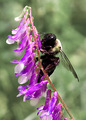
Amazing Beautyby tngrndreamComment: Trading Post
Nice close-up and focus. Awsome insect, colorful flowers. Bokeh is excellent too. This is the background I would like to have seen in your "Swinging" blurred motion offering.
The light is pretty bright here and that may account for what might otherwise be some over sharpening. I am not sure what the cause may be, but some of the flowers seem over done.
I didn't vote on this image but would have given it a 5 or 6. |
| 07/11/2006 03:07:58 AM |
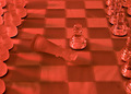
Death of a Kingby tngrndreamComment: Trading Post
Good idea, but I think there are a couple of problems. (I may be over critical on this first observation but...) I am not sure how a king is slayed in chess without another piece out of position. As a chess player, this can't happen...which is to say, the photo has an inherent "issue" which is unnecessary. Also, while I am on this subject, using a pawn to slay the king is less interesting than using a more ornate piece such as a knight. O.K. I realize I may be going overboard here, but those kinds of things cloud my appreciation for the image. It also appears that the focus is a bit off...with sharpness in the background and fuzziness beginning at about the point of the king and worsening in the foreground.
Now, less you think I don't like this image (because of my nit-picking) let me set this straight. I like the idea, I like the use of glass pieces (I think more direct light from a side angle may have been more dramatic) and I even like the red tone of the picture. If I were you I would try this set-up again sometime when you can work it into a challenge because it has a lot of possibilities and the deficiencies are pretty easy to correct. I think the DPC scores are a bit low for this image. I also think I need to buy a glass chess set for challenges (oh yeah, and for playing chess). Message edited by author 2006-07-11 03:08:29. |
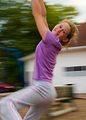
| 07/11/2006 02:53:52 AM |
Just a Swingin'by tngrndreamComment: Congrats on adding a new image to your top five. I like the model and her smile. I like the clarity of this image at her eyes and face. I like the blurring. What I wish you could do over is the background. Even though it is blurred is still manages to compete with your attractive model - and that is distracting. I assume you didn't have much choice because the swing is in the school yard or back yard of your home...but if there were a better angle to make the background simpler this photo would score much better with me. As it was, I gave it a 5. |
| 07/11/2006 02:46:09 AM |
Fire Flowerby KelliComment: Trading Post
I like the image - the well rounded shape of the "flower", the bokeh for a background, and the off-center position. I would have preferred to have the crop be less severe on the bottom, showing more of the "stem"...but since I don't know what was down there, perhaps you made a wise choice. |
| Photographer found comment helpful. |
| 07/11/2006 02:41:34 AM |
Celebrateby KelliComment: Trading Post
Congrats for having this image land in the middle of your top five. I like the abstract quality of the fireworks, the multiple colors, and the slightly off-center capture/composition. Given that I like fireworks this photo works for me. Since PP is not permitted, I guess that sums this up. |
| Photographer found comment helpful. |
Home -
Challenges -
Community -
League -
Photos -
Cameras -
Lenses -
Learn -
Help -
Terms of Use -
Privacy -
Top ^
DPChallenge, and website content and design, Copyright © 2001-2026 Challenging Technologies, LLC.
All digital photo copyrights belong to the photographers and may not be used without permission.
Current Server Time: 06/22/2026 01:22:58 AM EDT.