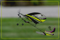
DPChallenge: A Digital Photography Contest You are not logged in. (log in or register
 
Browse Settings
Currently viewing:
Registered UserCEJ

Show comments:

Per page:

Order:

Comments:


Comments Made by CEJ
Pages:   ... ... [210]
Showing 381 - 390 of ~2098
Image Comment
MEN
12/17/2008 09:04:52 PM
MEN
by ashepp

Comment:
Where is the 'personification' this?
Photographer found comment helpful.
Transplant
12/17/2008 09:04:26 PM
Transplant
by mango

Comment:
Where is the 'personification' this?
Photographer found comment helpful.
Police Greys
12/08/2008 09:46:56 PM
Police Greys
by robst

Comment:
Simply a gorgeous photograph!
One Octave
12/04/2008 09:58:35 PM
One Octave
by jbirkman

Comment:
A little on the soft side - perhaps slightly out of focus. Piano keys are 'hard' objects with very clear lines and form. I would think a 'harder' focus would do them more justice. A slight WB adjustment appears to be needed as well.

On a personal side: the name should clue one in - OCTAVE - meaning eight (8) - C to C, not C to B. I think, for some reason, this disturbs me more than the softness.
Photographer found comment helpful.
IMG_3231C 720.jpg
11/08/2008 07:27:50 AM
IMG_3231C 720.jpg
by SJCarter

Comment:
Is this a re-visit? (just checked, yes it is...well the train cars are different anyway) I love the feel of this one. Sort of nostalgic.
Photographer found comment helpful.
Evening Star
11/08/2008 07:24:59 AM
Evening Star
by SJCarter

Comment:
Simply beautiful! Time of day, amount of light, balance of color and lightness - very well done!
Photographer found comment helpful.
obama.jpg
10/16/2008 10:16:20 PM
obama.jpg
by alanfreed

Comment:
never mind...bad comment...not fun or funny.

Message edited by author 2008-10-16 22:17:05.
Photographer found comment helpful.
Safetly Tucked Away
09/30/2008 01:25:23 PM
Safetly Tucked Away
by scooter88

Comment:
Hello from the Critique Club:

I have studied your image and have the following to offer:

Composition/perspective: I admit, after studying your image I still had to look at the description you supplied to know there was a bird there. Then I was able to see it. This may have hurt in the voting. Your straight on perspective makes it a bit hard to view - the DoF shows the center in focus, okay, but the feathers and sticks that are out of focus in the foreground I find to be distracting and make it even harder to spot your image. Perhaps a slight down looking perspective or even a greater DoF would help this or a tighter crop.

Light: natural light, again I think a perspective change may help make this area stronger. There are a lot of distinct shadow and light areas. So many that oppose each other it adds confusion to the shot. As above, a different crop would help this greatly.

Color: there are a lot of nice bold and subtle colors here. It would have been nice to see more of these contrasts brought out. This also may have helped to isolate and focus your subject since it is different from the surround nest.

Challenge: the idea is good and fits the challenge well. Where it falls off I think is in presenting the subject in such a way that it doesn't have to be searched for.

Overall/my opinion: I like the concept behind the image and think it is a great, fortuitous find. I found the image confusing in general which may be a part of the natural defense of the design. But I can see where it would have fallen short in the voter's eyes.
Photographer found comment helpful.
Adult Supervision Required
09/30/2008 01:04:41 PM
Adult Supervision Required
by incubus

Comment:
Hello from the Critique Club:

I have studied your image and have the following to offer:

Composition/perspective: the subject has excellent position in the frame. Flying 'into' the picture and obviously taking off. I say this as the only distraction in the shot I see as far as composition is the background. I feel the road/driveway takes away from the subject as it cuts right through it. I feel it would be stronger with an uninterrupted background. The feeling of flight and take-off would still be completely obvious. Your DoF is perfect for the image as well. The blurred background gives the feeling of height somewhat. Again, this would be stronger with a solid background. Perhaps this could have been achieved with a different perspective.

Color: the delicate structure of the plane allows the small areas of color on the wings to stand out and accentuate the shape and profile. The use of a matching border color really adds to the completeness of the image. All colors appear accurately represented.

Light: natural light, used very well. No blown out or dull/dark areas. Everything is evenly lit with no glare on the wings.

Challenge: in my opinion, this may be the weakest area of the image. Without the title to put it into the challenge, the image of the plane itself does not portray any risk. If there were other items in the image to support 'risk' as in power lines, children, houses (all risks if flying the plane nearby) it would make more sense on its own, as it is, without the title it presents little in the way of 'risk.'

Overall/my opinion: I like the image. For some reason when I see it I think of having fun. Same as I do when I am flying my kites. as stated above, I find the background disturbing in the respect that it is not solid. I like the detail and clarity of the plane itself and feel you captured it perfectly.
Photographer found comment helpful.
She's No Angel
09/27/2008 09:37:38 PM
She's No Angel
by citymars

Comment:
Excellent capture!
Photographer found comment helpful.
Pages:   ... ... [210]
Showing 381 - 390 of ~2098


Home - Challenges - Community - League - Photos - Cameras - Lenses - Learn - Help - Terms of Use - Privacy - Top ^
DPChallenge, and website content and design, Copyright © 2001-2025 Challenging Technologies, LLC.
All digital photo copyrights belong to the photographers and may not be used without permission.
Current Server Time: 09/08/2025 06:28:05 PM EDT.