| Image |
Comment |
| 07/01/2005 12:30:40 AM |
Beacon No Moreby atcbirdComment: At first I didn't like the subject being so centered, but then the sun is so pretty on the water, so that makes up for it. Nicely done 10 |
 Photographer found comment helpful. Photographer found comment helpful. |
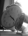
| 07/01/2005 12:28:31 AM |
Old Fashioned Wake Up Callby BlinksComment: I don't know...where I live, we don't have that much sun coming in our windows at 4:23 in the morning...actually none at all. |
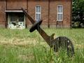
| 07/01/2005 12:23:17 AM |
thriving are only summer grassesby kenboComment: The grass is covering your subject too much. Actually, I think the building in the background could be a better subject for this challenge. |
| Photographer found comment helpful. |
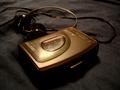
| 07/01/2005 12:21:23 AM |
Before Discman & Ipod...by CrystalFuryComment: Obsolete...yes But, the picture is blurry and you got too much glare on the walkman. Since the walkman is black, perhaps using a white background and pointing your lightsource away from the subject would give you better results. |
| 07/01/2005 12:17:07 AM |
|
| Photographer found comment helpful. |
| 07/01/2005 12:15:34 AM |
|
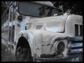
| 07/01/2005 12:11:31 AM |
1963by sacredspiritComment: Of all the broken down vehicles in this challenge, I think this is my favorite. Although it looks like you might have picked up some noise in the windshield area, the rest looks great. The lighting and the desaturation really adds to the desolate feeling of obsolete. Does that make sense? Very good work 10 |
| Photographer found comment helpful. |
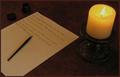
| 07/01/2005 12:08:14 AM |
Shine onby nikuserComment: Although cropped a little too close, this is a nice picture using the light from the flame. The looks more like the camping laterns we still use today instead of the old fashioned oil lamps but still a nice picture. |
| Photographer found comment helpful. |
| 07/01/2005 12:05:00 AM |
Before E-mail, Word Processors and Typewriters...by tsheetsComment: I was reading your note....and thinking about the language they used back then. They usually used mother, father, children instead of mom, dad, and kids. Just being picky. Beside that, this is a very clever idea for this challenge and very well put together. Lighting is nice. Perhaps desaturating it a little would make it more antique looking. Good luck in the challenge. |
| Photographer found comment helpful. |
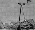
| 07/01/2005 12:00:19 AM |
State of the Artby WadeComment: Interesting angle. I like the fence in the background. The swing set (slide) is not so good in the background. B&W is fitting here. Good take on the challenge. Just a little bit blurry. |
| Photographer found comment helpful. |
Home -
Challenges -
Community -
League -
Photos -
Cameras -
Lenses -
Learn -
Help -
Terms of Use -
Privacy -
Top ^
DPChallenge, and website content and design, Copyright © 2001-2026 Challenging Technologies, LLC.
All digital photo copyrights belong to the photographers and may not be used without permission.
Current Server Time: 07/24/2026 03:49:36 PM EDT.