| Image |
Comment |
| 05/25/2006 01:56:19 AM |
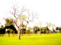
Despite Years of Sweat Equityby TomMMDComment: I think that I understand the scene, but I can't read the signs. I called the number, and apparently they are turning the pasta joint into a Mexican Cafe. That could be a success or a failure depending on your taste. I do like the image, but I would have liked to have seen more emphasis on one of the small signs. |
 Photographer found comment helpful. Photographer found comment helpful. |
| 05/25/2006 01:53:00 AM |
|
| Photographer found comment helpful. |
| 05/25/2006 01:52:03 AM |
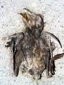
failure of the rainby bulitasComment: A little too over-processed for my likings. It looks like there was some selective editing here that really wiped out some of the image's detail. |
| 05/25/2006 01:50:33 AM |
failed attemptby eatbaklavaComment: Great idea, but it seems a bit overexposed. It looks like some detail was lost. Also adding to that effect is the image's small size. Always try to use the full resolution that DPC offers. |
| 05/25/2006 01:49:22 AM |
Failure to stay clean and eat a Giant Lollipopby Elvis_LComment: Your flash was a bit too harsh. The shadow on his right shoulder is very distracting. You captured a great expression and great catchlights. He looks like me with one of those suckers. No way you can stay clean. |
| Photographer found comment helpful. |
| 05/25/2006 01:47:48 AM |
No place to hide!by FalcComment: Excellent focus and great depth of field, but I only get a small sense of failure from this one. You captured great detail and a very interesting subject. I also like the composition as the stalk provide a terrific leading line. |
| Photographer found comment helpful. |
| 05/25/2006 01:46:12 AM |
Failure To Connect by lectrolComment: I think that a faster shutter speed to stop the motion of some of the sparks would have served this one better. Nice image and great idea, but I'd like to see the sparks with less light trails. |
| Photographer found comment helpful. |
| 05/25/2006 01:44:55 AM |
the Agony of Defeatby margiemuComment: Great tonal range and very interesting composition. I also like the depth of field taht pushes the viewer right back to the tear and the heartbreakign look on her face. The only element that bothers me is the teardrop on the tip of her nose. It almost adds anxiety to the frame based on knowing how annoying that tickling feeling really is. Still, very well done. |
| Photographer found comment helpful. |
| 05/25/2006 01:41:11 AM |
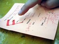
bummerby yourbuddyjhawkComment: Interesting lighting and great toning. The various scoring on the page works well to move the viewer's eye about the frame. I think the composition would have been better served without the pointing finger. Rather, just the hand holding the page would have been sufficient. Still, nicely seen. |
| 05/25/2006 01:38:52 AM |
Social Deceaseby GoodEndComment: Cool idea, but the blur just doesn't work for me in this one. I like the contrast of the image, but the blur is too bothersome. |
| Photographer found comment helpful. |
Home -
Challenges -
Community -
League -
Photos -
Cameras -
Lenses -
Learn -
Help -
Terms of Use -
Privacy -
Top ^
DPChallenge, and website content and design, Copyright © 2001-2026 Challenging Technologies, LLC.
All digital photo copyrights belong to the photographers and may not be used without permission.
Current Server Time: 06/18/2026 08:01:44 PM EDT.