| Author | Thread |
|
|
06/06/2006 05:55:40 AM |
Hi From the Critique Club!
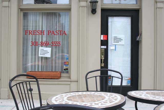
Ok, you know what the main problem was here;) I like scenes like this, and the idea was good, but without the sign being legible, the story you were trying to tell got lost.
I too have problems (who knows why) keeping the camera horizontal, and you rotated to compensate, but it still needs a little more?
The colours are soft and muted, with those nice tans, blues and blacks, creating a calm scene. The lack of people and things on the tables adds the feeling of emptiness.
The composition is a little busy, but that's what makes images like this more interesting. I might have cropped the chair back at the bottom of the image as it's distracting.
The lighting seems a little flat, but again that adds to the mood of closure..if only we could have seen those signs;) |
|
 Photographer found comment helpful. Photographer found comment helpful. |
Comments Made During the Challenge  |
|
|
05/30/2006 11:31:23 PM |
|
The closure signs could have been a litte more focused. |
|
| Photographer found comment helpful. |
|
|
05/30/2006 12:19:02 PM |
|
Probably looked fine at original resolution, but at 640 pixels the signs (which probably read "out of business" cannot be read. |
|
| Photographer found comment helpful. |
|
|
05/26/2006 03:24:00 PM |
|
Can't tell, is the restaraunt closed to business? |
|
| Photographer found comment helpful. |
|
|
05/26/2006 12:42:09 PM |
|
I was thinking of doing something similar to this. The empty tables are effective. |
|
| Photographer found comment helpful. |
|
|
05/25/2006 08:16:08 PM |
|
It would be better if I could read the sign. |
|
| Photographer found comment helpful. |
|
|
05/25/2006 11:19:47 AM |
|
I understand the idea but the foreclosure signs on the building. |
|
| Photographer found comment helpful. |
|
|
05/25/2006 10:22:32 AM |
|
Cannot read the sign. Loses all meaning without that |
|
| Photographer found comment helpful. |
|
|
05/25/2006 01:56:19 AM |
|
I think that I understand the scene, but I can't read the signs. I called the number, and apparently they are turning the pasta joint into a Mexican Cafe. That could be a success or a failure depending on your taste. I do like the image, but I would have liked to have seen more emphasis on one of the small signs. |
|
| Photographer found comment helpful. |
|
|
05/24/2006 09:32:08 PM |
|
with out the title i wouldnt know what was going on. |
|
| Photographer found comment helpful. |
|
|
05/24/2006 05:06:10 PM |
|
Nice photo,without the title looks closed for the day.....5 |
|
| Photographer found comment helpful. |
|
|
05/24/2006 02:36:32 PM |
|
erm, can't read the sign which I presume we're meant to... |
|
| Photographer found comment helpful. |
|
|
05/24/2006 12:38:00 PM |
|
? Don´t get it. Perhaps it would make sense if the wrinting in the window were visible but this shot makes no sense to me. |
|
| Photographer found comment helpful. |
|
|
05/24/2006 09:16:48 AM |
|
Nice shot. Would have liked to see closer view of the signs. |
|
| Photographer found comment helpful. |
Home -
Challenges -
Community -
League -
Photos -
Cameras -
Lenses -
Learn -
Help -
Terms of Use -
Privacy -
Top ^
DPChallenge, and website content and design, Copyright © 2001-2026 Challenging Technologies, LLC.
All digital photo copyrights belong to the photographers and may not be used without permission.
Current Server Time: 06/28/2026 08:28:42 AM EDT.