| Image |
Comment |
| 08/29/2005 12:12:21 PM |
relaxby irishempressComment: this should have done much better! I really liked it- I also had a problem with you covering your breasts but really only because it looked unnatural. maybe you could have rested one arm over them instead of holding. I especially loved the colors. |
 Photographer found comment helpful. Photographer found comment helpful. |
| 08/29/2005 12:07:45 PM |
Heliophileby bicrayComment: I did think this would do better, I had it at a 9 & then had to drop it to an 8 because I notice the distracting clone job on the left. The image was an excellent one tho- especially good lighting! |
| Photographer found comment helpful. |
| 08/29/2005 12:01:01 PM |
Bauhausby whiteroomComment: I expected this to do much better... I suppose there is much more going on here than just nude- perhaps that's why it didn't do as well? I loved it & gave it a 9. Peaked my interest :0) |
| Photographer found comment helpful. |
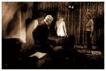
| 08/29/2005 11:56:46 AM |
The Puppeteer's Joyby docpjvComment: Definetly underrated- gave it a 10! I usually don't comment on the ones I give high scores 'cuz I assume they have enough 'pats on the back'
Great image & unique idea!!!
|
| Photographer found comment helpful. |
| 08/29/2005 11:51:09 AM |
A Simple Loveby ArtysteComment: A ha!! sisters- so that's why she looks huge!!! Again- a great image.
...now it's 101 comments :0) |
| Photographer found comment helpful. |
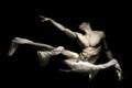
| 08/29/2005 11:39:12 AM |
Quasi una fantasia by nico_blueComment: hehe great story- I knew it was you! (and not because I recognized ya! I'm actually begining to notice peoples styles!!!) Glad you got the blue, gave it a 10 myself!
hmmmm.. art history background coming in thru the subconscious? And here I thought you were trying for the same pose as the sistene chapel creation of adam!! gotta admit, it's very classic :0) |
| Photographer found comment helpful. |
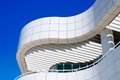
| 08/28/2005 09:00:56 PM |
Getty Architecture #1by brianlhComment: this is a great improvement. The windows in particular give the image a whole new dimension. The left side of the building has taken on some of the blue and I had thought you used sel color but you haven't! I love the composition and the curves :0)
|
| Photographer found comment helpful. |
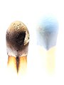
| 08/28/2005 05:09:47 PM |
Burnby RikkiComment: well, in regards to that white box bottom right when you're editing a picture just turn up and down the brightness- you would be able to catch things like that then. People will never have all thier monitors calibrated the same anyways... |
| Photographer found comment helpful. |
| 08/22/2005 11:03:07 PM |
Releaseby GeocideComment: the hair looks very unnatural and I'm not sure what you did to do this but you could have dodged highlights at 5-9% and possibly averted what is happening here. sorry if this is what you did, just a possible suggestion. otherwise a compelling pic. |
| Photographer found comment helpful. |
| 08/22/2005 01:16:58 PM |
|
| Photographer found comment helpful. |
Home -
Challenges -
Community -
League -
Photos -
Cameras -
Lenses -
Learn -
Help -
Terms of Use -
Privacy -
Top ^
DPChallenge, and website content and design, Copyright © 2001-2026 Challenging Technologies, LLC.
All digital photo copyrights belong to the photographers and may not be used without permission.
Current Server Time: 07/22/2026 12:57:08 PM EDT.