| Image |
Comment |
| 05/10/2006 11:02:58 PM |
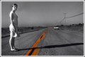
Driving Pass Carmenby kmbr2001Comment: I know this goes in with your title, but I think it would be a much better image without the car. However, in this case it really is the begining of a story. you have some overexposed spots on her shirt & skirt. I like the composition. |
 Photographer found comment helpful. Photographer found comment helpful. |
| 05/10/2006 10:59:32 PM |
|
| Photographer found comment helpful. |
| 05/10/2006 07:37:26 PM |
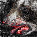
Don't Patronize Conwayby DefyTimeComment: while this image is far from technically perfect I love the angle and the expression on the guys face and the title just makes it so funny!!! 10 |
| 05/10/2006 07:33:55 PM |
|
| Photographer found comment helpful. |
| 05/10/2006 07:30:46 PM |
|
| Photographer found comment helpful. |
| 05/10/2006 07:27:21 PM |
De- Parting Coupleby loveComment: you did some editing on his hair? looks pretty weird... I think your monitor might be too dark if you can't see it. at the bottom of the voting screen there is a b&w bar- you should be able to distinguish all the black boxes. check it out :0) the soft glow is nice. good photo, just not exactly a movie poster |
| Photographer found comment helpful. |
| 05/10/2006 07:19:10 PM |
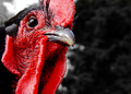
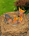
Documenting Predatory Chicksby tngrndreamComment: the lighting seems to be overkill here. if you used a flash, try putting tissue over it or I've heard a plastic spoon diffuses the light too. other than that, a great image- good tonality w/ the birds |
| Photographer found comment helpful. |
| 05/03/2006 07:36:01 PM |
Mediterraneanby AranchaComment: the lighting on this is perfection! was it natural? I want DETAILS!!! (please...) :0D |
| Photographer found comment helpful. |
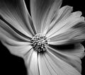
| 04/29/2006 09:50:09 PM |
Cosmoby WildpurpleComment: this is gorgeous! I love the way the edges fade out of the DOF. nice toal range too... |
| Photographer found comment helpful. |
| 04/27/2006 08:54:31 PM |
Midageby rameviComment: *Critique Club*
Well, it looks like everyone's mentioned the one main problem- it's too close, too cropped. Also, the composition is too centered for my taste.
The exposure seems great to me. The eyes are sharp and deep. The lighting is a little harsh- see how shiny it is under the eyes? Some indirect lighting might work better in this instance. Of course it fit the challenge theme great. The comments look quite helpful to me in this instance.
Good luck in future challenges! |
| Photographer found comment helpful. |
Home -
Challenges -
Community -
League -
Photos -
Cameras -
Lenses -
Learn -
Help -
Terms of Use -
Privacy -
Top ^
DPChallenge, and website content and design, Copyright © 2001-2026 Challenging Technologies, LLC.
All digital photo copyrights belong to the photographers and may not be used without permission.
Current Server Time: 07/22/2026 04:28:40 PM EDT.