| Image |
Comment |
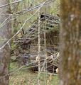
| 04/14/2005 09:36:40 AM |
Left for deadby rayg544Comment: Foreground is way too busy and distracting. Would have been a much better shot to step around the trees to shoot. The fact that the tree on the right is extrememly out of focus is very distracting. A different crop could help with that. I like that the building itself is in focus, and I like seeing htat you captured this place when the trees were budding out. Gives the photo less of a feel of ruin and decay. |
 Photographer found comment helpful. Photographer found comment helpful. |
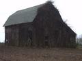
| 04/14/2005 09:34:07 AM |
Barnby sbeaumontComment: Overprocessed. It's lost a little of its clarity b/c of the applied color. Would have preferred to see this in B&W or in its natural color. |
| Photographer found comment helpful. |
| 04/14/2005 09:31:58 AM |
|
| Photographer found comment helpful. |
| 04/14/2005 09:30:40 AM |
Lonelyby tellyComment: This could have been a really good photo. Subject placement is good, but I can't see a darned thing! The image is way too dark. Also out of focus. |
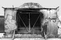
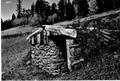
| 04/14/2005 09:29:11 AM |
Please Lock Gate When Leavingby GeneralEComment: Composition could have been better - you cut off one end of the house. Also, because of positioning, it seems like the gate is the center of attention. Entire image is out of focus. |
| Photographer found comment helpful. |
| 04/13/2005 09:03:47 PM |
Skin like an elephant / Nature Reclaimsby janbruderComment: What is it? Half-burned nylon? Bizarre cake icing? Peeling paint? And where does the building come into play? This shot is too much of a macro for me - and unfortunately, most buildings don't play well as macros. |
| Photographer found comment helpful. |
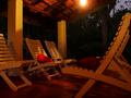
| 04/13/2005 09:01:00 PM |
Portby miyuruComment: I guess I just don't get this one. On the technical side, the light bulb is a glaring distraction, shadows on the chairs are distracting, and the cushions give a sense that the building has not been abandoned, merely vacated. |
| 04/13/2005 08:56:15 PM |
this old houseby scott photoComment: Picture is out of focus and too small. I can 'see' the concept, but it didn't play well... |
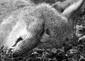
| 04/13/2005 08:55:20 PM |
Animus Doesn't Live Here Anymoreby mikasiComment: I understand that you're thinking out of the box, but I think maybe this is a little too far out of the box. On the plus side, the composition is good, lighting ok, clarity fantastic. Is this a fox or a dog? Bumping up to 4. |
| Photographer found comment helpful. |
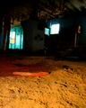
| 04/13/2005 08:53:08 PM |
The old Flour Mill.by NodeComment: Out of focus....or is this a picture of dirt? Background is too dark to pick up details, foreground makes no sense. |
| Photographer found comment helpful. |
Home -
Challenges -
Community -
League -
Photos -
Cameras -
Lenses -
Learn -
Help -
Terms of Use -
Privacy -
Top ^
DPChallenge, and website content and design, Copyright © 2001-2026 Challenging Technologies, LLC.
All digital photo copyrights belong to the photographers and may not be used without permission.
Current Server Time: 06/10/2026 05:12:56 PM EDT.