| Image |
Comment |
| 04/22/2005 09:06:39 PM |
Paper Craneby joangingComment: The crane is nice. I like the idea, but the two-tone background is distracting, especially since you can see that the green (grey?) material is out of focus and is reflecting the light in an unhelpful manner. Try a solid, non-reflective background, with the vertical part of the background angled slightly. |
| 04/22/2005 09:01:42 PM |
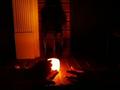
R&Sby figmentComment: I think there may be a decent (or even good) photo in there, but it's too dark and too small to see. |
| 04/22/2005 09:00:22 PM |
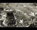
Rock: The Abandoned Fountainby mocabelaComment: The foreground flowers, while they add depth to the composition, are distracting because of their brightness. Perhaps this shot from another angle would work better? |
 Photographer found comment helpful. Photographer found comment helpful. |
| 04/22/2005 08:58:42 PM |
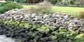
Rock y Bedby sharkavComment: Good idea. Nice colors. Out of focus. Also, a slightly tighter crop would pull the focus more to the center shrubbery; as it stand now, it looks like the bushes on either end are accidentally chopped off which gives the photo an unfinished feel. |
| Photographer found comment helpful. |
| 04/22/2005 08:56:39 PM |
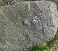
Rockby mjasrComment: Try pulling back from the subject just a little; the crop is too tight and causes the composition to feel static and a little claustrophobic - there is no 'frame' to support the rock. |
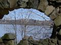
| 04/22/2005 08:53:03 PM |
Over the river and through the rock....by Jamie2772Comment: I like the concept. The trees in the center are too busy and distract/detract from the city skyline. The left side of the arch is cut off, which gives an out of balance feel to the photo which is emphasized by the tilted horizon. On the plus side, the focus and DOF is good, and the lighting on the stones is good. |
| Photographer found comment helpful. |
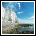
| 04/21/2005 11:20:57 AM |
Ragged by TychoComment: Beautiful colors and textures. Love the lighting. Very nice work. |
| Photographer found comment helpful. |
| 04/21/2005 11:19:44 AM |
Scissors!by wheeleddComment: Love the composition on this one - having the scissors on the diagonal is more interesting than if they'd been horizontal or vertical. |
| Photographer found comment helpful. |
| 04/21/2005 11:18:26 AM |
Celebrating the Creatorby glodaComment: Very creative. Beautiful colors - I like the color reflection in the crystal. Good composition, good clarity. |
| Photographer found comment helpful. |
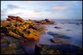
| 04/20/2005 02:08:19 PM |
Rockby gingerninjaComment: Beautiful colors. Great composition. Where is this? |
| Photographer found comment helpful. |
Home -
Challenges -
Community -
League -
Photos -
Cameras -
Lenses -
Learn -
Help -
Terms of Use -
Privacy -
Top ^
DPChallenge, and website content and design, Copyright © 2001-2026 Challenging Technologies, LLC.
All digital photo copyrights belong to the photographers and may not be used without permission.
Current Server Time: 06/11/2026 02:12:13 AM EDT.