|
|
|
Showing 291 - 300 of ~1042 |
| Image |
Comment |
| 02/27/2006 09:05:50 AM | beautiful in Basic Blackby kiwinickComment: This, to me, is a good shot, but just a couple of things keep it from being a 'great' shot. The lighting is excellent - no hot spots, no deep and distracting shadows in the wrong places, just a soft, beautiful glow that perfectly illuminates the model. The composition is quite nice.
What prevents the 'greatness', for me, is, first and foremost, the pose and the crop. The pose she is in, with her hips thrust forward and slightly to the side, really overemphasizes her hips and makes her look extremely bottom-heavy, which I suspect is not really the case in 'real life'. The crop cutting across her hips at the widest point really makes it worse. In addition, cropping where you did is a bit awkward in reference to her hands. The other things that bother me are really more of the nit-picky variety: her right earring is overly large for her face and really looks unbablnced and out of place, and her hair looks like it could have withstood a good brushing just before the sutter was clicked.
Again, good photo, just not *quite* a great one. |  Photographer found comment helpful. Photographer found comment helpful. |
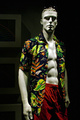
| 02/27/2006 08:57:43 AM | Men's Wearby banmornComment: The strong overhead light simply does not work for me. Had the model been a 'real' human (which I would have much preferred), the eyes would have been shadowed to the point of obscurity (as they are with the mannequin). A reflector or a fill light would help considerably in lighting the face. Also, I think more care should be taken with the background in relation to the models and his outfit - the sunglasses get almost totally lost in the dark bg - there isn't quite enough 'separation' there. Another thought about the bg - it would seem more 'professional' if picture frames in the background were _either_ removed before the shoot _or_ lit so that they looked like they were lieft in intentionally. | | Photographer found comment helpful. |
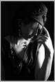
| 02/27/2006 08:52:30 AM | Damatic Dressupby chris_clarryComment: I think the main detractor for me with this photo is the lighting. I understand that the lighting was used to create a 'mood', and I'm all for that kind of thing - I even like the concept of it. However, I think that perhaps the lighting is falling on the wrong body parts for it to be really effective - the hand and arm are very 'hot', and the rest of the photo is pretty much lost in shadow. The pose is interesting (though I would have preferred to see her looking up at the camera from that position), and the composition is quite nice. The fact that the 'important' parts (her face, her outfit) are so shadowed, though, really undermines the impact of the photo. | | Photographer found comment helpful. |
| 02/24/2006 09:17:33 PM | Lament in Satinby toffleComment: I don't know if it's the lighting or the post-processing, but the model's skin has a lavender tint to it that is a little odd. |
| 02/24/2006 08:52:17 PM | 2006by Postgate1Comment: OK. I realize the white string thing is part of the outfit, but, man! It's seriously distracting! Also, I'm not too sure about the use of sepia toning with this one. I think color might have worked a little better. | | Photographer found comment helpful. |
| 02/24/2006 08:05:50 PM | | | Photographer found comment helpful. |
| 02/24/2006 06:23:41 PM | Enter Sandman... on the highwayby CalamitysMaster00Comment: This is a great view-point shot (or whatever they're called :P).
Amazingly crisp details, especially considering how the photo was taken! Beautiful framing in the mirror, too.
I think that maybe part of the reason I like this shot is that my husband drives semis for a living. |
| 02/24/2006 05:56:56 PM | Formalities Asideby O'HolleranComment: Love the concept, and the composition is good, even if the crop seems a little tight. The light is quite harsh, though, and she looks exceedingly bored. | | Photographer found comment helpful. |
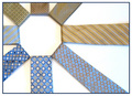
| 02/24/2006 05:55:53 PM | What Makes a Manby knkloveComment: This is a unique take on the ubiquitous and dreaded TIE. The colors of the chosen ties harmonize quite well with each other, and I love the composition of this. The only problem I really have with it is one of focus. It looks as though some of the ties are not quite as crisp as the others. I don't know if this is a DOF problem, or a result of taking a picture of shiny materials. If the bottom vertical tie were not quite so crisp, the problem would not be as obvious. | | Photographer found comment helpful. |
| 02/24/2006 05:53:14 PM | Giorgio Armaniby GeocideComment: I don't like the use of shallow DOF here. I would much rather see the entire picture clearly. Also, I think that the backlighting may be a little strong for this photo. I like the concept and composition of it, though I would like to see more of his face. | | Photographer found comment helpful. |
|
Showing 291 - 300 of ~1042 |
Home -
Challenges -
Community -
League -
Photos -
Cameras -
Lenses -
Learn -
Help -
Terms of Use -
Privacy -
Top ^
DPChallenge, and website content and design, Copyright © 2001-2026 Challenging Technologies, LLC.
All digital photo copyrights belong to the photographers and may not be used without permission.
Current Server Time: 06/11/2026 02:46:35 AM EDT.
|