| Image |
Comment |
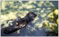
| 09/07/2005 08:32:29 AM |
From Where I Sit...by aboutimageComment: This could have been a fabulous shot if you had been able to get closer to the otter. The background highlights really take away from the otter and the branch. |
 Photographer found comment helpful. Photographer found comment helpful. |
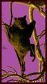
| 09/07/2005 08:29:46 AM |
A Bat, Branch Dancer.by BrianRComment: What a unique subject. I've never seen a capture of a bat before. Great shot for Halloween. Like the lighting and the background very much. |
| Photographer found comment helpful. |
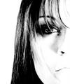
| 09/05/2005 07:36:18 PM |
Sophisticatedby idnicComment: Very good use of high cotrast. Very much like a high fashion photo. Nice job. |
| Photographer found comment helpful. |
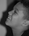
| 09/05/2005 07:34:52 PM |
Amusedby DreamerdollComment: The image is very clear, and the boys expression is wonderful, but the image itself is very flat. I don't think this quite brings out the supbject of high contrast. |
| Photographer found comment helpful. |
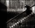
| 09/05/2005 07:30:14 PM |
Vantageby aznymComment: The picture needs more highlights for a stronger composition. I liked the stairs pretty well, and the person is pretty contrasty, but the wall is too flat. Maybe a crop of the area around the person with some of the stairs in the image. |
| Photographer found comment helpful. |
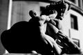
| 09/05/2005 07:24:04 PM |
Man vs Natureby modurnComment: The very large black area on the left seems too heavy for the photo. I think more midtones in the dark areas may have given it a bit more detail. The most attractive part of the photo seems to be the head and lit side of the statue. I would have liked to see more conrast along those lines. |
| Photographer found comment helpful. |
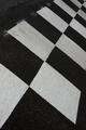
| 09/05/2005 07:20:34 PM |
bumpby visaksenComment: I think the contrast would have been stronger if you had dodged the white squares more. Adjusting contrast to a higher setting may have also created more of an illusion of contrast. |
| Photographer found comment helpful. |
| 09/02/2005 09:13:55 PM |
Shoes nightmareby mmusicanteComment: This was absolutely bizarre, and very creative. Title is great too. Give this one a ten. |
| Photographer found comment helpful. |
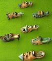
| 09/02/2005 09:09:05 PM |
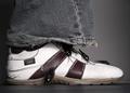
Lord of Roachesby paulmorrisComment: Eiyuu. I hope they are fake. Think the image would have been better without them. Liked the ragged leg bottom and the stitching coming out of the shoe. Great lighting too. Kind of makes you wonder what really lives in a bowling alley. |
| 09/02/2005 09:04:14 PM |
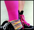
Mix Matchby kylhComment: Love the bright colors in this one. The texured white background was a good choice to enhance the sock. Really great interpretation. |
| Photographer found comment helpful. |
Home -
Challenges -
Community -
League -
Photos -
Cameras -
Lenses -
Learn -
Help -
Terms of Use -
Privacy -
Top ^
DPChallenge, and website content and design, Copyright © 2001-2026 Challenging Technologies, LLC.
All digital photo copyrights belong to the photographers and may not be used without permission.
Current Server Time: 07/23/2026 03:44:53 AM EDT.