| Image |
Comment |
| 05/20/2006 03:45:06 PM |
|
 Photographer found comment helpful. Photographer found comment helpful. |
| 05/20/2006 03:43:45 PM |
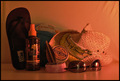
Bachelor's Breakfastby TimComment: That is some breakfast. I can't face much more than a slice of toast and coffee in the morning. Your focus was very good on the image and your were able to expose it well enough that not much glare shows on the item on the right. For me, though, it seems you might have put too much into the image. |
| Photographer found comment helpful. |
| 05/20/2006 03:36:00 PM |
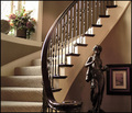
Quiet Climbby breadfan35Comment: This is an awesome interior shot. Compositionally it is very well put together. Lighting is really good as well. Very nice. |
| Photographer found comment helpful. |
| 05/20/2006 02:45:10 PM |
|
| 05/20/2006 02:43:36 PM |
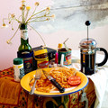
We Doby rubienneComment: Nice job of handling the gold color. I know how hard it is to get true gold colors on digital images. Would have liked slightly better focus. Still I give it an 8 |
| Photographer found comment helpful. |
| 05/20/2006 02:42:27 PM |
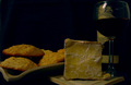
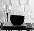
Boringby tonyvComment: Maybe boring, but it is definitely one of the better stills. Like the black and white and the gorgeous translucency of the glass. Nice job. So far this is the only 10 I have given, and I have already voted on 200 images. |
| Photographer found comment helpful. |
| 05/20/2006 02:39:53 PM |
Ha! Ha! You Lose!by tngrndreamComment: I missed the point on the first round. I didn't realize that they were different kinds of coke, one without caffeint and the other with caffeine. Are the gold cans also less calories? Anyway, I don't ordinarily like the shots made with the mannequins, but this one really works. It is creative and very cute. Like it alot. |
| Photographer found comment helpful. |
| 05/20/2006 02:37:00 PM |
-by YourBuddyFloComment: You have very good detail on the wood. Wondering why you showed so very little of the vase, though. Even if it had something growing in it, I think by having the top cut off it upsets the flow of the composition. |
| 05/20/2006 02:32:19 PM |
Add a little spiceby BlindBatComment: Very nice color combination. Detail is really good on the ground chile's on the right. Really liked the composition too. Very well done. |
| 05/20/2006 02:30:17 PM |
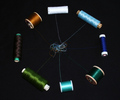
Intertwinedby ThelmaComment: Really nice subject for still life. The brown thread on the left may have been too dark for the background, but overall a clever and creative image. |
| Photographer found comment helpful. |
Home -
Challenges -
Community -
League -
Photos -
Cameras -
Lenses -
Learn -
Help -
Terms of Use -
Privacy -
Top ^
DPChallenge, and website content and design, Copyright © 2001-2026 Challenging Technologies, LLC.
All digital photo copyrights belong to the photographers and may not be used without permission.
Current Server Time: 07/27/2026 04:36:18 PM EDT.